- New to JMP? Let the Data Analysis Director guide you through selecting an analysis task, an analysis goal, and a data type. Available now in the JMP Marketplace!
- See how to install JMP Marketplace extensions to customize and enhance JMP.
- Subscribe to RSS Feed
- Mark Topic as New
- Mark Topic as Read
- Float this Topic for Current User
- Bookmark
- Subscribe
- Mute
- Printer Friendly Page
Discussions
Solve problems, and share tips and tricks with other JMP users.- JMP User Community
- :
- Discussions
- :
- Life distribution interval censoring compare distributions plot
- Mark as New
- Bookmark
- Subscribe
- Mute
- Subscribe to RSS Feed
- Get Direct Link
- Report Inappropriate Content
Life distribution interval censoring compare distributions plot
Hi,
I have a question regarding Life Distribution platform, precisely using compare distribution outline box with interval censored data.
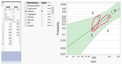
I would like illustrate my question with an example. I created some dummy numbers and tried to fit a Weibull distribution to it. The behaviors that I will describe below repeat as I am using actual data.
My general question is how JMP calculates Y-axis (probability) positions for interval censored data?
I wonder why two points with start value of 120 and 200 are plotted on the same height on Y axis?
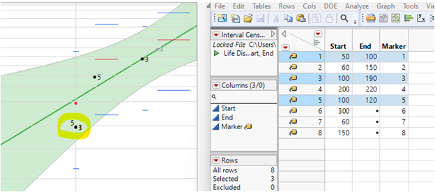
Next, why sometimes an uncensored observation is marked on a plot using single marker (ex. point 4), some marked using 2 markers (ex. points 1 and 3, as shown with red ellipses) and some are not marked at all (ex. missing point 2)?
Finally, I would like to ask, why I can only select on this plot point 1 (using cursor) and other points cannot be selected in any way, except, when using data table directly. Additionally, I can only move label of point 1, other are inactive.
Thank you for your help,
Regards,
Ceg1
Accepted Solutions
- Mark as New
- Bookmark
- Subscribe
- Mute
- Subscribe to RSS Feed
- Get Direct Link
- Report Inappropriate Content
Re: Life distribution interval censoring compare distributions plot
I believe that you are using JMP 16 or an earlier version. There was a bug which is associated with the marker selection issue that you stumbled upon.
And there is also a change in JMP 17. So if you run the analysis in JMP 17, you will see a different plot. The difference reflects a change to the y-axis positions of those points. But let me dial back all the way to the beginning to explain what is going on.
1. When data are interval censored, the "Nonparametric Estimate" of the distribution uses the so-called "Turnbull Estimator". You can find the numerical result of the estimate in the "Nonparametric Estimate" outline node. Here is the screenshot from JMP 16. And the Turnbull estimate is in the third column.
2. The markers that you have questions about are associated with the estimate. This is the tricky part. Traditionally, markers are associated with data. But here the markers in this plot are associated with the nonparametric estimate, which is a model. This explains why some data points do not seem to appear in the plot.
3. Now let me explain how to the Turnbull estimate is plotted.
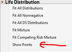
3.1 First, what you show here is one of two representations of the nonparametric estimate plots. For Turnbull, it might be easier for me to talk about the other representation, which is more rigorously representing the Turnbull estimate. To see the other one, you need to turn off "Show Points" option in the menu in JMP 16; see next screenshot:
After turning it off, you should see the following plot. There is one red dot, and three red horizontal lines. This style is known as the "step-function" representation of a nonparametric estimate.
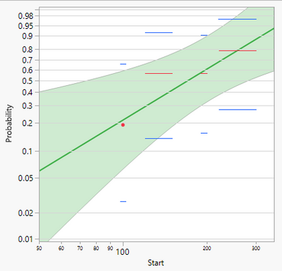
They correspond to the Turnbull estimate. Let me explain them one at a time. We need to look at the Nonparametric Estimate and the plot side by side. So we don't have to scroll up and down. Now, look at the first row in the table, it says that from the time origin (here it means 0) to 60, the probability estimate is 0. Because we are drawing the Y-axis using the Weibull probability scale, this line does not show up. But if you change the Y-axis to linear, you should see that additional line from 0 to 60, at y=0. Now, look at the second row in the table, it says, from time 100 to time 100, the probability estimate is 0.19047620. It means that a line collapses down to a dot. That is what the red dot is corresponding to. The third row through the fifth row in the table define three individual lines at respective probability estimates. Notice the third and fourth lines have the same probability estimates. That determines the two lines are at the same level.
3.2 Now toggle back to see the markers. I put them side by side, and it is now more obvious where the y-axis positions of the markers come from.

In addition, in order to accommodate the tradition that markers are brush-able in JMP, the software tries to make as much sense as possible to associate the estimate (the model) with the data. But I should explain what is going on using JMP 17. Due to the bug in JMP 16 and the change in JMP 17, explanation of this marker style plot in JMP 16 will bring more confusion. I am switching gear to JMP 17 in the following. Resetting the item number as well to be clear.
1. In JMP 17, the Nonparametric Estimate report for this data is the following. Notice the third column's name is "Midpoint Estimate", and there is an additional last column "Turnbull Estimate". So this table moves what was in the second column to the last. And put "Midpoint Estimate" at the third column.
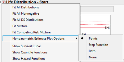
2. JMP 17 has a new submenu for nonparametric plot options.
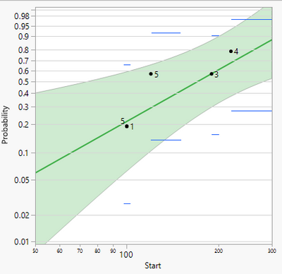
3. The following 3 screenshots are associated with the first 3 options. I do not bother to paste the one associated with "None".
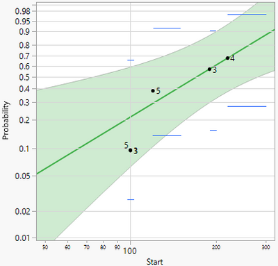
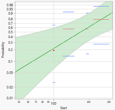
4. So as you may guess. The "Step Function" plot did not change. The "Points" plot, the marker version, changed. More specifically, the markers' y-axis positions changed. And the new positions are corresponding to the second column - "Midpoint Estimate" - in the above table. Now I am going to explain what are the "Midpoint Estimate". Look at the second row, the Midpoint Estimate and Turnbull Estimate. The Midpoint one 0.09523810 is the average of 0 and 0.19047620, the first and second row values under Turnbull. Look at the third row. On this row, the Midpoint estimate 0.38095239 is the average of 0.19047620 and 0.57142857, the second and third row values under Turnbull. So on so forth.
Besides y-axis positions, I also need to point out the x-axis positions of those markers. The markers' x-axis positions are the beginning of the steps in the step-function representation. So they are 100, 120, 190, and 220, or the values in the first column Start.
5. The Midpoint estimate was already used for plotting purpose when data are only right censored. The same decision for interval censored data, however, was not made in previous versions.
6. The Midpoint estimate is also known as "midpoint adjustment". And such adjustment is not unique. There are other kinds of adjustments in the literature. Midpoint adjustment is crucial for plotting right censored data, because otherwise the plot will give the misconception that a parametric estimate is biased if the marker version of nonparametric estimate is overlaid. The adjustment is not crucial to interval censored data. A decision was made in JMP17 development cycle to make the two situations consistent.
7. Now, maybe the most mind twisting thing is about the association between the four markers and data points. It is to accommodate the tradition that markers are associated with data and brush-able. So the behavior is implementation dependent. The behavior has to do with the x-axis positions of those markers. In JMP 17, if you brush the first marker on the lower left, whose x-axis position is 100, you should see three rows in the data tables are highlighted. Now look at those three rows, they all have 100 tucked within the corresponding censoring intervals. That is the rule of association. Meanwhile, you should see the second and third markers also get highlighted. Their x-axis positions are 120 and 190. Since the highlights go either ways, from data table to plot. The highlighted rows happen to loop in 120 and 190 as well.
In the end, as a summary. The markers in the plot are associated with nonparametric estimate. The markers are associated with data points through matching markers' x-axis positions with observations. The change from JMP16 to JMP17 should not impact any existing decisions. But the platform itself is a little more consistent moving forward, besides providing more options to accommodate different preferences.
- Mark as New
- Bookmark
- Subscribe
- Mute
- Subscribe to RSS Feed
- Get Direct Link
- Report Inappropriate Content
Re: Life distribution interval censoring compare distributions plot
The groups are estimated separately.
What are the groups? What is the row-wise membership in each group?
- Mark as New
- Bookmark
- Subscribe
- Mute
- Subscribe to RSS Feed
- Get Direct Link
- Report Inappropriate Content
Re: Life distribution interval censoring compare distributions plot
I believe that you are using JMP 16 or an earlier version. There was a bug which is associated with the marker selection issue that you stumbled upon.
And there is also a change in JMP 17. So if you run the analysis in JMP 17, you will see a different plot. The difference reflects a change to the y-axis positions of those points. But let me dial back all the way to the beginning to explain what is going on.
1. When data are interval censored, the "Nonparametric Estimate" of the distribution uses the so-called "Turnbull Estimator". You can find the numerical result of the estimate in the "Nonparametric Estimate" outline node. Here is the screenshot from JMP 16. And the Turnbull estimate is in the third column.
2. The markers that you have questions about are associated with the estimate. This is the tricky part. Traditionally, markers are associated with data. But here the markers in this plot are associated with the nonparametric estimate, which is a model. This explains why some data points do not seem to appear in the plot.
3. Now let me explain how to the Turnbull estimate is plotted.
3.1 First, what you show here is one of two representations of the nonparametric estimate plots. For Turnbull, it might be easier for me to talk about the other representation, which is more rigorously representing the Turnbull estimate. To see the other one, you need to turn off "Show Points" option in the menu in JMP 16; see next screenshot:
After turning it off, you should see the following plot. There is one red dot, and three red horizontal lines. This style is known as the "step-function" representation of a nonparametric estimate.

They correspond to the Turnbull estimate. Let me explain them one at a time. We need to look at the Nonparametric Estimate and the plot side by side. So we don't have to scroll up and down. Now, look at the first row in the table, it says that from the time origin (here it means 0) to 60, the probability estimate is 0. Because we are drawing the Y-axis using the Weibull probability scale, this line does not show up. But if you change the Y-axis to linear, you should see that additional line from 0 to 60, at y=0. Now, look at the second row in the table, it says, from time 100 to time 100, the probability estimate is 0.19047620. It means that a line collapses down to a dot. That is what the red dot is corresponding to. The third row through the fifth row in the table define three individual lines at respective probability estimates. Notice the third and fourth lines have the same probability estimates. That determines the two lines are at the same level.
3.2 Now toggle back to see the markers. I put them side by side, and it is now more obvious where the y-axis positions of the markers come from.

In addition, in order to accommodate the tradition that markers are brush-able in JMP, the software tries to make as much sense as possible to associate the estimate (the model) with the data. But I should explain what is going on using JMP 17. Due to the bug in JMP 16 and the change in JMP 17, explanation of this marker style plot in JMP 16 will bring more confusion. I am switching gear to JMP 17 in the following. Resetting the item number as well to be clear.
1. In JMP 17, the Nonparametric Estimate report for this data is the following. Notice the third column's name is "Midpoint Estimate", and there is an additional last column "Turnbull Estimate". So this table moves what was in the second column to the last. And put "Midpoint Estimate" at the third column.
2. JMP 17 has a new submenu for nonparametric plot options.
3. The following 3 screenshots are associated with the first 3 options. I do not bother to paste the one associated with "None".


4. So as you may guess. The "Step Function" plot did not change. The "Points" plot, the marker version, changed. More specifically, the markers' y-axis positions changed. And the new positions are corresponding to the second column - "Midpoint Estimate" - in the above table. Now I am going to explain what are the "Midpoint Estimate". Look at the second row, the Midpoint Estimate and Turnbull Estimate. The Midpoint one 0.09523810 is the average of 0 and 0.19047620, the first and second row values under Turnbull. Look at the third row. On this row, the Midpoint estimate 0.38095239 is the average of 0.19047620 and 0.57142857, the second and third row values under Turnbull. So on so forth.
Besides y-axis positions, I also need to point out the x-axis positions of those markers. The markers' x-axis positions are the beginning of the steps in the step-function representation. So they are 100, 120, 190, and 220, or the values in the first column Start.
5. The Midpoint estimate was already used for plotting purpose when data are only right censored. The same decision for interval censored data, however, was not made in previous versions.
6. The Midpoint estimate is also known as "midpoint adjustment". And such adjustment is not unique. There are other kinds of adjustments in the literature. Midpoint adjustment is crucial for plotting right censored data, because otherwise the plot will give the misconception that a parametric estimate is biased if the marker version of nonparametric estimate is overlaid. The adjustment is not crucial to interval censored data. A decision was made in JMP17 development cycle to make the two situations consistent.
7. Now, maybe the most mind twisting thing is about the association between the four markers and data points. It is to accommodate the tradition that markers are associated with data and brush-able. So the behavior is implementation dependent. The behavior has to do with the x-axis positions of those markers. In JMP 17, if you brush the first marker on the lower left, whose x-axis position is 100, you should see three rows in the data tables are highlighted. Now look at those three rows, they all have 100 tucked within the corresponding censoring intervals. That is the rule of association. Meanwhile, you should see the second and third markers also get highlighted. Their x-axis positions are 120 and 190. Since the highlights go either ways, from data table to plot. The highlighted rows happen to loop in 120 and 190 as well.
In the end, as a summary. The markers in the plot are associated with nonparametric estimate. The markers are associated with data points through matching markers' x-axis positions with observations. The change from JMP16 to JMP17 should not impact any existing decisions. But the platform itself is a little more consistent moving forward, besides providing more options to accommodate different preferences.
- Mark as New
- Bookmark
- Subscribe
- Mute
- Subscribe to RSS Feed
- Get Direct Link
- Report Inappropriate Content
Re: Life distribution interval censoring compare distributions plot
Thank you peng_liu for this exhaustive information and examples. It is very illustrative.
- Mark as New
- Bookmark
- Subscribe
- Mute
- Subscribe to RSS Feed
- Get Direct Link
- Report Inappropriate Content
Re: Life distribution interval censoring compare distributions plot
Hi Peng,
Thank you for you detailed explanation.
Now I understand why the probability is different from the actual failure from the test.
I posted this confusion as a question in the link below:
I wonder if I want to have the probability plot markers' Y axis to use the Kaplan-Meier Estimate or Turnbull estimate, is there a way to achieve that?
In my case, the Kaplan-Meier Estimate or Turnbull estimate will be my actual failure rate from the test.
My main goal is to plot the weibull distribution with markers' Y axis consistent with the actual measured failure rate.
That will be much more intuitive and acceptable to my audience.
Thank you!
- Mark as New
- Bookmark
- Subscribe
- Mute
- Subscribe to RSS Feed
- Get Direct Link
- Report Inappropriate Content
Re: Life distribution interval censoring compare distributions plot
Hi,
If your application is indeed reliability analysis, I suggest against coming up a different way to plot nonparametric estimate other than industry convention. The adjustment is necessary for the audience of reliability analysis.
To see why it is necessary, your example gives a perfect illustration.
The following plot turns on two plotting options: Points and Step Function. (BTW, the screenshots are made by using JMP18.2 and above.)
The red crosses in the following screenshot are what I marked up, they are what you are asking for.
Now, notice all red crosses are on one side of the parametric fit.
If you present the red crosses and the parametric fit to your audience, you will have a hard time to explain why the fit seems so biased, while it is not.
The purpose of markers here is to provide a visual check whether a parametric model is a good fit to the nonparametric fit.
Meanwhile, look at "Step Function". They are just fine, without adjustment. So, If you insist presenting the original KME, I recommend that you turn on "Step Function" and turn off "Points".
- Mark as New
- Bookmark
- Subscribe
- Mute
- Subscribe to RSS Feed
- Get Direct Link
- Report Inappropriate Content
Re: Life distribution interval censoring compare distributions plot
Thanks @peng_liu for the in-depth explanation : )
A great collection of meaningful arguments.
- Mark as New
- Bookmark
- Subscribe
- Mute
- Subscribe to RSS Feed
- Get Direct Link
- Report Inappropriate Content
Re: Life distribution interval censoring compare distributions plot
Hi Peng,
Thank you for your reply.
I guess I have a dumb question now.
In my company, the weibull plot and fit is always done using the actual tested failure rate at each failure occur time.
That means it uses the Kaplan-Meier Estimate instead of the Midpoint estimate.
The fit looks good since the marker and weibul fit line are using the same Kaplan Meier estimate.
In JMP's case, the weibull plot marker and fit is done using Midpoint estimate.
That is why Kaplan-Meier Estimate will be off from the fit line.
My question is: Is it wrong to use Kaplan-Meier Estimate from the reliability and statistics point of view?
Is more correct to do weibul fit using the midpoint estimate?
I am quite confused about this since JMP only provides the Midpoint estimate, which seems suggesting this is the correct way and the industry norm.
I also found this post, which might be a good reference post. https://community.jmp.com/t5/JMP-Wish-List/Life-Distribution-plot-points-should-default-to-Kaplan-Me...
Please excuse my ignorance. I do not have much applied math background.
Thank you.
- Mark as New
- Bookmark
- Subscribe
- Mute
- Subscribe to RSS Feed
- Get Direct Link
- Report Inappropriate Content
Re: Life distribution interval censoring compare distributions plot
Hi,
There is no dumb question. But I haven't convinced you to use the report that Life Distribution produces.
Plotting points at the beginning of KME steps is not accepted by industry convention.
If you have never seen the issue with points by drawing the points at the beginning of KME using other software, then it could be that you have never seen a situation with fewer data, or the software that you used is wrong. Or it is possible, you are not talking about KME.
I start to suspect that you are not talking about KME, but Turnbull. And you data have mixed censoring. In that case, there is a bug in JMP17, which is what wish list item is talking about. If that is the case, please upgrade to JMP18.2. I believe that it was fixed in JMP18.1. But JMP18.2 is the newest 18 release.
- Mark as New
- Bookmark
- Subscribe
- Mute
- Subscribe to RSS Feed
- Get Direct Link
- Report Inappropriate Content
Re: Life distribution interval censoring compare distributions plot
Hi Peng,
I think I shall clarify my question.
We have insitu monitoring so the exact failure time is recorded. So there is no censoring in my data. (If we take the example JMP file as an example, the start and end time is the same, which means no censor.)
So when the data is fed in JMP, the beginning of the KME is the exact failure rate at each exact failure time.
In my company, the norm is to do weibull fit and plot using the exact failure rate at exact failure time regardless of the sample size of the data.
That is why I wonder if the norm in my company is mathematically incorrect, and we should use the midpoint estimate to do the weibull fit and plot as JMP mandates.
The people in my company do not know Turnbull or KME. I don't think we have that knowledge...
BTW, my company people wrote their own Matlab code to do the Weibull plot, which is simply a fit. I cannot use the software to judge if this method is correct or not.
And I tried the same file using JMP 18.2 but saw no difference.
Thank you.
Recommended Articles
- © 2026 JMP Statistical Discovery LLC. All Rights Reserved.
- Terms of Use
- Privacy Statement
- Contact Us
