- New to JMP? Join us Sept. 23-24 for the Early User Edition of Discovery Summit, tailor-made for new users. Register now for free!
- Use World Cup data to build models, explore spatial relationships, and create informative visualizations in JMP. Register. July 17, 2 pm US Eastern Time.
- Your voice matters! Tell us how you prefer to receive JMP updates, so we can tailor our communication to your needs. Take short survey.
- Subscribe to RSS Feed
- Mark Topic as New
- Mark Topic as Read
- Float this Topic for Current User
- Bookmark
- Subscribe
- Mute
- Printer Friendly Page
Discussions
Solve problems, and share tips and tricks with other JMP users.- JMP User Community
- :
- Discussions
- :
- JSL - Generate -x-y Plot that loops through columns with different variables

- Mark as New
- Bookmark
- Subscribe
- Mute
- Subscribe to RSS Feed
- Get Direct Link
- Report Inappropriate Content
JSL - Generate -x-y Plot that loops through columns with different variables

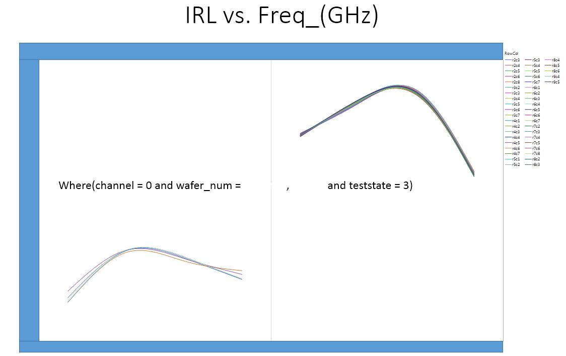
Background: I have a very large data set that is an output of specific RF testing for semi-conductor devices. During this RF test there are a variety of differnt conditions that are important. I have 3 outputs that are tested on 16 different channels at 6 different test states which require me to generate 105 differnt graphs.
example: Gain vs Frequency on Channel 1 at Test State 1; Gain vs Frequency on Channel 2 at Test State 1 where i have 15 channels and 6 test states.
I have searched these discussion boards for a solution and the closets i have come is a thread started in 2017 titled "How to export JMP graph to PPT by JSL?"
I tried to incorperate the script used in this solution to help me and i can get it to make the required number of plots but cannot get specific channels to filter out.
I think i am having a hard time communicating this so please if you need clarification, ask.
Thanks
Summarize( dt, lstChannel = By( :channel ) );
gb = Graph Builder(
	invisible,
	Size( 1225, 952 ),
	Show Control Panel( 0 ),
	Variables(
		X( :Name( "Freq _(GHz)" ) ),
		Y( :Gain ),
		Group X( :wafer_num ),
		Overlay( :RowCol ) ),
		Elements( Smoother( X, Y, Legend( 19 ) ) )
);

For( i = 1, i <= N Items( GroupBy ), i++,
		gb << Local Data Filter(
			columns(
				:wafer_num,
				:channel,
				:RowCol),
			Where( :channel == LstChannel[i] ) ),

// I would like to loop through the teststates as well
			Where( :teststate == 1 ),
			Mode( Show( 1 ), Include( 1 ) ) );
	If( i == 1,
		gb << Save Presentation( "$TEMP/jmp_example2.pptx" ),
		gb << Save Presentation( "$TEMP/jmp_example2.pptx", Append )
	);
	gb << remove data filter;
);

Open( "$TEMP/jmp_example2.pptx" );- Mark as New
- Bookmark
- Subscribe
- Mute
- Subscribe to RSS Feed
- Get Direct Link
- Report Inappropriate Content
Re: JSL - Generate -x-y Plot that loops through columns with different variables
Thank you for the advice / code.. I am going to give it a try this week.. I have a soft deadline to demonstrate the data pull, table format and graph output.. Your help has greatly increased the likelihood of me succeeding
- Mark as New
- Bookmark
- Subscribe
- Mute
- Subscribe to RSS Feed
- Get Direct Link
- Report Inappropriate Content
Re: JSL - Generate -x-y Plot that loops through columns with different variables
Thank you for the script... I have a question about the first one you put up. Do you just put that in the main script or a separate new one?
I loved the graph you plotted and offered up to my boss so i am waiting to hear from him about implementing it in the many reports he is requesting.
I also took the script you gave me with how to plot the -x by -y and substituted Graph Builder with Distribution and it worked almost perfectly. I do have a question about tree structure. I was able to reverse into the this line and located the Text Box(1) however with the distribution modification i am getting an error when running this script. I can't seem to locate the parts that need to be removed.. I am attaching the data table and modified script that includes the distribution function.
(gb << top Report)[TextBox(1)] << delete; //delete the where statement

- Mark as New
- Bookmark
- Subscribe
- Mute
- Subscribe to RSS Feed
- Get Direct Link
- Report Inappropriate Content
Re: JSL - Generate -x-y Plot that loops through columns with different variables
Yngeinstn,
I have attached 2 scripts:
- ModifiedDistribution[test_2].jsl, and
- OtherDistributionPlots.jsl
The take away is that not every platform report has the same structure or same messages, and what is available depends upon your version of JMP. Show Tree Structure and Get XML are messages that can help you discover the report structure and the Scripting Index lists the messages for the display boxes. I like to use XPath() to get a "handle" on hard to find objects or multiple segments, like BoxPlotSeg and HistSeg. However, there are other methods to reference an object. To get a handle to the Y variable scalebox for a histogram, use
_xx = gb<< Xpath("//ScaleBox[@charID='1']");
_xx << message;
or
Report( gb )[ScaleBox(1)] << message;
The other script shows alternative plots that are good to compare distributions.
- Mark as New
- Bookmark
- Subscribe
- Mute
- Subscribe to RSS Feed
- Get Direct Link
- Report Inappropriate Content
Re: JSL - Generate -x-y Plot that loops through columns with different variables
You are amazing with this JSL stuff.. I don't even know if could find any of that. I am testing the distribution one right now.. I can't thank you enough for the other graphs either.. I am sure i am going to be asked about how to do these as well. FYI i am using JMP 12.1.0 however our company is making the move to JMP 14 which i can't wait because of the Semiconductor Toolkit Add-in i found on this site..
I am getting an error when it comes to the gd_inc statement.
Name Unresolved: gd_inc in access or evaluation of 'gd_inc' , gd_inc( Lo, Hi, 10 ) /*###*/
In the following script, error marked by /*###*/
dt = Current Data Table();
jjrn3 = New Window( "Distribution [test_2]", <<Journal );
dtsum = dt << Summary( Group( :Channel, :Test State ), invisible );
Current Data Table( dt );
Lo = Floor( Col Minimum( :test_2 * If( Excluded(), Empty(), 1 ) ) );
Hi = Ceiling( Col Maximum( :test_2 * If( Excluded(), Empty(), 1 ) ) );
_yscl = gd_inc( Lo, Hi, 10 ) /*###*/;
For( i = 1, i <= N Row( dtsum ), i++,
    chnl = dtsum:Channel[i];
    tst = dtsum:Test State[i];
    gb = dt << Distribution(
        where( dt:Channel == chnl & dt:Test State == tst ),
        Stack( 1 ),
        Continuous Distribution(
            Column( :test_2 ),
            Horizontal Layout( 1 ),
            Vertical( 0 ),
            Fit Distribution( Normal )
        )
);- Mark as New
- Bookmark
- Subscribe
- Mute
- Subscribe to RSS Feed
- Get Direct Link
- Report Inappropriate Content
Re: JSL - Generate -x-y Plot that loops through columns with different variables
gd_inc() is a user function that was sent previously on this blog path. I attached it again. Either add the code to your script prior to using it, or save the script ( I call mine gd_inc.jsl ) to a common directory of useful functions, your own personal library, and for any script when you want to compute good axis increments, add the statement.
Include( "mydirectory/gd_inc.jsl" );
For people who support reports for their company, they often create one big script, named something like usr_functions.jsl. Then instead of numerous Include() statements, they use just one Include("mydirectory/usr_functions.jsl")
Here is the function again. Look at the previous posting, there are examples of how to use this function.
gd_inc = Function({xlo, xhi, ntic}, {sp,tt, yrnd, ginc, ndec,lc, ll},
 sp = (xhi - xlo)/ntic;
 tt = log10(sp);
 yrnd = If(
	tt > 0, 1 - Floor( tt ),
	Abs( Floor( tt ) - 1 )
 );
 ginc =round(sp,yrnd);
 ndec = length(word(2,char(ginc),"."));
 lc    = length(word(1,char(xhi),"."));
 if(ndec>0, lc=lc+ndec+1);
 if(xlo <0, lc++); //add 1 character for the negative sign
 ll=[1,1,1];
 ll[1] = ginc; //increment
 ll[2] = ndec; //# decimals
 ll[3] = lc;   //character length
 ll
);  // end gd_inc
/* test cases
show(gd_inc(1,11,10), gd_inc(.001, .005, 10), gd_inc(10000,20200, 10) )
*/
By the way, I have been using and teaching JMP and JSL for many years. So my knowledge is not so amazing, just trying to share.
- Mark as New
- Bookmark
- Subscribe
- Mute
- Subscribe to RSS Feed
- Get Direct Link
- Report Inappropriate Content
Re: JSL - Generate -x-y Plot that loops through columns with different variables
Yes, well your skills are stellar and I would take a JSL class from you any day..
Quick question though.. I ran it with the gd_inc.jsl and this is what i get.. I can see that the scale is almost perfect but my 15 data sets have these 2 difference. Not to say that this isn't going to happen in the future.. When you say modify your script with that second one you quoted i get confused.. I am trying to revere into and figure out where the 10.5 and 42.0 is derived from and think it has something to do with the log() function but not sure..

- Mark as New
- Bookmark
- Subscribe
- Mute
- Subscribe to RSS Feed
- Get Direct Link
- Report Inappropriate Content
Re: JSL - Generate -x-y Plot that loops through columns with different variables
Yngeinstn,
I was under the impression you wanted the same scale for all distributions. JMP Distribution typically does an excellent job to scale the histograms to the data at hand. However, when you are plotting subsets of the data, the scale of the individual histograms will be different. If you know the range of the data, then assign the values for Lo, Hi and inc. If you want the script to handle data whose range could change with a process change or ?? then computing a Lo and Hi and inc should be a task of the script.
For the previous script, I just used the min and the max of the unexcluded data.
Lo = Floor( Col Minimum ( :test_2 * If( Excluded(), Empty(), 1 ) ) );
Hi = Ceiling( Col Maximum( :test_2 * If( Excluded(), Empty(), 1 ) ) );
Below, I made another modification to give some space on the ends: compute the std dev of the unexcluded data and add a half std deviation. One of the reasons, I proposed the alternative graphs that compare the distributions is that JMP will scale to all the included data and you can see the effects of channel and test state.
dt = Current Data Table();
jjrn3 = New Window( "Distribution [test_2]", <<Journal );
dtsum = dt << Summary( Group( :Channel, :Test State ), invisible );
Current Data Table( dt );
std = Col Std Dev(:test_2 * If( Excluded(), Empty(), 1 ));
Lo  = Floor( Col Minimum( :test_2 * If( Excluded(), Empty(), 1 ) )
     - 0.5 * std );
Hi  = Ceiling( Col Maximum( :test_2 * If( Excluded(), Empty(), 1 ) )
	 + .5 *std );

_yscl = gd_inc( Lo, Hi, 10 );
current data table(dt);
For( i = 1, i <= N Row( dtsum ), i++,
    chnl = dtsum:Channel[i];
    tst = dtsum:Test State[i];
    gb = dt << Distribution(
        where( dt:Channel == chnl & dt:Test State == tst ),
        Stack( 1 ),
        Continuous Distribution(
            Column( :test_2 ),
            Horizontal Layout( 1 ),
            Vertical( 0 ),
            Fit Distribution( Normal )
        )
    );
  	(gb << top Report)[TextBox(1)] << delete;  //delete the where statement
	report(gb)[OutlineBox(1)] << set title( EvalInsert("Results for IRL @ Channel=^chnl^ and Test State=^tst^"));
	_xx = gb<< Xpath("//ScaleBox[@charID='1']");
	_xx << Axis Setings({Min( Lo ), Max( Hi ), Inc( _yscl[1] ), Minor Ticks( 1 ),
				Label Row( {Show Major Grid( 1 ), Show Minor Grid( 1 )} )});

/*
If( i == 1,
		gb << Save Presentation( "$TEMP/jmp_example2.pptx" ),
		gb << Save Presentation( "$TEMP/jmp_example2.pptx", Append )
	);
*/
	gb<< Journal Window();
	wait(0);

	gb << close window();

 );
There are multiple methods to automatically scale, and automatically find and eliminate outliers. I am reluctant to strongly recommend because methods accepted by one industry might not be acceptable to another; and normal data methods typically do not apply for lumpy data (clustered data or spatial data) or zero inflated defect data or reliability data. My intent is to point out alternatives that might or might not work for you.
- Mark as New
- Bookmark
- Subscribe
- Mute
- Subscribe to RSS Feed
- Get Direct Link
- Report Inappropriate Content
Re: JSL - Generate -x-y Plot that loops through columns with different variables
First, My name is David. Nice to meet you..
That is correct, i do want a uniform scale and would adjust the -x axis based on the worst case scenario.. I would love to hear your recommendation to remove outliers.. Those are killing my data set.. The parts that we are electrically testing either PASS, BARELY PASS or catistrophically fail. Those catistrophically failed parts need to be removed..
I am going to plug your revised script in my main script to test. Again, I am very appreciative. I also want to thank you for the Include().. I had a huge bulk of my script that was nothing but SQL data pull strings. Our database has 8 different tables i have to pull data from depending on the type of test..
Thank you again...
Here is an example FYI: I have 9 of these that took up a ton of lines of code that was solved by one Include()
testdata_HAY_DC_QQ_Data = Expr(
	"
	SELECT
		t1.testdate,
		t1.wafer_id,
		t1.wafer_number,
		t1.lot_number,
		t2.rownum,
		t2.colnum,
		t2.die_id,
		t2.part_name,
		t2.testname,
		t2.channel,
		t7.header_id,
		t7.idx,
		t7.run_id,
		t7.set_id,
		t7.Supply_Name,
		t7.Voltage,
		t7.Current
FROM tst_master  t1
	LEFT OUTER JOIN tst_dataset_header t2
		ON  ( t2.run_id = t1.run_id )
	LEFT OUTER JOIN tst_dc_data t7
		ON  ( t7.header_id = t2.header_id )
WHERE (t1.wafer_number LIKE '"||SelectedLot||"')
		AND (t2.testname LIKE '"||SelectedTest||"')
 	"
);- Mark as New
- Bookmark
- Subscribe
- Mute
- Subscribe to RSS Feed
- Get Direct Link
- Report Inappropriate Content
Re: JSL - Generate -x-y Plot that loops through columns with different variables
Good morning gzmorgan0,
Previously you mentioned "There are multiple methods to automatically scale, and automatically find and eliminate outliers"
I am wondering if you wouldn't mind sharing that with me? I have been doing a lot of coding and i am pretty close to the end with some minor tweaks..
Yng
- Mark as New
- Bookmark
- Subscribe
- Mute
- Subscribe to RSS Feed
- Get Direct Link
- Report Inappropriate Content
Re: JSL - Generate -x-y Plot that loops through columns with different variables
Yng,
You did not specify what you are looking for. I typically use JMP default scaling, and use something like the following if I want the same axis scaling for all subgroups. This script names the variables of interest ylist, but this can be applied to any numeric continuous varaible (column), even Datetime. The trick is to let JMP scale for all, then copy the axis setting to the table column, then any graph using that column will deploy that scale.
Names Default to Here(1);

ylist = {"Sepal length", "Sepal width", "Petal length", "Petal width"};
dt = Open("$sample_data/iris.jmp");

//get common axis
for(i=1, i<=nitems(ylist), i++,
	ovl = dt << Overlay Plot(Invisible,
		Y( Column(dt,ylist[i]) ),  //yaxis
		Overlay( 0 )
	);
	report(ovl)[AxisBox(1)] << Save to Column Property;
	ovl << close window;
);

//now the same axis will be applied to all sub groups

ovl1 = dt << OverlayPlot( Y( :Petal length ),  Overlay(0), By(:Species) );
//all  3 subgroups have the same Y - axis

//ovl  = dt << OverlayPlot( Y( eval(ylist) ),  Overlay(0), By(:Species) );
I do custom scaling for axes only if:
- there is a known range like control or spec limits,
- need to scale to something like +/- k sigma,
- need to control the grid lines, for example, a grid line at each 0.5 sigma,
- data whose nominal value is large but variation is very small, for example, means value is 1750222 stdev is 0.000023, then I plot a transform Y- mean and figure out a good scale and use the alogorithm, gdinc.jsl
- perform an analyses and determine whether the data is highly skewed or lumpy (clustered).
Regarding outlier detection, I have not found one method that applies to all data. For univariate data with a strong right skewed data (ex. zero inflated Poisson), I like to use a modified Lenth method:
- uscreen = median + k * (upper p percentile -median) / Abs( Normal Quantile(p) )
- lscreen = median - k * (median - lower(p) percentile/ Abs(Normal Quantile(p) )
- where p could be 0.1 ( for 10 and 90 percentiles) or p could be 0.25, then this would be a modified pseudo sigma, and typically k is in [4,6] for summarized data. There are times for raw data, I use a much larger k.
- Also, I typically screen for all data of one variable, but if by groups are quite different, I I screen by groups if there is enough data fopr each group.
Below is an example for computing the screening values by group. If vargroup has 10 groups, the uscreen and lscreen are vectors of size 10 and vg is a list of 10 vargroup names.
//Find global outliers by vargroup for raw measurement data

//Use an assymetric 6 pseudo-sigma, computed from the 10 & 90th percentiles.

summarize(  vg=by(vargroup),
                     c=count,
                     q10=quantile(varvalue,.10),
                     q50=quantile(varvalue,.50),
                     q90=quantile(varvalue,.90)
                  );

uscr  = q50 + 6*(q90-q50)/Normal quantile(0.9);
lscr  = q50 - 6*(q50-q10)/Normal quantile(0.9);
Please note:
- There is no one correct method, and you should always review the methods with those that are reviewing the data. And outliers shoudl never be ignored, because they are leads to possibly important information.
- I often use 2 levels of screening, especially when I needed to compute control limits, screening for the plotted points and screening for limits ... control limits shoudl not accommodate 5 and 6 sigma data.
- If you are creating weekly analyses, note you can get different screening values each week. You might want to do a mega analysis once an use the same limits each week.
- For multivariate data, you should use a mutivariate screen. See graphic. Two obvious outliers are in control based upon univariate limits. So if data is strongly correlated a correlated screen shoudl be used. JMP multivariate has a nice multivariate screen.

Recommended Articles
- © 2026 JMP Statistical Discovery LLC. All Rights Reserved.
- Terms of Use
- Privacy Statement
- Contact Us