- New to JMP? Let the Data Analysis Director guide you through selecting an analysis task, an analysis goal, and a data type. Available now in the JMP Marketplace!
- See how to install JMP Marketplace extensions to customize and enhance JMP.
- Subscribe to RSS Feed
- Mark Topic as New
- Mark Topic as Read
- Float this Topic for Current User
- Bookmark
- Subscribe
- Mute
- Printer Friendly Page
Discussions
Solve problems, and share tips and tricks with other JMP users.- JMP User Community
- :
- Discussions
- :
- How to plot Count of values of Nominal data vs. Continuous data
- Mark as New
- Bookmark
- Subscribe
- Mute
- Subscribe to RSS Feed
- Get Direct Link
- Report Inappropriate Content
How to plot Count of values of Nominal data vs. Continuous data
End goal: Display a Chart that shows Count of values of a Nominal Data Column (X) Vs. Continuous Data Column (Y).
Further in the weeds:
I have a Nominal Data Column: DieNumber.
And a Continuous Data Column: ResDelta.
I want to display the count of each DieNumber (ex: 1, 2, 3) displayed on the X axis instead of each DieNumber value, but in Graph Builder switching the summary statistic to N when ResDelta (Continuous) is plotted on the Y axis is summarizing Y and not summarizing the counts of each value of X.
The only workaround I've found is using the Overlay Plot function, associating ResDelta as \[Y\], associating DieNumber as \[By\], but this splits out each chart individually when I want the data all in one chart.
Really struggling with this so any help would be appreciated, thanks!
- Tags:
- windows
Accepted Solutions
- Mark as New
- Bookmark
- Subscribe
- Mute
- Subscribe to RSS Feed
- Get Direct Link
- Report Inappropriate Content
Re: How to plot Count of values of Nominal data vs. Continuous data
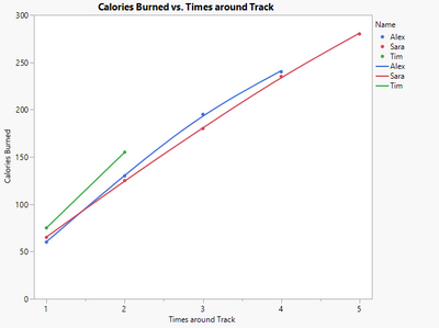
Aah, thank you ask this example clarifies your use case! If I understand correctly, you want all of the individual track times plotted as separate points, not just a single point representing both of Tim's runs. I would approach this by making a column counting the number of times each person ran around the track so far, and then just plotting that against Calories Burned.
The formula for the times around track column could look like this (note how it just sums the number instead of having a column reference in the first argument):
Script to recreate chart:
Names default to here(1);

dt = New Table( "Count Table",
	Add Rows( 11 ),
	New Column( "Name", Character, "Nominal",
		Set Values( {"Tim", "Tim", "Alex", "Alex", "Alex", "Alex", "Sara",
			"Sara", "Sara", "Sara", "Sara"} ) ),
	New Column( "Calories Burned", Numeric, "Continuous", Format( "Best", 12 ),
		Set Values( [75, 155, 60, 130, 195, 240, 65, 125, 180, 235, 280] ) ),
	New Column( "Times around Track", Numeric, "Continuous", Format( "Best", 12 ),
		Formula( Col Cumulative Sum( 1, :Name ) ) )
);

g = dt << Graph Builder(
	Size( 534, 456 ),
	Show Control Panel( 0 ),
	Variables( X( :Times around Track ), Y( :Calories Burned ), Overlay( :Name ) ),
	Elements( Points( X, Y, Legend( 13 ) ), Smoother( X, Y, Legend( 15 ) ) )
);- Mark as New
- Bookmark
- Subscribe
- Mute
- Subscribe to RSS Feed
- Get Direct Link
- Report Inappropriate Content
Re: How to plot Count of values of Nominal data vs. Continuous data
If you sort your data by "Name" (Using @ih example), the following formula will give you the Column Cumulative Sum in JMP 11
If(Lag(:Name) != :Name | Row() == 1, x = 0);
x++;
x- Mark as New
- Bookmark
- Subscribe
- Mute
- Subscribe to RSS Feed
- Get Direct Link
- Report Inappropriate Content
Re: How to plot Count of values of Nominal data vs. Continuous data
First, welcome to the community. I'm not sure I understand the issue, but I have attached a fake data set with fake numbers for two variables Die and ResDelta. I have saved a script for Graph Builder (green arrow). Just click on it. Is this what you are looking for? BTW, I'm on V17 so not sure it will work on V11... so here is the script:
Graph Builder(
	Variables( X( :Die ), Y( :ResDelta ) ),
	Elements( Points( X, Y, Legend( 5 ) ) )
)- Mark as New
- Bookmark
- Subscribe
- Mute
- Subscribe to RSS Feed
- Get Direct Link
- Report Inappropriate Content
Re: How to plot Count of values of Nominal data vs. Continuous data
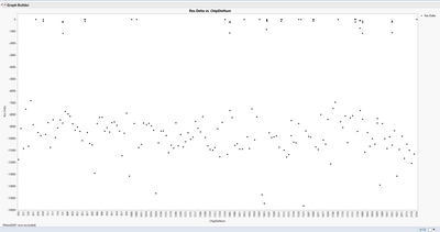
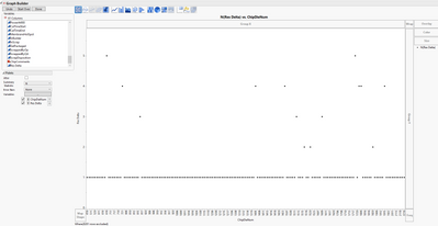
Thank you for the warm welcome and I appreciate your time looking in to this! I plotted the variables on X and Y how I think it should be, and here is what I see:
This is almost correct, except for each X (ChipDieNum) there can be multiple Y values (ResDelta). Instead of plotting the X values, I want to plot the counts of each X (ChipDieNum) value.
As mentioned previously, X is set to Nominal and Y is Continuous.
- Mark as New
- Bookmark
- Subscribe
- Mute
- Subscribe to RSS Feed
- Get Direct Link
- Report Inappropriate Content
Re: How to plot Count of values of Nominal data vs. Continuous data
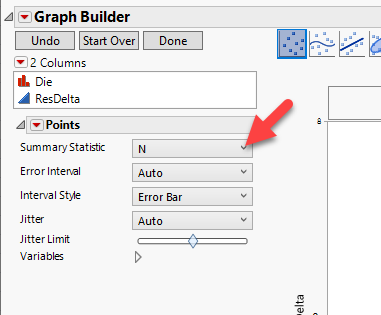
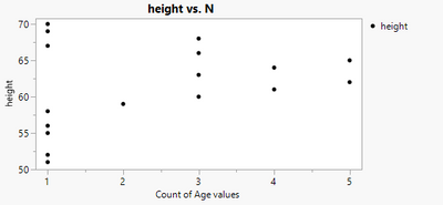
Under Points, try changing the summary statistic to 'N':
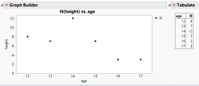
I think this gives what you are looking for:
Script to recreate:
Names Default To Here( 1 );

dt = Open( "$Sample_data/big class.jmp" );

win = New Window("Example",
	H List Box(
		Graph Builder(
			Size( 503, 256 ),
			Show Control Panel( 0 ),
			Variables( X( :age ), Y( :height ) ),
			Elements( Points( X, Y, Legend( 3 ), Summary Statistic( "N" ) ) )
		),
		Tabulate(
			Show Control Panel( 0 ),
			Add Table( Row Table( Grouping Columns( :age ) ) )
		)
	)
);
- Mark as New
- Bookmark
- Subscribe
- Mute
- Subscribe to RSS Feed
- Get Direct Link
- Report Inappropriate Content
Re: How to plot Count of values of Nominal data vs. Continuous data
I've tried doing that, but for some reason JMP is summarizing Y (I guess since it is continuous data) instead of summarizing N for X, so I end up getting a different graph:
While this is showing the counts of the ChipDieNumber, it's now plotting on the Y in place of ResDelta.
- Mark as New
- Bookmark
- Subscribe
- Mute
- Subscribe to RSS Feed
- Get Direct Link
- Report Inappropriate Content
Re: How to plot Count of values of Nominal data vs. Continuous data
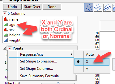
Aah, now I understand. You need to change your y axis to be ordinal or nominal data, and then choose the response axis to summarize under the red triangle for Points. In some cases you might need to bin the data first, for example by rounding to the nearest whole number, but in your case it looks like Res Delta is already a whole number.
Now for some reason the x axis labels messed up when I ran this, so I had to go into the x-axis settings and fix them. So, I thought this script should work:
Names Default To Here( 1 );

dt = Open( "$Sample_data/big class.jmp" );

dt:height << Set Modeling Type("Ordinal");
dt:age << Set Modeling Type("Ordinal");

Graph Builder(
	Size( 502, 256 ),
	Show Control Panel( 0 ),
	Variables( X( :age ), Y( :height ) ),
	Elements(
		Points( X, Y, Legend( 3 ), Summary Statistic( "N" ), Response Axis( "X" ) )
	)
);
but instead I needed to use this:
Names Default To Here( 1 );

dt = Open( "$Sample_data/big class.jmp" );

dt:height << Set Modeling Type("Ordinal");
dt:age << Set Modeling Type("Ordinal");

Graph Builder(
	Size( 501, 256 ),
	Show Control Panel( 0 ),
	Variables( X( :age ), Y( :height ) ),
	Elements(
		Points( X, Y, Legend( 3 ), Summary Statistic( "N" ), Response Axis( "X" ) )
	),
	SendToReport(
		Dispatch(
			{},
			"age",
			ScaleBox,
			{Label Row(
				{Tick Mark( Label( "12" ), Label( "0" ) ),
				Tick Mark( Label( "13" ), Label( "1" ) ),
				Tick Mark( Label( "14" ), Label( "2" ) ),
				Tick Mark( Label( "15" ), Label( "3" ) ),
				Tick Mark( Label( "16" ), Label( "4" ) ),
				Tick Mark( Label( "17" ), Label( "5" ) )}
			)}
		)
	)
);
- Mark as New
- Bookmark
- Subscribe
- Mute
- Subscribe to RSS Feed
- Get Direct Link
- Report Inappropriate Content
Re: How to plot Count of values of Nominal data vs. Continuous data
ResDelta is continuous data though. Also, I don't have red arrows next to the points dropdown in the control panel. Maybe because I'm using JMP 11.
- Mark as New
- Bookmark
- Subscribe
- Mute
- Subscribe to RSS Feed
- Get Direct Link
- Report Inappropriate Content
Re: How to plot Count of values of Nominal data vs. Continuous data
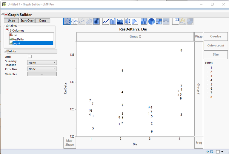
If this is the kind of graph you want
Here is the method that I used in JMP 11. Newer versions would make it easier.
First, I create a new column called "count" using the formula
If(Lag(:Die) != :Die | Row() == 1, x = 0);
x++;
x
The Label state is then applied to the Count column.
Each row has the Label State set for it. This will allow for the displaying of the value as a label.
ResDelta column is dragged to the Y dop area
Die is dragged to the X drop area
Count is dragged to the Color drop area
This last step is done so the color of the points can be changed to white, so they will not show on the graph. To change the color, just go to each of the colored points in the legend, right click on them one at a time, and change the color to white.
- Mark as New
- Bookmark
- Subscribe
- Mute
- Subscribe to RSS Feed
- Get Direct Link
- Report Inappropriate Content
Re: How to plot Count of values of Nominal data vs. Continuous data
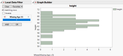
Here is an alternate method that I think will work in JMP 11 and will plot continuous values, and below that is perhaps an easier way to display this data using a histogram:
Method 1
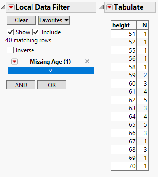
Calculate the points to plot using tabulate with ordinal data types and a local data filter excluding missing values on what would be the x axis. Then in the new data table change data types back to continuous and plot.
- Add a new column with a formula like this (in newer versions of JMP you could do this right in the platform launch dialog without making a column):
- Open tabulate, change the y variable to nominal temporarily, you can change it back after this.
- Add a local data filter to exclude rows with missing ages, set to nominal, and select '0'
- Make into a data table
- Change data modeling types back to continuous
- Graph
Method 2
In graph builder make a histogram using only the y axis, and add a local data filter excluding missing values on what would be the x axis.
- Make the same 'is missing' column for the x axis variable
- Add that column as a local data filter in graph builder.
- Add the y variable to the y axis, it should be continuous
- Change the graph to a histogram
- Change the axis settings on the y axis to something reasonable. Note that this will still do some binning, so depending on your setting here it might combine heights 51.1 and 51.2 into the same bar with a count 2.
- Mark as New
- Bookmark
- Subscribe
- Mute
- Subscribe to RSS Feed
- Get Direct Link
- Report Inappropriate Content
Re: How to plot Count of values of Nominal data vs. Continuous data
This is the closest so far out of all the solutions, but the problem I have is that my end graph needs to be (Count of ChipDieNum) vs. (Res Delta).
For example:
ChipDieNum: 401 ran through calibration 3 times with Resistance Deltas: -10200; -2000; -100 Ohms. In the data, ChipDieNum = (401), Count of ChipDieNum = (3), & Res Delta = (-10200,-2000,-100)
ChipDieNum: 510 ran through calibration 2 times with Resistance Deltas: -13000, -2600; -200 Ohms. Which would show as: ChipDieNum = (510), Count of ChipDieNum = (2), & Res Delta = (-13000,-2600,-200)
I am attempting to correlate that Res Delta for a chip increases according to the number of times it ran through calibration by plotting Count of ChipDieNum (X) against Res Delta (Y). In another sense, I am trying to associate multiple Res Delta (Y) values with values of Count (X) of each ChipDieNum value where ChipDieNum is Nominal, and Res Delta is Continuous.
Recommended Articles
- © 2026 JMP Statistical Discovery LLC. All Rights Reserved.
- Terms of Use
- Privacy Statement
- Contact Us


