- New to JMP? Let the Data Analysis Director guide you through selecting an analysis task, an analysis goal, and a data type. Available now in the JMP Marketplace!
- See how to install JMP Marketplace extensions to customize and enhance JMP.
- Subscribe to RSS Feed
- Mark Topic as New
- Mark Topic as Read
- Float this Topic for Current User
- Bookmark
- Subscribe
- Mute
- Printer Friendly Page
Discussions
Solve problems, and share tips and tricks with other JMP users.- JMP User Community
- :
- Discussions
- :
- How do I plot "spiderdiagrams" in JMP
- Mark as New
- Bookmark
- Subscribe
- Mute
- Subscribe to RSS Feed
- Get Direct Link
- Report Inappropriate Content
How do I plot "spiderdiagrams" in JMP
Hello,
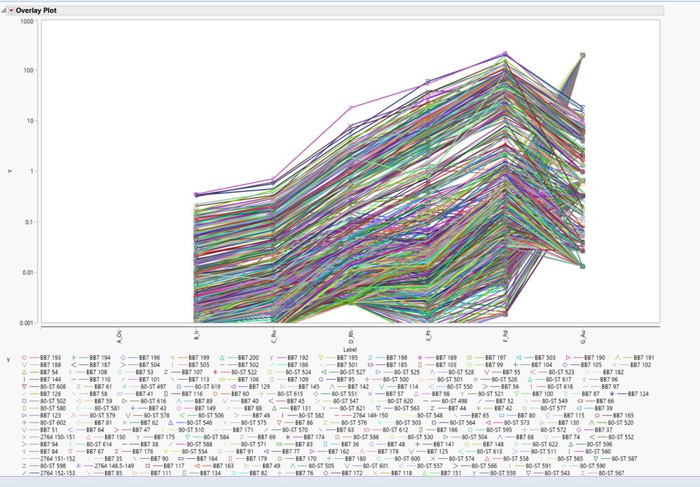
I have a large geochemical dataset that I am attempting to plot in JMP13. I use JMP for most of my geochemical plots but I have yet to figure out how to do so-called "spiderdiagrams." Following the advice of another post I found, I transposed my data table and was able to plot things that looked like spiderdiagrams using the graph overlay tool. This allowed me to plot the data and would work fine as a solution if I had a small dataset. Using this method, everything is grouped by element rather than sample ID so when I click on one point I select all of the points of that element group (i.e. if I click on one Au datapoint, all of the Au datapoints are selected rather than the points that correspond to one sample). Ideally, I would like to be able to select all of the datapoints for a given sample (i.e. Pt-Pd-Rh-Ru-Au points) so that I can begin to divide all of the samples into subgroups.
Please, does anyone have any suggestions for how I can group the connected points so I can begin to sort them into lines of similar slope and appearance.
Thank you!
- Mark as New
- Bookmark
- Subscribe
- Mute
- Subscribe to RSS Feed
- Get Direct Link
- Report Inappropriate Content
Re: How do I plot "spiderdiagrams" in JMP
You can try clustering the data using the approach outlined here (thanks Jeff P and David B!)
https://community.jmp.com/t5/Discussions/Clustering-X-Y-graphs/m-p/46916#M26732
- Mark as New
- Bookmark
- Subscribe
- Mute
- Subscribe to RSS Feed
- Get Direct Link
- Report Inappropriate Content
Re: How do I plot "spiderdiagrams" in JMP
I recently was working with a similar type data set and I used the Parallel Plot in Graph Builder to achieve a plot like the one you show below. In Graph Builder highlight the columns of interest along with sample ID and drag them to the X axis drop zone. From there select the Parallel Plot icon on the upper right side of the icons list. This should generate the plot. From there go back to your data table and select Rows > Data Filter. Add sample ID to filter on. When the filter option comes up make sure you have "Select" checked. Now you have to make sure both your Data Filter and Graph Builder are visible together. You should be able to put them side-by-side in the same window. Go to your list of sample ID's in the Data Filter and click on the one you want to see. You should have a single line in your plot showing with all others grayed out. I tried local data filter in Graph Builder but could not get the single sample view I was hoping for. Maybe someone else out there has a better idea there.
If you only want to see the one line make sure to check "Show" and "Include" in the data filter as well.
@pmroz made a great suggestion for clustering as well that will help you see "like" samples. You can then drop the cluster variable into Group X or Group Y to further break things out.
HTH
Bill
Recommended Articles
- © 2026 JMP Statistical Discovery LLC. All Rights Reserved.
- Terms of Use
- Privacy Statement
- Contact Us


