- JMP will suspend normal business operations for our Winter Holiday beginning on Wednesday, Dec. 24, 2025, at 5:00 p.m. ET (2:00 p.m. ET for JMP Accounts Receivable).
Regular business hours will resume at 9:00 a.m. EST on Friday, Jan. 2, 2026. - We’re retiring the File Exchange at the end of this year. The JMP Marketplace is now your destination for add-ins and extensions.
- Subscribe to RSS Feed
- Mark Topic as New
- Mark Topic as Read
- Float this Topic for Current User
- Bookmark
- Subscribe
- Mute
- Printer Friendly Page
Discussions
Solve problems, and share tips and tricks with other JMP users.- JMP User Community
- :
- Discussions
- :
- Re: Graph Builder: Unclear statistics when using multiple response columns
- Mark as New
- Bookmark
- Subscribe
- Mute
- Subscribe to RSS Feed
- Get Direct Link
- Report Inappropriate Content
Graph Builder: Unclear statistics when using multiple response columns
Hi all,
I have a problem reagrding statistics/bar graphs using multiple response columns. As an example, I will use the Big Class Families data table, and I'm using JMP18.
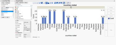
I want to plot the fraction of persons, which have visited specific countries, for simplicity I restricted the age to 14. I made a graph builder with the following script:
Graph Builder(
Size( 1097, 475 ),
Legend Position( "Right" ),
Fit to Window( "Off" ),
Summary Statistic( "Median" ),
Order Statistic( "Median" ),
Variables( X( :countries visited ), Group X( :age ) ),
Elements(
Bar(
X,
Legend( 5 ),
Summary Statistic( "N" ),
Label( "Label by Percent of Total Values" )
),
Caption Box( X, Legend( 6 ), Summary Statistic( "Median" ) )
),
Local Data Filter(
Add Filter(
columns( :age ),
Where( :age == 14 ),
Display( :age, N Items( 6 ) )
)
)
);
The percentage labels on the bar plot show values of 9.1 and 18% for counts of 1 and 2, respectively. I would expect (correct me if I'm wrong) to have a value of 1/12~ 8.3% and 2/12 ~ 17% if the percentage is calculated with the number of persons in the respective age (12) as a base value. For some reason, JMP seems to use the number of responses as the base value for the percentage calculation (which is 11 in this case, so 1/11 ~ 9.1% and 2/11 ~ 18%)
Is it intended, that the number of responses is used as a base value for such calculation with Multiple Response columns instead of the number of respective rows? What is the best practice to plot the values like I intend (percentage respective to the number of rows as labels)?
- Mark as New
- Bookmark
- Subscribe
- Mute
- Subscribe to RSS Feed
- Get Direct Link
- Report Inappropriate Content
Re: Graph Builder: Unclear statistics when using multiple response columns
maybe with Consumer Research/Categorical Response Study?
https://community.jmp.com/t5/Discussions/Question-related-to-multiple-response-variable-how-to-gener...
Open( "$SAMPLE_DATA/Big Class Families.jmp" );
Categorical(
	Count Missing Responses( 1 ),
	Multiple Delimited( :countries visited )
);
student's who travel a lot count N times - even in the denominator!
→ fixed
students which don't travel don't count!
→ fixed via Count Missing Responses( 1 )
and - tada! - [the statistics at the bottom]:
Open( "$SAMPLE_DATA/Big Class Families.jmp" );
Categorical(
	Count Missing Responses( 1 ),
	Multiple Delimited( :countries visited ),
	Legend( 0 ),
	Local Data Filter(
		Close Outline( 1 ),
		Add Filter(
			columns( :age ),
			Where( :age == 14 )
		)
	)
);
- « Previous
-
- 1
- 2
- Next »
Recommended Articles
- © 2025 JMP Statistical Discovery LLC. All Rights Reserved.
- Terms of Use
- Privacy Statement
- Contact Us


