- New to JMP? Let the Data Analysis Director guide you through selecting an analysis task, an analysis goal, and a data type. Available now in the JMP Marketplace!
- See how to install JMP Marketplace extensions to customize and enhance JMP.
- Subscribe to RSS Feed
- Mark Topic as New
- Mark Topic as Read
- Float this Topic for Current User
- Bookmark
- Subscribe
- Mute
- Printer Friendly Page
Discussions
Solve problems, and share tips and tricks with other JMP users.- JMP User Community
- :
- Discussions
- :
- Re: Graph Builder: How to toggle off the overlay for different y-axes?
- Mark as New
- Bookmark
- Subscribe
- Mute
- Subscribe to RSS Feed
- Get Direct Link
- Report Inappropriate Content
Graph Builder: How to toggle off the overlay for different y-axes?
Hey Everyone,
This is not so much of a question rather me posting this so that the information is available online
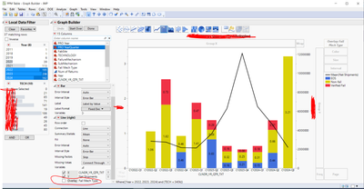
I was having trouble using graph builder. My current chart uses two y-axes to compare two different data types. The problem I was running into was that the overlay variable wanted to split both of my y-axes' data into the groups associated with that variable (My overlay variable was "Fail Mech Type"). This overlay is what is splitting my stacked bar chart into three different colors. To avoid my line graph being split into three different plots I needed to toggle off the overlay for my right y-axis. I couldn't find anything online to help me, so I reached out to some JMP experts.
The image below shows where in the graph builder you can toggle the overlay on and off. This is under the "variables" drop down to the left of the chart.
Hope this helps a few people!
- Mark as New
- Bookmark
- Subscribe
- Mute
- Subscribe to RSS Feed
- Get Direct Link
- Report Inappropriate Content
Re: Graph Builder: How to toggle off the overlay for different y-axes?
It isn't as easy as it should be to find this information from JMP Help page but it is there. For example for Bar chart
https://www.jmp.com/support/help/en/18.0/index.shtml#page/jmp/bar.shtml#
And the example https://www.jmp.com/support/help/en/18.0/index.shtml#page/jmp/example-of-an-area-and-line-chart.shtm....
Essential Graphing (jmp.com) is a good read. And so are Pictures from the Gallery by Scott Wise Master List – Pictures from the Gallery – Advanced Graph Building Series which also contain videos.
- Mark as New
- Bookmark
- Subscribe
- Mute
- Subscribe to RSS Feed
- Get Direct Link
- Report Inappropriate Content
Re: Graph Builder: How to toggle off the overlay for different y-axes?
Besides deactivating some "variables", one can also "pick" variables for the axes and for color:
just drop multiple *) columns onto the drop zone and then just activate the column that you want.
*) Now: up to 2. According to :folded_hands: Graph Builder: support more than 2 'Color' columns ,
in future there will be up to 10 columns possible for color :)
And if you are interested in getting the same functionality for overlay, please follow this wish: Graph Builder - Overlay by multiple columns and support it with a Kudo :)
- Mark as New
- Bookmark
- Subscribe
- Mute
- Subscribe to RSS Feed
- Get Direct Link
- Report Inappropriate Content
Re: Graph Builder: How to toggle off the overlay for different y-axes?
All,
FYI: New in Graph Builder JMP 18 is the Overlay Encoding (right click options directly in the overlay landing zone which offers some additional overlay view controls, in addition to the panel check boxes. An example of the overlay encoding will be part of the new Pictures from the Gallery 9 talk that is debuting at the Online Discovery Discovery Online on Sept 18th & 19th.
Recommended Articles
- © 2026 JMP Statistical Discovery LLC. All Rights Reserved.
- Terms of Use
- Privacy Statement
- Contact Us


