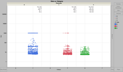
Is your x axis (Category, a continuous variable, I think) necessary? I think JMP is trying to force the width of the box plot element to 1, which hangs over the edge of your current x axis scale. Maybe changing axis settings to show 4 to 10, or converting the Category variable to nominal, would help, at least while drawing this chart?