- Subscribe to RSS Feed
- Mark Topic as New
- Mark Topic as Read
- Float this Topic for Current User
- Bookmark
- Subscribe
- Mute
- Printer Friendly Page
Discussions
Solve problems, and share tips and tricks with other JMP users.- JMP User Community
- :
- Discussions
- :
- Displaying number at Risk on Kaplan Meier curve in JMP pro 17
- Mark as New
- Bookmark
- Subscribe
- Mute
- Subscribe to RSS Feed
- Get Direct Link
- Report Inappropriate Content
Displaying number at Risk on Kaplan Meier curve in JMP pro 17
Can anyone help me in Displaying number at Risk on Kaplan Meier curve in JMP pro 17?
- Mark as New
- Bookmark
- Subscribe
- Mute
- Subscribe to RSS Feed
- Get Direct Link
- Report Inappropriate Content
Re: Displaying number at Risk on Kaplan Meier curve in JMP pro 17
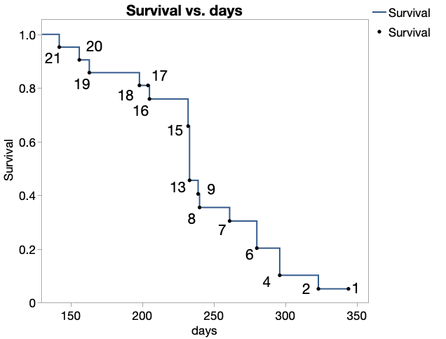
Hi, @yousefhan. You can do this with a combination of the Survival platform and Graph Builder.
That example is based on the Rats.jmp sample data set (Help > Sample Index), subsetted down to just Group 1. Here's how to reproduce it:
- Run the Survival platform on the column Days, and in the resulting report, right click inside the Combined table and choose Make Into Data Table.
- In the resulting data table, right click the At Risk column header and select Label/Unlabel. Next, select all rows, right click on one of the selected rows, and select Label/Unlabel. Now we've told JMP that we want At Risk values displayed for each row whenever we make a graph.
- In Graph Builder, put the time column (Days) on the X axis and Survival on the Y. Remove the smoother element and add the line element (and make sure the points element is still in there, too). Find the line element options to the lower left, and under the Connection drop-down, choose Step.
That'll produce the graph, but depending on your graph frame size and font settings, you may want to click and drag the labels around so they're not crowding each other. And if the labels are so crowded that some might need to be removed, you can deactivate any one of them by right clicking on the corresponding point and selecting Rows > Row Label.
For reference, see the attached data table (the data table created from the Survival report). It contains a table script that will reproduce the graph.
JMP Academic Ambassador
- Mark as New
- Bookmark
- Subscribe
- Mute
- Subscribe to RSS Feed
- Get Direct Link
- Report Inappropriate Content
Re: Displaying number at Risk on Kaplan Meier curve in JMP pro 17
Thank you for sharing this. I have been missing the ability to add Number at Risk for KM plots for many years. In clinical research there is a specific format for presenting the number at risk for KM plots (available in SAS, STATA, and R etc) that would be great to replicate in JMP if possible (and is different than above).
Ive attached a recent example from NEJM to demonstrate, but these plots are ubiquitous in clinical manuscripts. (article at https://www.nejm.org/doi/full/10.1056/NEJMoa2312948 )
If anyone knows how to get this output from JMP or has a plugin or other code that they would like to share, it would be much appreciated!
Best
John
- Mark as New
- Bookmark
- Subscribe
- Mute
- Subscribe to RSS Feed
- Get Direct Link
- Report Inappropriate Content
Re: Displaying number at Risk on Kaplan Meier curve in JMP pro 17
I strongly support the request of adding numbers at risk to the Kaplan-Meier plot and recommend that this request should be put on the JMP wish list because to my insight too the Table as in the figure 3 is really a standard request for Kaplan-Meier Plots.
Best
Winfried
Recommended Articles
- © 2026 JMP Statistical Discovery LLC. All Rights Reserved.
- Terms of Use
- Privacy Statement
- Contact Us

