- New to JMP? Let the Data Analysis Director guide you through selecting an analysis task, an analysis goal, and a data type. Available now in the JMP Marketplace!
- See how to install JMP Marketplace extensions to customize and enhance JMP.
- Subscribe to RSS Feed
- Mark Topic as New
- Mark Topic as Read
- Float this Topic for Current User
- Bookmark
- Subscribe
- Mute
- Printer Friendly Page
Discussions
Solve problems, and share tips and tricks with other JMP users.- JMP User Community
- :
- Discussions
- :
- Change Marker Size of just certain rows?
- Mark as New
- Bookmark
- Subscribe
- Mute
- Subscribe to RSS Feed
- Get Direct Link
- Report Inappropriate Content
Change Marker Size of just certain rows?
Is there a way to change the marker size on just specific rows on a variability guage instead of changing them all to larger or smaller? Thanks in advance.
Accepted Solutions
- Mark as New
- Bookmark
- Subscribe
- Mute
- Subscribe to RSS Feed
- Get Direct Link
- Report Inappropriate Content
Re: Change Marker Size of just certain rows?
One other option that might work for you is to go to Preferences and select the Graphs preference group. Change the Marker Selection Mode to Selected Larger. This will allow you to either individually select rows in the data table, directly select points on the graph, or use the Global Data Filter to select rows based upon any variable in the table. The selected rows' markers will appear larger:
- Mark as New
- Bookmark
- Subscribe
- Mute
- Subscribe to RSS Feed
- Get Direct Link
- Report Inappropriate Content
Re: Change Marker Size of just certain rows?
The only way that I would think this could be done is to use JSL to add graphics to the chart or plot,
- Mark as New
- Bookmark
- Subscribe
- Mute
- Subscribe to RSS Feed
- Get Direct Link
- Report Inappropriate Content
Re: Change Marker Size of just certain rows?
I can only think of one way to do this, but it could not be in the variability platform, but I think you can get the same results.
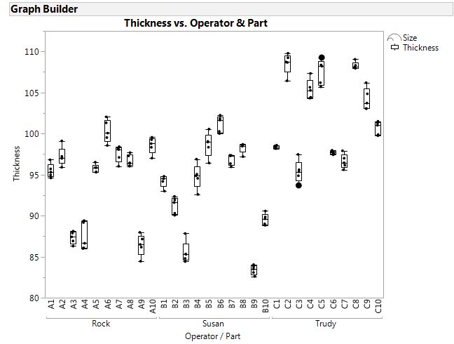
First, you will need an extra column in the data table, let's call it "Size" which has all the same values (say 1) EXCEPT for the rows where you want a larger marker. Let's give those rows a bigger number, say 10.
Create the graph in Graph Builder. You should be able to drag the x variables and nest them to get a similar look to what the Variability chart provides.
You can then drag the "Size" variable into the Size role, and it will draw the markers using that variable.
Here is a quick sample. Notice the two larger dots in Trudy's data:
- Mark as New
- Bookmark
- Subscribe
- Mute
- Subscribe to RSS Feed
- Get Direct Link
- Report Inappropriate Content
Re: Change Marker Size of just certain rows?
One other option that might work for you is to go to Preferences and select the Graphs preference group. Change the Marker Selection Mode to Selected Larger. This will allow you to either individually select rows in the data table, directly select points on the graph, or use the Global Data Filter to select rows based upon any variable in the table. The selected rows' markers will appear larger:
- Mark as New
- Bookmark
- Subscribe
- Mute
- Subscribe to RSS Feed
- Get Direct Link
- Report Inappropriate Content
Re: Change Marker Size of just certain rows?
There is a small cheat which might have the desired effect. You can change the markers for specific rows in the data table to be a symbol from the keyboard (Right click on the Row, Markers - Other...). The full stop character and asterisk can be used as smaller versions of the dot and star standard markers.
The input box also accepts the unicodes (on a PC hold down Alt then type 0176 for example for the degree sign). The insert symbol function of your word processing package should give you the unicode options for your alphabet/font.
Recommended Articles
- © 2026 JMP Statistical Discovery LLC. All Rights Reserved.
- Terms of Use
- Privacy Statement
- Contact Us


