Peng Liu, JMP Principal Research Statistician Developer, SAS
This paper presents four features that have been added to JMP 12. The first is the mixture distribution modeling in the Life Distribution platform. The type of a mixture can be the finite mixture distribution, or the latent competing risk mixture distribution. The mixture distribution modeling allows an arbitrary number of arbitrary types of distributional components. The second is a standalone destructive degradation modeling platform. The platform provides a friendly user interface to conduct the analysis. The third is to assign different costs to different groups in the Reliability Forecast platform. That allows user to aggregate monetary uncertainties from non-homogeneous resources. The fourth is a new component importance criterion in the Reliability Block Diagram platform. The new criterion integrates the structural importance of a component in the system and the failure risk of that component at a given time.
Mixture Modeling in Life Distribution Platform
We provide two types of mixture models in this release. The first is known as finite mixture model. The name is commonly known in the literature. The second is called competing risk mixture model. To our knowledge, the model does not have a common name yet.
The finite mixture model prescribes a cumulative distribution function in the following form:
where k is a known constant, wi’s are weights and sum up to one, Fi’s are individual cumulative distribution functions. If Fi’s are Normal distributions, then F is known as a finite Gaussian distribution. The research on finite Gaussian distribution remains active in the literature. The research on other situations is emerging. In our software, we allow Fi’s to be any supported distributions, besides Normal. And Fi’s can be different types, e.g. is Lognormal and is Weibull. The finite mixture model could be appropriate in the reliability data analysis when subjects of interest are from heterogeneous sub-populations. For example, life characteristics of a product is affected by uncontrollable factors, due to different manufacturers, materials, and environments; life characteristics of a product are affected by unclear usage situations, due to usage intensities and use conditions.
The competing risk mixture model is also called latent failure modes model. Typically, when we mention competing risk, we are discussing a subject whose failure cause is due to one among several possibilities. And the possible causes compete against one another. The earliest occurrence of any cause determines the failure cause and failure time of an object. The object is usually described as a series system, with each failure cause as a node in the series graph. Breaking any node in the graph breaks the linkage of the graph, which represents the failure of the system. When the failure cause is known for every failure, the data are usually modelled by the competing risk model, which has been supported in JMP for many versions. Meanwhile, the competing risk mixture model is appropriate when the failure causes are unknown. That situation is plausible if the information is lost or cannot be collected. Another plausible situation is when the failure cause cannot be immediately identified, e.g. differentiate a failure from a wear out due to bad fabricating process or wear out due to fatigue. The competing risk mixture model has a cumulative distribution function of the following form:
where k is a known constant, Fi’s are individual cumulative distribution functions. Notice the form of coincides that of a competing risk model. It is the type of data and the inference that are different.
Data Format
The data format to be used for the two mixture models are identical to what has been used in the regular Life Distribution. That is the data contain only time-to-event information, including time and censoring schemes.
Use the Feature
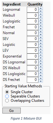
Feed the data to and launch the Life Distribution as usually. The resulting report have two new menu items: Fit Mixture and Fit Competing Risk Mixture, for finite mixture and competing risk mixture models respectively. By selecting either of the menu items, the platform adds an outline node which consists of configuration user interfaces and reports that present final results. For both types of models, the configuration user interfaces are identical; see Figure 1. The configuration user interface allows one to pick ingredients and the number of each ingredient. For ingredients, we are not limited to a single type distribution in a mixture distribution. For example, one can mix a Lognormal and a Weibull.
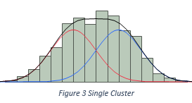
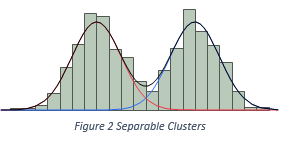
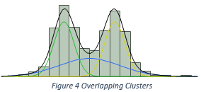
The software also needs to know some presumptions on how ingredients are mixed, such that the software can spend reasonable amount of efforts to come up with a solution. We assume three recipes to mix ingredients. They are illustrated in Figure 2, 3, and 4. In Figure 2, two Normal ingredients are mixed together, but the histogram only presents a single cluster of data. In Figure 3, two Normal ingredients are mixed, and the histogram presents two distinct modes. Therefore, the number of clusters equals the number of ingredients. In Figure 4, three Normal ingredients are mixed, among which two are well separable, but the third ingredient inflates into the other two. Such that the total number of clusters is less than the total number of ingredients. Based on the presumptions of how ingredients are mixed, we can compute starting values for parameters, which could be close the final estimates. We label the presumptions as the starting value methods, and put into users’ hands as a choice, or as a belief.
By choosing the types of ingredients, the quantities of ingredients, and a method of computing starting values, the platform will try to find the maximum likelihood estimates of parameters. And the computational time increases as the types of ingredients differ, as the quantities of ingredients increase, as the starting value method moves from Single Cluster, to Separable Clusters, and further to Overlapping Clusters. The Overlapping Clusters starting value method usually requires a long computing time. The resulting report will list estimates, major graphs. And the report also allows one to compare different mixture models to make a decision.
Standalone Destructive Degradation Analysis Platform
The Destructive Degradation platform grows out of the Degradation platform. The purpose is to ease the use of existing methodologies. The analysis is to model the data, by using a (log-)location-scale distribution, the location parameter of which is a function of time, with or without other factors.
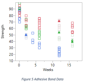
For example, Figure 5 plots the Adhesive Bond data, which is available among sample data in JMP. Each squared point is a measurement reading at a particular time. The measurement here is the strength which breaks the adhesive bond between the two surfaces in each testing unit. The measurement can be censored values. For example, in Figure 5, the upper solid triangle points are right censored. They mean that the strength is some value larger than what has been recorded, probably because the designated strength cannot break the bond. After gradually increasing the strength, finally the bond was broken, but the measurement on the strength is not accurate in the dynamic process. The colors in the graph denote different temperatures. Each testing unit was placed under an environment with a constant temperature.
The questions that are to be answered by the analysis include:
- How does a study subject of interest degrade over time?
- What is the probability of degradation measurement cross a given threshold at a given time?
- What is the time when the degradation measurement of a certain fraction of units will cross a given threshold?
A plausible use of the model is to determine a time to replace units, which have degraded.
Given the data, the platform provides options for four choices. The first is the distribution. The analysis is interested in how the degradation measurements are distribution at given time, given fixed conditions. The second and the third are transformations of degradation measurements and time. Data are allowed to be transformed before being analyzed. The fourth is the definition of the degradation, which is a function that defines the location parameter of the chosen distribution.
Data Format
The platform expect a data that at least includes degradation measures and associated times, at which measures are taken. The degradation measures can be censored, and the censoring schemes are identical to those defined in Life Distribution platform and Survival platform, except that the unit is not related to time. The platform takes one optional X role. That could be temperature, voltage, or just batch indicator. Usually, it is the data with X that we are more interested in, especially when X is continuous.
Use the Platform
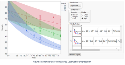
The graphical user interface of the platform consists of an overlay of data and the current model, a panel of model configuration widgets, and a place for collecting detailed model reports. The overlay of the data points and the current model allows one to quickly assess how appropriate the model is.
The choice of distributions, transformations, and path definitions probably depends on domain knowledge. The workflow may be in that order as displayed. However, empirically, when there is no single good candidate model at the first place, working out backward could be a feasible alternative.
The Path Definition panel lists all supported function definitions for the location parameter. For each function, besides its expression image, there is a thumbnail image, which depicts the final fitted function. By comparing the shape of the fitted function and the actually data, one may have a better idea about which path definition is more suitable. After choosing the path definition, then one can play with the transformations. There are nine different combinations of transformations. Finally, one can change the distribution. There are eight of them.
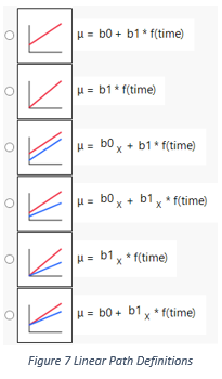
There are total of thirteen path definitions. The first six are all linear in parameters; see Figure 7. And the fitted functions are straight lines in transformed space, if the distribution belongs to the location-scale family. If one chooses a log-location-scale distribution, the solid lines in the graph will be curved. The points on solid lines drawn in the graph are medians associated with each distributions, time, and other factors. The points on the boundaries of shades are the lower and upper percentiles.
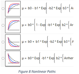
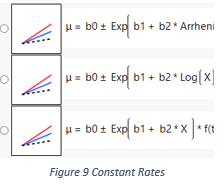
The next four have similar expressions; see Figure 8. By looking at the thumbnail images, one can notice they are different in vertical positions and monotonicity. They are preconfigured version of the general model in Chapter 21 of Meeker and Escobar (1998). Each version here is configured in the way that certain parameters are constrained, such that the path definitions match their thumbnail images. And it is easy to compare four images to tell their differences. The first starts from some non-zero value and increases, until reaches an asymptote. The second one starts from zero and increases, until reaches an asymptote. The third and fourth ones are similar, but they decrease instead of increase. Comparing to the first six linear path definitions, these four thumbnail images have extra dashed curves. The dash curve represents that the model can be extrapolated along the X variable. For example, if X is temperature, these four models can be used to predict quantities under a temperature, the value of which is not in the data set.
The last three are similar in shapes as well. They appear to be straight lines in time in thumbnails. However, their path definitions are not linear in parameters. The reason that they appear to be straight lines is that their slopes are functions of only parameters and the X variable. That also allows the model to be extrapolated along X variable. Therefore, we can see there are dashed lines in the thumbnails.
After configuring the model, and the overlay of the data points and the fitted model looks appropriate, one should save the model by clicking the Generate Report button just below the Path Definition panel. The platform then generates a detailed report of that model, including a formula picture of the path definition, a report of estimates, and three profilers that can answer our questions mentioned earlier. Also the model summary information is added to a Model List panel for model comparisons. Here, we look at the report from the Adhesive Bond data to understand how to interpret the three profilers.
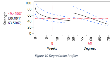
The first profiler is the Degradation Profiler. Its first frame shows the estimation of the entire degradation path, given the temperature 60, specified in the second frame. The median and 95% lower and upper percentiles of the distribution for the degradation measurement are represented by the solid curve and dashed curves in the graph. In Figure 10, the readings on the vertical axis tells the median and 95% percentiles of the distribution of the degradation measurement at the 8th week, under a constant 60 degrees environment.
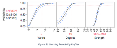
The second profiler is the Crossing Probability Profiler. Its third frame draws a cumulative density function (CDF). That depicts the estimation of the degradation measurement distribution under the given condition, at the given time. In Figure 11, the time is 8 weeks, the condition is 60 degrees. The reading on the vertical axis tells that there will be about 91% of measurements will fall under 58.5. And the interval is the confidence interval for that estimate.
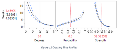
The third profiler is the Crossing Time Profiler. Although the profiler presents three curves, we only interpret the reading on the vertical axis as the estimation and confidence interval of the time that a certain percentage of measurements, under given condition, will fall under a given threshold. In Figure 12, the percentage is 50%, the temperature condition is 60 degrees, and the threshold is around 58.5.
Variable Costs by Group in Reliability Forecast Platform
Variable costs by group in Reliability Forecasting, by its name, is useful in forecasting monetary amount associated with failures. In another word, different types of failures may have different severities of consequences, and different severities cost different amount of money. The task of monetary forecasting cares not only the amount due to specific type of failures, but also the total amount from all types of failures. And some quantities on the total amount is not the sum of those quantities on individual amount. We make a hypothetical example in the next paragraph.
Suppose we are forecasting the total cost of repairing two models of laptops that are still under the warranty. To simplify the discussion, we assume all laptops are sold one year ago, and there are still n1 and n2 of each type are still under a two year warranty. The average repair costs of two types are different. Suppose the costs are m1 and m2 respectively. The returned quantities in the next year will be N1 and N2. We use upper case letters to represent random variables, because the returned quantities in the next year will not be fixed numbers. Computing the expected values of N1 and N2 are easy. And the expected value of the sum equals the sum of the expected values, which is easy. However, the variations of those random variables and the sum of those random variables are very important as well.
In computing the variation of the sum of several random variables, the additive rule usually does not work. For example, the variance of the sum of several random variables does not equal the sum of the variances of individual random variables, i.e. 
Use the Feature
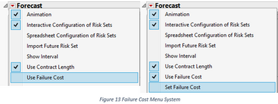
By default, the platform assumes that forecasting the quantities of failures is the task of the analysis. In order to switch the task to forecasting the costs, one should check the menu item “Use Failure Cost” under the “Forecast” outline node menu; see the first screenshot in Figure 13. After it is checked, the platform will ask for values of the costs of all groups. One should enter reasonable values then click Ok button to confirm. The menu system will append a new menu item “Set Failure Cost” to allow making changes; see the second screenshot in Figure 13.
After applying the costs, the graph will allow one to configure future productions for each group, their own contract lengths, and their own appropriate failure distributions. The results will include forecasted costs of individual groups and the total. If “Show Interval” option is checked, the lower and upper limits of the forecasting will appear as the shaded areas.
Component Integrated Importance in Reliability Block Diagram
Component Integrated Importance (CII) is a new criterion, which can be used to assess the importance of a component in a system. It is easier to understand CII by comparing what we already have in the previous release, which is Birnbaum’s Component Importance (BCI). In plain language, BCI of a particular component Ci is the probability to fail the entire system by failing Ci. Based on BCI, engineers usually consider increasing the reliabilities of the components associated with larger BCI values.
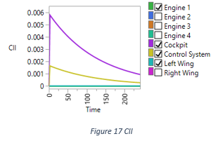
CII is not a probability in our implementation, it is related to hazard rate. It has different forms in different contexts. The original form in Si et. al. (2012) considers a multiple-state system with discrete risk transition rates. In our Reliability Block Diagram, we only consider two states: failure and survival. And our risk transition rate is continuous, which is represented by the hazard function. After identifying equivalent elements in their formulation, our implementation of CII of component Ci is a multiplication of the BCI and the hazard function of component Ci.
An Example
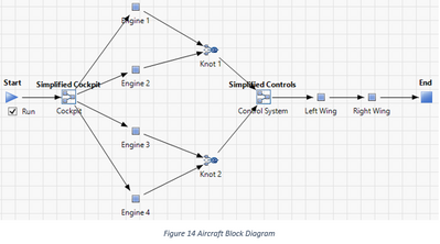
We use an example to illustrate the difference between BCI and CII. Figure 14 depicts a block diagram design for an aircraft. The diagram has been simplified. Overall, the diagram is a series system, which includes a cockpit, four engines in a block, a control system, and two wings in separate blocks. If any block fails, the aircraft crashes. For the four engines as a sub-diagram, they are basically in parallel. We configure two engines on each wing, and as long as at least one engine functions on each wing, we consider the aircraft should be able to get enough throttle from engines.
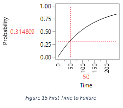
The distribution of the first time to failure is shown in Figure 15. And we are interested in the system performance between time zero and time 200.
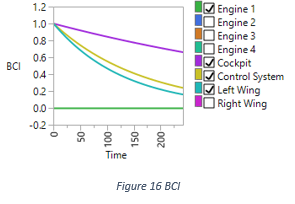
To see the BCI overlay, one should follow the instruction in the documentation and check the “Show BCI” menu item associated with the diagram. Figure 16 draws the BCI overlay graph of this diagram, over time range between zero and 200. The graph hides duplicated elements, such as three engines and one wing. In the graph, we can see the order of importance from high to low is: Cockpit, Control System, Wing, and Engine. The importance of Control System and Wing are close to each other.
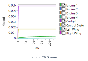
To see the CII overlay, the corresponding menu item is “Show Component Integrated Importance”, the second down “Show BCI”. Figure 17 draws the CII overlay graph of this diagram, in which the importance of Wing is close to Engine instead, which are at the bottom of the graph. The reason is not obvious until we look at the hazard function of each component; see Figure 18. We can see Wing has the smallest failure rate all the time on this aircraft.
The CII is provided as a supplement rather than an alternative to making decision in the system reliability engineering. One may soon notice that CII does not have a conditional counterpart, as we provide a Conditional BCI along the side of BCI. First we should look at why we provide Conditional BCI, which probably does not exist in other software. Our BCI is often called Time Dependent BCI in the industry, which draws the importance indices of the all components as a function of time from zero to anytime in the future. The perspective of the graph is at the time point zero, when the system has not been used at all. The Conditional BCI provides a dynamic forward perspective, which the time point can be any time after zero. The computation of a conditional BCI is by simply replacing the reliability by the conditional reliability, given the survival time as an extra argument. On the other hand, we do not provide a conditional version of CII. One reason is that hazard function has already included survival time in its concept. We do not understand what it means if we introduce the survival time into other parts in calculating CII.
References
Luis Escobar and William Q. Meeker, Accelerated Destructive Degradation Tests: Data, Models, and Anaysis., Unpublished manual script.
Shubin Si, Hongyan Dui, Xibin Zhao, Shenggui Zhang, and Shudong Sun, 2012, Integrated Importance Measure of Component States Based on Loss of System Performance, IEEE Transactions on Reliability, Vol. 61, No. 1.


