- JMP User Community
- :
- Learn JMP
- :
- On-Demand Courses
- :
- Statistical Thinking for Industrial Problem Solving
- :
- Fitting a Simple Logistic Regression
Fitting a Simple Logistic Regression
- Article History
- Subscribe to RSS Feed
- Mark as New
- Mark as Read
- Bookmark
- Subscribe
- Printer Friendly Page
- Report Inappropriate Content
- Setting up the analysis
- Setting the value ordering column property
- Interpreting the analysis
- The logistic curve graph
- The parameter estimates table
- Saving the predicted values
- Fit details and themisclassification rate
Learn more in our free online course:
Statistical Thinking for Industrial Problem Solving
Setting up the analysis
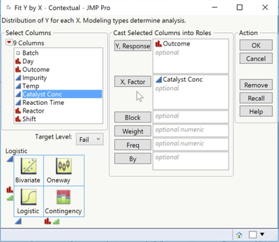
In this example, we use the Impurity Logistic data to fit a logistic regression model for Outcome and Catalyst Conc using Fit Y by X.
Analyze > Fit Y by X
Outcome as Y, Response and Catalyst Conc as X, Factor.
The analysis key, in the bottom left corner, tells us that JMP will conduct a logistic regression analysis. We also see that the target level, which is the outcome we are interested in modeling, is Fail.
Setting the value ordering column property
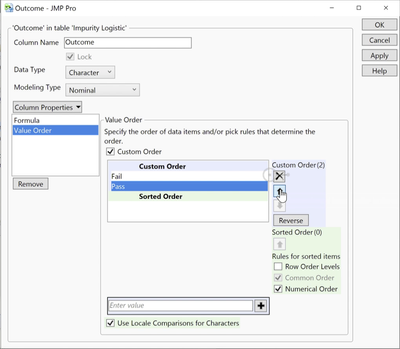
By default, JMP models the probability of the outcome that comes first alphanumerically. If desired, we can change the target category using this field. In this example, we'll model the probability of Fail.
Value Ordering Column Property
Notice that we can also change the value that is modeled in all analyses by setting the Value Ordering column property. To do this, we right-click on the column name in the data table, select Column Properties, and then select Value Ordering.
Fail is already first in the list, so we'll simply cancel, return to the analysis dialog, and click OK to run the analysis.
Interpreting the analysis
The logistic curve graph
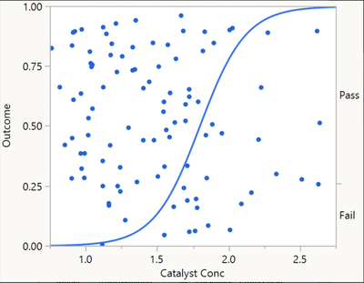
The default graph is the logistic curve. From the curve, we can see that as the value of Catalyst Conc increases, the probability of Fail also increases.
From the steepness of the curve, we can see that the relationship is fairly strong. The data points are plotted at the value of Catalyst Conc (on the X axis), and appear either above or below the curve based on Outcome. Batches that failed to meet the Impurity specification are plotted below the curve and are randomly scattered relative to the Y axis.
The parameter estimates table

Saving the predicted values
We can use this model to predict the outcome for different values of Catalyst Conc. When we select Save Probability Formula from the top red triangle, JMP adds four new columns to the data table.
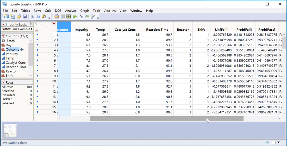
Lin[Fail] is the logit, that is, the logistic model. When we look at the formula, we see the intercept and slope coefficients that are reported in the Parameter Estimates table. The next two columns, Prob[Fail] and Prob[Pass], are predicted probabilities that are calculated from the logit. In the first row, we see that Prob[Fail], based on a Catalyst Conc of 1.5, is 0.11. The fourth column, Most Likely Outcome, classifies Outcome as Fail or Pass, based on the outcome with the highest predicted probability. In the first row, Prob[Pass] is the highest, so Outcome is classified as Pass.
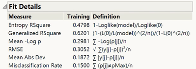
Fit details and the misclassification rate
Returning to the analysis window, we can look at the misclassification rate in the Fit Details report to see how well our model performs. For the logistic model with only Catalyst Conc, the overall misclassification rate is 15%. That is, 15% of the observations were incorrectly classified by the model. This simple logistic regression model is wrong 15% of the time. Can we do better? In the next video, we build a more complex model to see whether we can improve the overall misclassification rate.
- © 2024 JMP Statistical Discovery LLC. All Rights Reserved.
- Terms of Use
- Privacy Statement
- About JMP
- JMP Software
- JMP User Community
- Contact
