What inspired this wish list request? I was at the Greater Philadelphia Area Pharma JMP Users Group Meeting today and learned about the existence of the wish list from the JMP staff. I had requested this to a JMP representative at a different event a few years ago who told me to call JMP Tech support to make the request, but I never did.
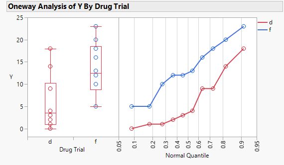
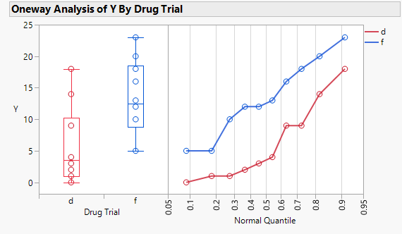
I have "Box Plots" and "Plot Actual by Quantile" on by default due to my Platform Preferences for Fit Y by X with a continuous Y and nominal X. (This side-by-side plot is my favorite graph in JMP.) The red default is confusing because it does not match the legend color. So, I usually change it by right clicking, selecting Customize...Customize Graph... then repeating Box Plot, Box Plot Line Color, and changing the color for each level of X.
Default red boxes misaligned with the legend

Color scheme aligned with the legend that comes with the Q-Q plot.

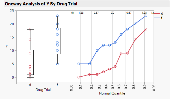
To make things worse there is a bug in JMP that I have not reported before, which I will report separately to JMP Technical Support. After I change all the boxes to black and save the graph to a script Window or a script in the data table my color customization does not stick. So, I have to redo my customization every time I make the graph. I am using v17.0 now, but I think this has happened as long as I can remember (>15 years). Today is the first day I figured out that changing the color to anything but black sticks in the script because I generally use black. (I know I could add the command lines to the script manually and resave it.)
All black boxes (not saved properly in a script):

What is the improvement you would like to see?
In Fit Y by X...Oneway, Box Plot, the box color should have an option to be other than red in the Platform Preferences. One choice could be black. Another could be the same color scheme used by "Plot Actual by Quantile".
Why is this idea important? Red is confusing for side-by-side box plots when the legend for the normal quantile plot has red to indicated the group with the first level of X. Red is confusing when the dot plots under the box plots have different colored symbols, and one of them is red. Black would work because other elements of the graph are in black.
The same color scheme used by "Plot Actual by Quantile" would work, especially when the Q-Q plot is part of the same graph to the right of the box plots and using the same Y-axis as the box plots.