- New to JMP? Let the Data Analysis Director guide you through selecting an analysis task, an analysis goal, and a data type. Available now in the JMP Marketplace!
- See how to install JMP Marketplace extensions to customize and enhance JMP.
- Subscribe to RSS Feed
- Mark Topic as New
- Mark Topic as Read
- Float this Topic for Current User
- Bookmark
- Subscribe
- Mute
- Printer Friendly Page
Discussions
Solve problems, and share tips and tricks with other JMP users.- JMP User Community
- :
- Discussions
- :
- Re: Customizing space between bars in graph builder/aligning data points to bar ...
- Mark as New
- Bookmark
- Subscribe
- Mute
- Subscribe to RSS Feed
- Get Direct Link
- Report Inappropriate Content
Customizing space between bars in graph builder/aligning data points to bar graph?
Hello,
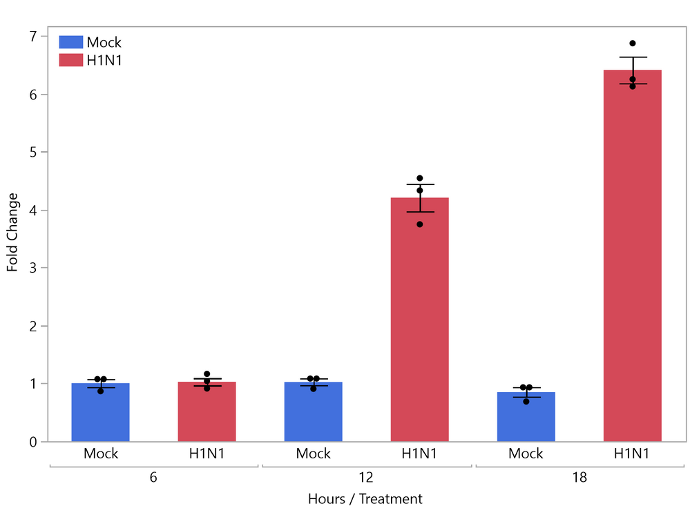
I am trying to make a bar graph in JMP Pro and having an issue customizing my graphs. For example, for the graph below, I would like to adjust the spacing to make my two treatments (Mock/H1N1) closer together, while keeping the spacing the same between the hours variable.
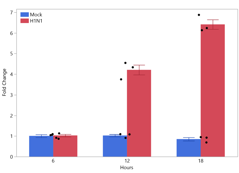
I'm able to achieve this when I overlay my treatment variable (see graph below), but then when I try to add the individual data points to my bar graph, they do not align with the bars.
Is anyone able to help me figure this out? I would like to either adjust the spacing in the first graph, or know how to align the data points with the bars in the second graph. Thank you!
- Tags:
- windows
Accepted Solutions
- Mark as New
- Bookmark
- Subscribe
- Mute
- Subscribe to RSS Feed
- Get Direct Link
- Report Inappropriate Content
Re: Customizing space between bars in graph builder/aligning data points to bar graph?
- Mark as New
- Bookmark
- Subscribe
- Mute
- Subscribe to RSS Feed
- Get Direct Link
- Report Inappropriate Content
Re: Customizing space between bars in graph builder/aligning data points to bar graph?
Welcome to the Community.
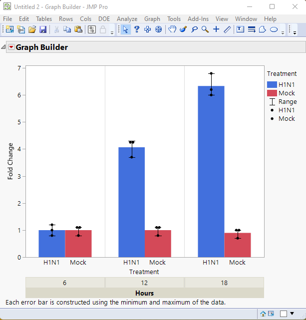
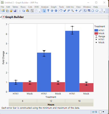
Here are the results I was able to produce
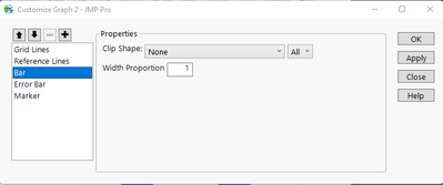
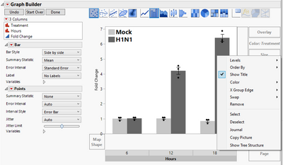
The first notable change, is that I specified Hours as an X axis group. The grouping display has also been moved to the bottom of the chart. By grouping, the different charts in the groups will be treated as separate charts. So what I then did, wans to right click on the graph, and select Customize. In the Customize window, I selected Bar, and set the Width Proportion to 1
I did this for each grouping. This resulted in the below graph
I then went into the X axis settings and changed the range of the X axis from -.5 <> 1.5, to -1 <> 2
which resulted in the final chart,
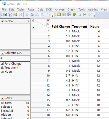
Here is the data table I used(it is also attached)
And the script that JMP produced that will recreate the chart
Graph Builder(
	Size( 518, 490 ),
	Show Control Panel( 0 ),
	X Group Edge( "Bottom" ),
	Variables(
		X( :Treatment ),
		Y( :Fold Change ),
		Group X( :Hours ),
		Color( :Treatment )
	),
	Elements(
		Bar( X, Y, Legend( 6 ), Error Interval( "Range" ) ),
		Points( X, Y, Legend( 7 ) )
	),
	SendToReport(
		Dispatch(
			{},
			"Treatment",
			ScaleBox,
			{Min( -0.5 ), Max( 1.5 ), Inc( 1 ), Minor Ticks( 0 )}
		),
		Dispatch(
			{},
			"400",
			ScaleBox,
			{Legend Model(
				7,
				Properties( 0, {Line Color( 0 )}, Item ID( "H1N1", 1 ) ),
				Properties( 1, {Line Color( 0 )}, Item ID( "Mock", 1 ) )
			)}
		),
		Dispatch( {}, "graph title", TextEditBox, {Set Text( "" )} ),
		Dispatch(
			{},
			"Graph Builder",
			FrameBox,
			{DispatchSeg( BarSeg( 1 ), {Set Width Proportion( 1 )} )}
		),
		Dispatch(
			{},
			"Graph Builder",
			FrameBox( 2 ),
			{DispatchSeg( BarSeg( 1 ), {Set Width Proportion( 1 )} )}
		),
		Dispatch(
			{},
			"Graph Builder",
			FrameBox( 3 ),
			{DispatchSeg( BarSeg( 1 ), {Set Width Proportion( 1 )} )}
		)
	)
);
- Mark as New
- Bookmark
- Subscribe
- Mute
- Subscribe to RSS Feed
- Get Direct Link
- Report Inappropriate Content
Re: Customizing space between bars in graph builder/aligning data points to bar graph?
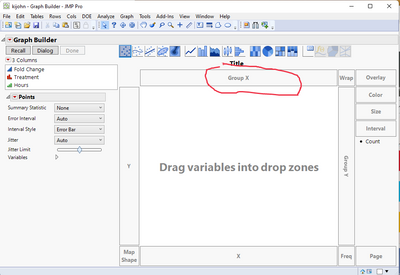
Hello, Thank you for your very quick response! I'm a little new to JMP, so where do you go to specify hours as an x-axis group? I think once I do that I will be able to replicate the rest as you've shown.
- Mark as New
- Bookmark
- Subscribe
- Mute
- Subscribe to RSS Feed
- Get Direct Link
- Report Inappropriate Content
Re: Customizing space between bars in graph builder/aligning data points to bar graph?
I strongly suggest that you take the time to read the section on Graph Builder in the Essential Graphing document found in the JMP Documentation Library, available under the Help pull down menu
- Mark as New
- Bookmark
- Subscribe
- Mute
- Subscribe to RSS Feed
- Get Direct Link
- Report Inappropriate Content
Re: Customizing space between bars in graph builder/aligning data points to bar graph?
I see, thank you! I was able to replicate the graph that you made. Is there any way to remove the lines between the x-axis groups? Thank you again for your help!
- Mark as New
- Bookmark
- Subscribe
- Mute
- Subscribe to RSS Feed
- Get Direct Link
- Report Inappropriate Content
Re: Customizing space between bars in graph builder/aligning data points to bar graph?
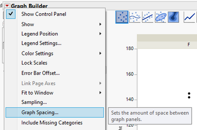
Try setting Graph Spacing to from red triangle menu
- Mark as New
- Bookmark
- Subscribe
- Mute
- Subscribe to RSS Feed
- Get Direct Link
- Report Inappropriate Content
Re: Customizing space between bars in graph builder/aligning data points to bar graph?
Great, got it! Thank you both for your help!
- Mark as New
- Bookmark
- Subscribe
- Mute
- Subscribe to RSS Feed
- Get Direct Link
- Report Inappropriate Content
Re: Customizing space between bars in graph builder/aligning data points to bar graph?
Sorry, I'm realizing there is another issue I'm having trouble editing now that I have made the x-axis groupings. I would like to edit the x-axis group labels (font/size, etc) as well as remove the border around this group label if possible, however there does not appear to be an option for this that I can find. I have also tried to look into the Essential Graphing document but have not found an answer to this. Is there a way to edit these group labels?
- Mark as New
- Bookmark
- Subscribe
- Mute
- Subscribe to RSS Feed
- Get Direct Link
- Report Inappropriate Content
Re: Customizing space between bars in graph builder/aligning data points to bar graph?
The font and size for the Group display is controlled by a global preference
File=>Preferences=>Fonts
I am not aware of anyway to delete the border of the Group.
Recommended Articles
- © 2026 JMP Statistical Discovery LLC. All Rights Reserved.
- Terms of Use
- Privacy Statement
- Contact Us
