- JMP User Community
- :
- Blogs
- :
- Scott Wise
- :
- Soy What? Where is the Wheat? (Advanced Graph Exploration of US Agricultural Tre...
- Subscribe to RSS Feed
- Mark as New
- Mark as Read
- Bookmark
- Subscribe
- Printer Friendly Page
- Report Inappropriate Content
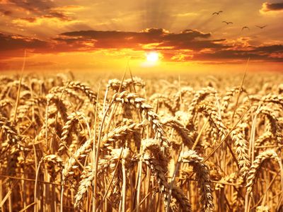
Source: #39015 @ www.pexels.com
Growing up in the US Midwest (Southern Ohio), I mainly remember seeing two types of crops in fields, wheat and corn. Wheat and related grain production are well represented in our national psyche in providing us the flour for our daily bread and helping to build our country into an agricultural power. So much so it even features prominently in our national anthem “America the Beautiful” with the lyrics “o beautiful for spacious skies; for amber waves of grain.” The next crop we tend to think of is corn as it is easily recognizable in its tall growing stalks. The uses of corn are almost impossible to avoid from livestock feed, to our food (cooking oil, canned corn & corn tortillas), to our snacks (popcorn and kettle corn), to even our gasoline (ethanol). So why with the current trade war between the United States and China is there so much talk about another farming crop, soybeans, impacting the livelihood of our farmers? While we don’t have enough information yet to understand the effects of commodity price changes due to tariffs, we can look at past data to understand how soybeans has become such a large player in our agricultural productions and what happened to wheat.
According to a CNN Business article in April of 2018, “Soybeans are America’s leading agricultural export” worth “$21.6 billion in sales last year” with over “60% of the beans going to China.” Further reading tells us that while soybeans can be used in a diverse range of products (cooking oil, tofu, milk and biodiesel), it is the high protein content in soy beans that Chinese farmers “use as a protein source in animal feed.” With a government directive to take steps to add more protein to Chinese diets, a huge demand for soybean exports has been created that major agricultural producing countries such as Brazil and The United States have been quick to fill. This explains why soybean has become one of the targeted US exports in danger of becoming less competitive due to Chinese retaliatory tariffs that raise export costs (https://money.cnn.com/2018/04/05/news/economy/soybeans-china-trade-us/index.html).
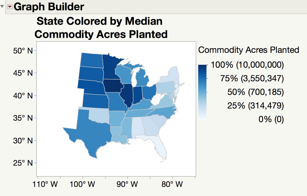
While the full tariff war effects on this and other commodity exports are still slowly playing out in the international market, it raised our curiosity to understand just how our agricultural industry has changed over time to a point that we are so reliant on soybean exports. First, we found “2000 to 2017 commodity acres planted by states with corn, wheat, and soybean production” data on the excellent USDA agricultural statistics public database (https://www.nass.usda.gov/Quick_Stats/Lite/index.php). After some data summarization to isolate down to just the states which farm all of our study commodities (corn, wheat, soybeans), we checked out a geographic map to see who is leading in terms of total acres planted. It is clear to see that the states in the Central & Midwest of the US (often described as the “Corn Belt”) are the ones that have the highest median acres planted.
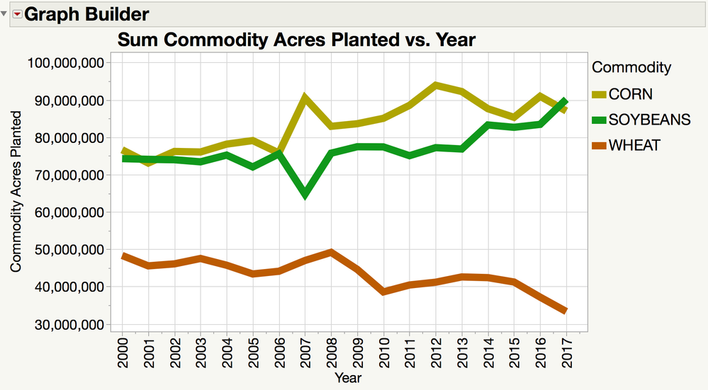
Next, we want to visually see the trend by the sum of commodity acres planted for corn, wheat and soybean over time. While it can be seen that soybeans and corn seem to be increasing over time, wheat seems to be in a steady decline. While wheat is still a vitally important food crop for any nation, there are some trends that help explain this decline in acreage planted.
Research shows that farmers follow helpful crop rotation strategies on what to plant this year in order to best prepare the soil for future plantings. An article from the appropriately named “Corn and Soybean Digest” explains that "research shows the most profitable rotation in the Corn Belt is the corn-soybean rotation and the nitrogen provided by soybean for growing corn is a major reason for this profitability." (https://www.cornandsoybeandigest.com/corn-soybean-rotation-still-makes-sense). The science behind the practice of crop rotations comes from the fact that legume (bean) crops such as soybeans actually break down nitrogen and returns it to the soil (often referred to as a nitrogen credit), which makes it better for crops that don’t return nitrogen back into the soil, such as grass (row) crops. This means if you want to plant next season a grass (row) crop such as corn or wheat, you will not need to purchase and deploy as much large quantities of nitrogen rich fertilizer. Also, the increasing use of corn and soybeans in “green energy” fuel production (ethanol and biodiesel respectively) have additionally helped increase the profit of these commodities over wheat.
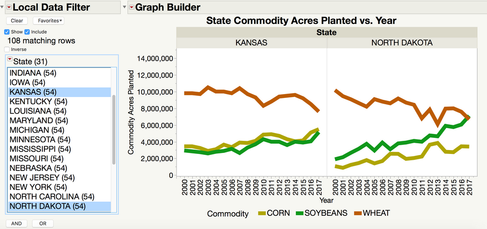
To best visualize this, it would be nice to be able to break these commodity trends down by state. For example, looking at historically strong wheat producing states such as Kansas and North Dakota, we can start to see this impact of the declining popularity of planting wheat. However, if we want to look at all the states in the Rust Belt, this would require viewing over twelve separate state graphs, which makes side-by-side comparisons difficult.
However, there is an advance view that we can use to show everything we want to see (a combination of the geographic map and the trend chart views) into just one graph. We first take each states commodity trend line chart data from above and then reuse them as inserts (markers) into a single geographic map. This “graph within a map” not only makes for easy state to state commodity trend comparisons, but also allows us to bring in other variables such as total acreage plotted by state. We are used to seeing these types of charts in the past with sized circles as the marker (like in bubble plots on geographic maps), but in reality, any type of graph (such as line or even bar charts) can be used as markers. Our finished graph below gives us the ability to compare all the Rust Belt states in one graph and even see the focus on these impacts in the largest farming states. Note that the trend chart markers have the same Y and X Axis scales.
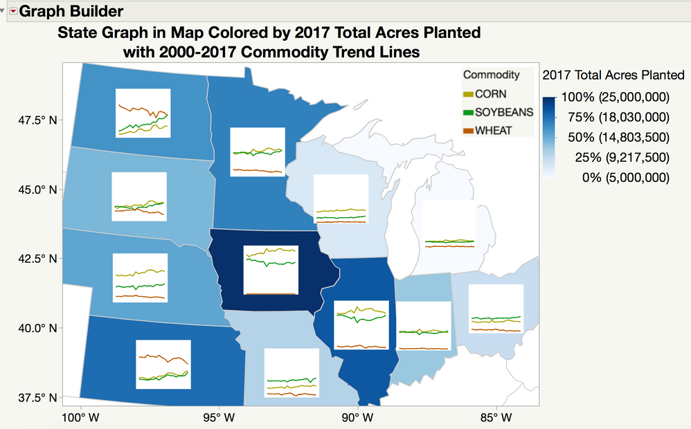
Corn and soybean have for most states the highest levels/upward trends and seem to correlate with each other thereby showing us that they are most likely being used together in many crop rotation strategies. Trends in the largest wheat producing states seems to be either declining or flat. While the overall trend for traditional wheat farming does not look promising, there is a movement that could help reverse this pattern. The growing local and farm-to-table food movement is creating increasing demand for “heritage and ancient grains” as captured in this recent Cornell University study as featured on Science Daily (https://www.sciencedaily.com/releases/2017/07/170720103129.htm). The higher price that can be achieved by selling these specialty grains to restaurants, bakeries and even craft breweries can increase the desire to bring this type of commodity back into farming crop rotations. And with the export future of soybeans currently under threat, changes may be soon on the horizon. So next time you are going for a drive in the countryside, give a longer look to what is growing in your area farm fields. As Woody Guthrie reminds us in his epic patriotic protest song “This Land is Your Land”
“When the sun comes shining, then I was strolling,
In wheat fields waving and dust clouds rolling,
The voice come chanting as the fog was lifting,
This land was made for you and me.”
To try this out for yourself, please see the following link for access to the full blog data and table/graph scripts:
https://community.jmp.com/t5/JMP-Sample-Data/Graph-in-Map-Trend-Lines-in-Geographic-Map/ta-p/80106
(Note this requires JMP 14)
You must be a registered user to add a comment. If you've already registered, sign in. Otherwise, register and sign in.
- © 2024 JMP Statistical Discovery LLC. All Rights Reserved.
- Terms of Use
- Privacy Statement
- About JMP
- JMP Software
- JMP User Community
- Contact

