- JMP User Community
- :
- Discussions
- :
- How to create a fold change heat map?
- Subscribe to RSS Feed
- Mark Topic as New
- Mark Topic as Read
- Float this Topic for Current User
- Bookmark
- Subscribe
- Printer Friendly Page
- Mark as New
- Bookmark
- Subscribe
- Mute
- Subscribe to RSS Feed
- Get Direct Link
- Report Inappropriate Content
How to create a fold change heat map?
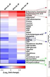
I'm having some difficulty figuring out how to create a fold change heat map in JMP pro. I have five samples, with various concentrations of almost 300 compounds. I would like to visualize the data via a heat map like the example below, with each sample above, each compound ID on the side, and the continuous color scale determined via the fold change. The heat map function in Graph Builder doesn't seem to take multiple compounds at once, and the cell plot only does the values. Is this type of graph called something else in JMP? Or is there something wrong with my set up?
- Mark as New
- Bookmark
- Subscribe
- Mute
- Subscribe to RSS Feed
- Get Direct Link
- Report Inappropriate Content
Re: How to create a fold change heat map?
Try using a Cell Plot
Graph=>Cell Plot
Each column in the graph is a column from the data table, and the labeling also comes from a separate column
- Mark as New
- Bookmark
- Subscribe
- Mute
- Subscribe to RSS Feed
- Get Direct Link
- Report Inappropriate Content
Re: How to create a fold change heat map?
From my understanding cell plot does the color scale based on count. Is there a way to specify fold change instead?
- Mark as New
- Bookmark
- Subscribe
- Mute
- Subscribe to RSS Feed
- Get Direct Link
- Report Inappropriate Content
Re: How to create a fold change heat map?
The cell plot uses whatever value is in the cell for the specified column. So if the cell value has the fold change value, that is what will be used in the graph.
- Mark as New
- Bookmark
- Subscribe
- Mute
- Subscribe to RSS Feed
- Get Direct Link
- Report Inappropriate Content
Re: How to create a fold change heat map?
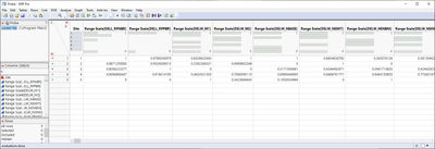
I'm not sure how your data is formatted so I assume your data has few rows and lots of columns. Something like below
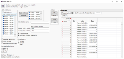
You can stack your data
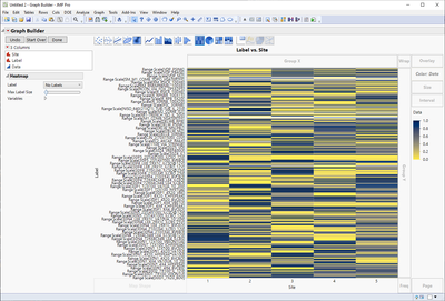
And then you can plot it
- © 2024 JMP Statistical Discovery LLC. All Rights Reserved.
- Terms of Use
- Privacy Statement
- About JMP
- JMP Software
- JMP User Community
- Contact


