

Pictures from the Gallery 9: Innovative Graph Builder Views
A picture is said to be worth a thousand words, and the visuals that can be created in JMP Graph Builder can be considered fine works of art in their ability to convey compelling information to the viewer. This journal presentation features how to build popular and captivating graph views using Graph Builder. Based on the popular Pictures from the Gallery journals, the Gallery 9 presentation highlights new views and tricks available in the latest versions of JMP. It features several popular industry graph formats that you may not have known can be easily built within JMP. Views such as swimmer lanes, donuts charts, Delaunay triangulation, advanced overlay plots, and more are introduced to help breathe new life into your graphs and reports!
Welcome, everybody. The pictures from the Gallery 9. My name is Scott Wise, and I'm real excited to show you another batch of advanced Graph Building views. Before we start, I like to do something a little more inspirational here. I really think Graph Building can help you make connections. I was inspired by a really old history science TV program called Connections. James Burke created it and hosted it. It was brilliant. He always would show you a bunch of unrelated events and say, \!"What do these have to do with each other?\!" And show you how change is often random. When someone does something in one area, it might inspire it being used in a totally different way they never thought of. If you ever get a chance to see these, please check it out.
In honor of James Burke, I'm going to talk to you about a Graph Building Connection, and I'm going to start it the same way he did his show. What does Locating Bats in Texas have to do with triangles? Have to do with patterned into Stained Glass, and have to do with saving Landmarks like Notre Dame Cathedral? Wow! That is a lot of stuff, right? I'll show you how this all got started.
I originally was just looking at some data in where I live. I live in the central part of Texas, and one of our favorite things to do is go out and see our bat colonies fly out of their homes at dusk to be good bats and run out in the night and eat all the bad bugs that bite and pester you. We're fond of our bats, and a lot of our state parks have bat colonies in a cave or under a bridge. I was able to get that data from the Texas Department of Wildlife here. I'll turn on my little headers. I can see, I've got some locations here. Boy, it looks like I've got latitude and longitude data for the location. Not just the name. I have bat population. I even have pictures. Hopefully, you can bring pictures into a JMP data table and use those as a hover label point or a marker, which is cool. But I've got some information.
The first thing I did, I said, just show me a map. We've shown maps before in our talks. It's one of the first things you learn in basics. There's background maps you can use. This one is a US state county background map. You see, I put my latitude and longitude on the edges there. I've got my marker, my points, sized by how big the bat population is. Here's 50 million bats in San Antonio. Wow! Here's one that I live pretty close to. This is the Congress Avenue Bat Bridge in Austin, Texas, and it's over the Colorado River that runs right through downtown.
This is a really big tourist attraction. What bothered me is I live up in this little area just a little north of here, and there's a bridge over the highway that runs through my town. It's called Round Rock. The Neil Bridge has 3.5 million bats under it, but no one goes out to watch them unless you just happen to be in the area when they fly out. I was like, where else are there bat colonies within central Texas? There's actually a graph that can really help us see that. It's called a Contour Plot. I'll bring my control panel back up here and I'll show you.
Right up here, it's this density-looking icon in your icon menu. What it does is it draws, whether you fill it or you just want to see the lines, it draws these lines around, kind of projected, expected output. In this case, my output was the bat population, and I had colored by the bat population. Now, I can see it does make sense that there's red, which is a really high bat population in San Antonio. If I go further west, there's the Frio Bat Cave, that's got 12 million. Down in that area, which is about an hour and a half, two hours south of me, there are bigger bat populations than up where I live, more in the greens. That made sense. I said, \!"I want to bring more points into my graph. Maybe I can use this contour plot, instead of doing a model to help me figure out if I'm at a certain latitude, longitude within this area, what can I expect in terms of bat population?\!" I did that, and I added these other points in.
I'll now unhide, and unexclude those as well. You can see I estimated out based on their contour where they were. Now I've got more points. Now, I can see in Mason, Texas, what do I expect there to be? I expect there to be 5, 800, 000 in this site. It is just a really cool way of utilizing some points. But I got looking at this, and there's all these controls. These are your element panels down here. Sometimes you can get to them by right-clicking and going under the graph. But I generally go here for speed and completeness. It's got some stuff I can do? Well, I knew I could change the number of levels, and I knew I could control how round these things were and how jagged they were.
But here's this Alpha. Watch what happens when I put this all the way down. Now, I don't know how these are created, but it sure looks like they're creating triangles, doesn't it? Building triangles, building triangles, and somehow coming up with these contours in them. That really got me curious. What does this have to do with triangles? Well, I went out to the community and I looked up contour plots in the community. Wouldn't you know it, I found a great blog. It was done back in JMP 15 when there was a lot of additional elements added to the contour plot and Graph Builder by Dan Schikore, and Dan Schikore, along with Xan Gregg, are our visualization development gurus, experts.
He wrote this excellent, excellent blog. If I go down to the blog, right here, said something about using triangles to come up with how the contours are formed. Here he's got a little scripted graph where he drew those triangles with the contour in the background. He even put a link in here, and this is a Wikipedia page talking about the method they were using to create these contours. Delaunay, if I'm saying that correctly, triangulation, where you take points, and you draw triangles connecting those points, and you draw a circle where the circumference takes those points, and somehow out of that, they get these contour lines. We're not going to go into the statistics on that one. I think it's quite cool.
But what we will do is maybe find a way to save the triangles. The triangles are beautiful. Reminded me like network diagrams. I said, \!"I really want to save them.\!" I couldn't find a way to do it in Graph Builder. But if you go to the old contour plot GUI, it's under Graphs, again, not under Graph Builder, but this is an older one, and this produces the contour plot. You just do that by filling in the dialog. I've gone ahead and done that, and you can see it gives me the same thing I had before. But this time under the red triangle, it has some additional saves functionality, and you can save the triangulation. What does that look like? Can I use that then to create a graph? I saved it out, and here we go. It's a stacked, ordered data table with just the coordinate positions and latitude and longitude.
Now, there's everything for triangle one. I said, \!"That's cool.\!" If I go to Graph Builder, I guess I can put my latitude on the Y, my longitude on the X. I can put maybe overlay by the triangle. Let's add in some lines here and let's see if we can join these up. I know these are row order lines, so I'll click on that. Close but no cigar. Take a look at one. It looks like it's only drawing the lines for two sides of my triangle. I want to close that triangle to make it a little easier to see. I figured out that all I needed to do was modify this table a little bit.
For triangle one, I figured, well, row one and two is the first line, row two and three is the second line, but it doesn't know how to connect it back up and close the shape. To do that, I took the first row's coordinates and I put them in as a fourth row under triangle. There you go. Now, I have all four of those. Now, I can go and now I can close that triangle. Not only can I close that triangle, if I go back to my Graph Builder Control Panel, I can also fill it. This is what it would look like just without filling it.
But there's these fill lines down here. On these fill lines, you just go fill. This time I do fill below, and now I have a beautiful-looking piece of art. This reminded me of stained glass. Reminded me of putting patterns and mosaics and that type of thing. I started to stare at it and I started to see a pattern. Do you see a pattern in this? It's like the 3D puzzles. Maybe it's coming back at you. I'm seeing a pattern. I decided to remove just a couple of triangles, so you could better see the pattern.
Let's show you what that looks like. There we go. We have a beautiful bat-shaped mosaic/stained glass art. That's just beautiful to look at. Brought to you by my best guest for where bats are located in central Texas. Isn't that great? Now, here's a connection. I was sitting there like, \!"What could this be used for?\!" Obviously, we could put this in any gallery, right? That's why it's in pictures from the gallery. But would it also have better usage. I said to myself, \!"Where else could I use this?\!" Then I was reading about the reopening of the Notre Dame Cathedral.
There was an awful fire a few years ago. It burned a lot of the historic areas of the Notre Dame Cathedral in Paris, and they have rebuilt it. I remember in reading the article, they were having a lot of debate over how historically accurate they should make the reproductions because they're going to reproduce some art that got damaged or burnt, some mosaics. Notre Dame's really been built over the centuries as old as the city itself. I remember the mayor of Paris had suggested, \!"Hey, maybe up toward the top, you can put something more modern in there, like maybe a nice mosaic or plaque with all the names of the donors and the leaders of Paris.\!"
Of course, I'm sure he wanted his name on there, maybe re-elect mayor Pierre, something like that. But on this one, it didn't go over very good. I think they kept things historically accurate, no matter what time period the art was introduced into the Notre Dame Cathedral. But if they're open to it, I said, \!"You know what? I can give you my bat stained glass art, and it serves two purposes, and maybe it could protect it.\!" Because here you got your bat stained art and there, if you shine a light through it, what do you get?
Man, you're going to get the bat signal. Batman can now come and save Notre Dame in the city of Paris from any danger you might have. Just having a little fun with this. But hey, if you think you could convince the leader of your city's big landmark to put in, to buy our bat-inspired stained glass art that doubles as the bat signal, let me know. I'll be glad to come to your city and do that. Hopefully you're not laughing too hard at this point. But we did learn two tips in doing this, and then hopefully you got a little inspiration.
One tip that I think we've learned is, hey, contour plots are really useful. They are in Graph Builder, and they are underutilized, in my opinion. Also with lines, you can do fills. This is not the last time we'll talk about filling in lines, but that's also a very good visual tool to use. Thank you for joining us. Let's clear the stage and get the true star. The true star are the pictures from the gallery and here's our version for this year, version 9.
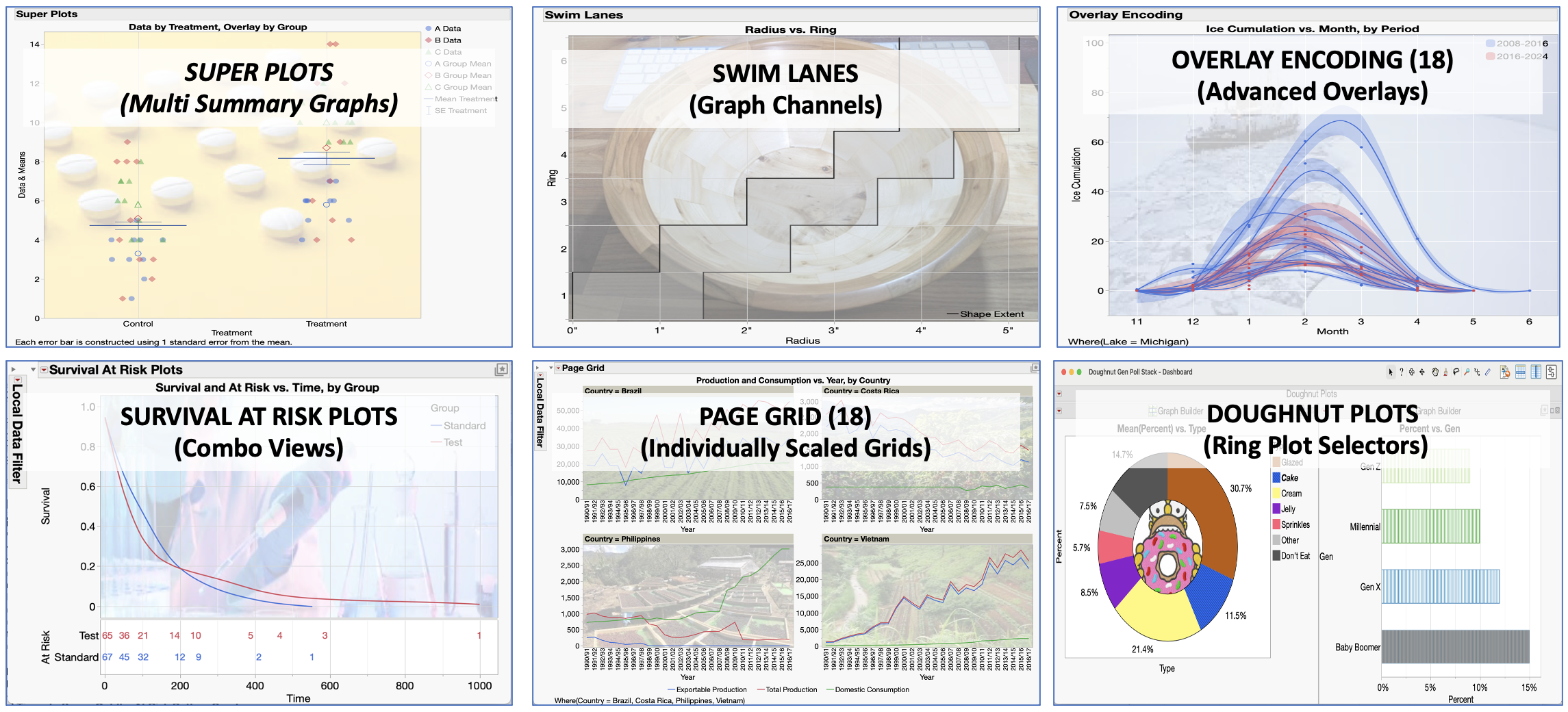
We have super plots, swim lanes, survival at-risk plots, donut plots, and two that are now available in JMP 18. I'm showing you JMP 18. That is overlay encoding and page grid. I'm going to feature these charts as time allows. Let's take the first one. Now, I want to point out that my gift to you, I'm going to give you… Like I do every version, I'm going to give you this journal. When you go look at the abstract, you'll be able to download this journal. In this journal, you will have the pictures. You will have my talking points. You will have, more importantly, all the steps to make the graph.
You will have a link to which has the embedded data with the ability to reproduce it by clicking on a script. You can practice this yourself. You can get these same views yourself. Let's talk just a little bit about this view. Super plot, this is a popular chart that is starting to show up in the biotech research field. What it is, it's really an overlay chart. It allows you to put raw data. Then you could put the information about group data statistics on top of that and maybe another layer over a group statistics.
You can get group means, and group, group means. It does it in a pretty easy way to view, and that's why they call it the super plot, a lot of information on one chart. How can we create this? I'm going to follow my steps. Here, you can see my data set-up. I have two treatments, I can control, maybe where the real treatment happened. I have over three groups. I have the real data. Then we have a formula column where all I did was ask for the column mean of data by treatment by group.
All that is ready for us to use. I'll click on the Graph Builder, and let's build it together. I'm going to take both sets of data together in the Y-axis, I'm going to put the group down into a treatment first. Let's put treatment onto the X, and let's put group in the overlay. A little confusing. I'm not so clean right now, but that's okay. We'll clean it up. I do need to right-click in here and add a second points element. Now I have points on top of points. Little confusing until I start to make some selections.
What I'm going to do right now, this first points, I want this to be the raw data. For this first points, all I have to do is open up this variable selection and remove the means. Now this first set of points is just showing my raw data dispersion across treatment, which is cool. I will close that one. The next one up here, this is one I want to do a little different. Instead of doing it by the data, I want to do it by the means group. Now, I've got many points all showing the mean.
I can put that jitter label all the way down in this area. I can also change the summary statistic just to be the mean. Now, I've got it here. Now, it's a little hard for me to see. I can right-click right into the graph, I'm going to do this. I'm just going to go to Graph, and I'm going to do Marker Size. If you want to change the marker size of all the points on the graph, you can do it this way and make it really big. Now, what can I do to clean up this view?
This is a good time to go under the red hotspot, the red triangle, I call it the hotspot, and right on the Graph Builder menu and pull up your Legend settings. Let's add back that second set of points. Now, let's work with not just colors, which we can't change the colors, but let's work with the markers. Maybe I can change the markers to make this cleaner. Here under A, I can go under Marker. Instead of a little solid dot, let's make it a triangle. Under the other A, I'll make that one an open triangle. That's the mean of the groups, and that one's going to be the raw data.
For B, let's not do points again. Let's do a marker of a closed triangle. For the B on the second set of points, let's do an open triangle, and so on, and so forth. We'll do diamonds here. We'll do a solid diamond for C, for the first point, and for the second point, we will do a closed diamond. There we go. Marker Size, closed diamond. There we go. That's looking a little better.
I know on the first set of points, you can also spread out how far those are looking, and I might spread them out just a little bit more. I think one thing that could help me, I could right-click here into the X-axis, go to Axis settings, and I can add a darker line here right under Control and Treatment. You can see where the group mean of A is under treatment and control. That's that hollow circle. You can see where it is under B, and then you can see where the rest of the points fall. That's nice alone. But can we beat this? Yeah, we can.
We can actually bring in another level of information. I'm going to add Bars, and this is going to add a bar chart. Now, that's not a very helpful bar. I would love to see the mean of the treatments irrespective of group. To do that one, I'm going to change the style to a float. I might turn on some error intervals, look at my standard error around that. Now, you see it's got broke out by group. Obviously, in variables, I need to do some things here. I can take out the data, I can take out the overlay group, and now I've got a pretty nice-looking chart. I'm going to say Done. Now I've got really three levels of information on the same chart. Pretty easy to see.
As well, and I'll show you this probably once because I do this a lot, you can bring in pictures as backgrounds, and I do this every time I do pictures from the gallery. I've got this image as a background. Now it's an image you can right-click, you can say, Image. Let's size and scale with the fill the graph. Oh, that's drowning out my data, so let's make it transparent. Maybe make it 0.3 or something. Now, that's a nice background picture. Of course, you can change your titles, you can change what your legend settings mean, the position of the legend settings. But that's the whole idea. You have that available to you. That is the super plot. All right. Very cool.
Well, let's move on to the next chart. The next one is Swim Lanes, and I owe a big thanks to my good friend, Jed Campbell. Jed is very talented. He's extremely talented statistician and JMP guru and custom scripter, but he's also a good woodworker. He's got all these talents, and he was making this beautiful... That is a bowl that Jed made. He featured this in a blog, and I put the link to that blog, so you can visit. He actually created a wood turning segment calculator in JMP to help him make it, and he created this view with swim lanes. Swim lanes are like what you think. If you're in a swimming pool, you've got your own lane to swim in. You can go and swim down that lane and no one else is going to swim in your way.
This is creating those type of swim lanes in your graph. This really helped them for a ring position as it gave them these inner and outer radius dimensions. What we can do here is go pull up this data. Ring is a ordinal data set. It could have been categorical, but you need something ordinal or nominal to make that work. Then he's got these inner and outer dimensions. Those are continuous. Let's go ahead into the Graph Builder.
Let's put that inner and outer diameter on the X-axis. Let's put Ring into the Y-axis. Okay, so far, so good. He got points. I think he would also like to have lines. And not just lines, he wanted to have a step line. The connection type here will change from line to the centered step. Oh, that's nice. It looks like that's doing well within the swim lane, so you can fill it. This would be a fill between this time. It looks like the graphics doing what I wanted to do. I'll just make this stuff a little darker on our screen. But take a look at when I start to add grid lines. It's not the fault of the X-axis. That one looks pretty good.
But if I go right now under the Y-axis and I go to my axes settings and I try to add the grid line, look what it's going to do. You can see it in the preview alone. It is going to put a line right by the number of the ring. That's not what I want. That's not the swim lanes. The ropes are not where I want them to be in my pool. To do that, if I just go back to Axis settings, Jed showed me, you know what? If you click right here where it says Show Tick Labels, instead of just doing marks, you can do dividers. Here's short divider. Take a look at that. That makes the swim lanes. You say, Okay, and now we have the right view.
Now, you can bring in the picture of his beautiful bowl, but this was actually what he needed to help him make that bowl and have the right swim lanes to make it easy to view. All right, so Swim Lanes. Thank you, Jed, for that contribution. Please do see his blog.
Overlay Encoding. It's really funny. I was learning of new things you could do in JMP 18. There were times before JMP 18, like in 17 and the previous versions, that you would do too much stuff. You would add too many elements on your graph. In the overlay element, if you use that element, it would take over the colors or the style of what's being presented. They fixed that in 18, and I found the perfect data to help us see that. It's going to show off what we can do with overlay encoding.
This is ice accumulation on the Great Lakes between Canada and the US. This is one of the things they're looking at that's helping them measure the impact of climate change in the warming planet. Is there less ice over the winter periods? This is like Lake Michigan, and you can see I've got to broke it out in two distinct time periods, a before and after. Well, let's go ahead and pull this data up and make it work. Here's this Great Lakes Ice Accumulation. We'll just do it for all the lakes for this example.
We'll go do our Graph Builder. There is our Graph Builder. Looks like I want my ice accumulation on my Y. I want a month. That's ordinal, and it's ordered ordinal. I've I'm not sure that 11 started first because these are the winter months, at least up near the Great Lakes. I don't consider June to be a winter month, but I guess at some point they had ice still in the Lakes. All right, that's cool. What else do we want? I want year. We want to have separate points and lines by year. That's an overlay. I have overlaid by year.
Now, I can right-click in here. I don't want box plots. Change me to box plots. I want points, and I want to add the smoother lines. Now, under points, I'll go to these graph elements. Now, let's go ahead and make those means, which is cool. Down here, I might turn on this Confidence of Fit for the smoothers. All that looks pretty good. If I take a look at it now, it's busy on the legend. I might do away with the legend, but you can see my points and my lines are the same color. Well, what if I wanted to bring I've got another element? I've got this winter period, and it's going to show me the difference between times after 2016 winter season and times before that winter season. I like to bring in that data.
Oh, well, that's no problem. Just take winter period here and throw it in the color now. Oh, no! What happened? It took over the year data points, and it started to give them a symbol. Did I really want it to do that? I don't know. But now in JMP 18, you have a place. It's right in the overlay landing drop zone. You right-click and you say overlay encoding. It's got an auto, and I think the auto is always... It decides between color and style. It's usually color. But let's see what color would be. I don't like color because now my lines are the breakout among the two different distinct periods of years. But now it's given different colors that I can barely see.
I mean, I can go under Graph and try to make these marker sizes bigger, but I have a hard time seeing the colors, and I want everything to be blue or red. Well, how do I do that? I'll right-click in overlay encoding. Maybe I do it by style. No, that is silly. Right click. Oh, my goodness, there's a none. I can turn off that control among the overlay and just let it overlay by it, but let the other landing zones, in this case, the color landing zone, come forward and take over what color things should be. This one's proper. I don't need to keep all this other information in the legend. I might drop that, but that one's given me the proper view. So that easy to do.
If you take a look at the one I've encoded in here, I put some axis lines. I have put a little filter here, and now you can play around with different… Lake Michigan, Lake Ontario, a place I used to live, Lake Erie. See if you're seeing the same trend within each individual lake, and you can sail your little icebreaker through the ice. All right. It is showing, I hate to say, but it is showing that we are entering a period over these last eight years of less ice accumulation, which means the temperature is warming. All right, very cool view. We thank development for that overlay encoding. We can do now more types of graphs.
Okay, about halfway through, we're doing pretty good. I think we're good to see the next set. In the next set here, this is a challenge one. Just like the super plot, our customers came by and said, \!"Hey, I want this view.\!" This is a very typical view for when people are doing clinical trials, and it is getting a survival plot with the at-risk numbers below.
I have this graph showing me survival among these two groups. I even have a little aligned indicator of how many of my populations' left. One person in the test survived out to this time period, which was a thousand. One person didn't even make 600. I'm on the blue one in standard when there was probably between four and three people left. This is a really nice view. This is actually stacking a bunch of graphs in the same window that makes this happen. It can be created.
Now, if you have a product like JMP Clinical, this type of report is the type of thing that gets built into those automatic clinical reports that help you explore and analyze and basically report out your data. But you can do this in JMP, and I'm going to show you how. Where most people would go first, if you don't have the data set up yet, if you just We have basic raw data like we have here, there is a nice platform, might not be where you think it is, but you can make a survival curve.
For those that are interested, it's Analyze, Reliability, and Survival. Here it is. It's called Survival. Time is my time. Treatment is my grouping. When you do these kinds of charts, you might have an indicator over whether something at that time frame survived or didn't survive. That's called censoring. You see that in reliability, too. We'll click on there, and this is just to make that graph. That should look pretty similar. It's a jaggard graph. It's not smooth, but it's the same thing. But where are the at-risk numbers?
Well, they happen to be in these bottom three tables down here. If I open one of them, you can see there's the at-risk number. But it dawned on me, Oh, I still have time and survival information in that table. One thing you can do anytime you have reports open and there's tables, you can right-click and make a combined data table, and it will stack any like data tables that are open in that report window. There's the standard, there's the test, there's the combined. I'm really interested in standard and test, so I saved that out. That's where I got this data, and that's where you can get the information to make your survival curve. If you don't like the one that's already there, we can go ahead and make that.
I've already saved that. When you look at your journal, it's going to be the VA Lung Cancer Combined. This is the one, and I just kept the standard and the test from the stack. Now it should be relatively easy because now I have my graph data in with my table, my at-risk data that I can make into one graph. Go to Graph Builder. Now I'm going to put Survival on the Y, Time on the X, and let's use the grouping for the overlay. Let's remove the points that I have smoothers. In three clicks, I've regenerated that view. That's pretty easy. Now, below it, maybe I can take the group.
Now, remember, the group was like my treatment, whether it was standard or treatment in terms of my treatment types. I don't put it in with survival data on the Y-axis. I put it below. It makes a split chart, which is cool. You could keep these separated. There's also a little red hotspot setting here which does graph spacing. Now that I've got two in here, I can make the line in between them a little thicker. That's just a little fun thing.
But I'm looking at this now, it's got points. Well, that's not the numbers. How do I do the numbers? To do the numbers, I will go under this little red triangle options under the points element. I'll say Set Shape Column. I'll make sure the at-risk is selected. Now I have the at-risk numbers. In fact, I'm going to right-click in here under a Marker Size and make them big. That's cool. You can jitter points, and it jitters them up and down, and I can put all the way to the left, and now they're all on one line.
Now, this is more data overlaying on top of each other to be really clear. I might want the filter on that. But that's the view that I'm looking for. You might say, \!"Oh, this looks terrible at the bottom. How can I make it look a little better?\!" If I take my pointer into the axis, it becomes this little grabber hands, and I can move stuff up, and I can move stuff down in this area, and I can just work and even get the little grid line up here, and I can just work and massage until it becomes a little smaller than the little smaller space and then the one up top. I like that.
Now, all I have to do, if I say Done, is go to my local data filter right there under the big red triangle menu, red hotspot. I'll just put time up here, and now I can just do select times. I can start at zero. I can put some at eight. I could put some at 18. I try to do them every 10 or so and start to build out this graph. I've already done this. It's actually scripted in here into the data. I brought in a picture and add some axis lines. But here now you can get just the time periods you want lined up with that same scale on the graph.
When you add a axis line to your graph, and I've added these grid lines, it works for both graphs because they're really the same graph. You just stacked them on top of each other, sharing the same. They're two different graphs sharing the same axis in the same window. That's a pretty cool view, and I'm glad we were able to meet that challenge. Maybe that will be helpful for you as well. In anything you're looking at, something performing over time, this might be a great chart to look at. It doesn't have to be clinical or biotech data. It could be warranty failures. It could be anything out there in the field or out there in a lab.
All right. That was our survival at-risk plot. Let's take a look at page grids. Here is something else that we can only do in JMP 18. What it is, is sometimes when you're comparing a bunch of charts in a grid, you would like them to maintain their individual axis scales because you're just looking for trends. You're not trying to combine. You're not trying to compare the level, the magnitude of the numbers. You're just looking for trends. This was really hard to do before without some probably customization.
I'll show you what this looks like. I have all these coffee export in countries. It has how much they export domestically or consume it as well, has all this information. This was a really good one to show this. I will open this up. I've got my Graph Builder. I'll take my three outputs and put them all on the Y. Instead of points, I will change to a line. I will put it down by year. There's my years, looking over growing seasons, obviously. I like this, but I want to see it by the countries. I've got this Page button down here.
Well, let me create different little views by page. You see it just stacks them on top of each other. I'm going to say Done here. I'm going to right-click, and I am going to go and turn on a local data filter and let's just look at a two-by-two grid of some of my favorite countries. Brazil, great coffee producer and consumer. Costa Rica, get a lot of coffee from Costa Rica. I like dark roast. They have good dark roast in Costa Rica. I got to put my second home, which is the Philippines on there, and let's do Vietnam, one of the up-and-coming coffee producers.
Now, I have these views. You can right-click up here and say Levels Per Row. Let's just do two. Now I have a grid. This is nice because every country has their own individual axes. Now, before JMP 18, this is what you would have seen. There we go. This is what you would have seen. It would have forced everybody to share the largest scaled axis, which is Brazil, which goes from zero to 50,000 or above.
Well, Costa Rica, you can't even see a trend. Philippines, you can see a trend. Vietnam, you can see a small trend. But for trend examining, it doesn't really help you. You don't have to come in here and force something as well. If you right-click right in here, you can go to this Link Page Axes. This is new in JMP 18, and you can say, I want, if you have this Replicated Page Axes clicked, it will go across your grid, and it will allow you to say, hey, share X-axis, share Y-axis, or share none. In this case, X-axis is the only thing that these guys share because everybody had the same yearly periods. Now I've got it, and now it brings it back to where the default was smart enough to see. Now I can see trends irrespective of the numbers. I know Brazil is 3X, 5X, 10X, the others. But I can see your downward trend for Costa Rica now, flat consumption, a little increase in consumption.
Oh, my God! Look at the Philippines. Look at that. Starting in about the last part of this data set, their domestic consumption, which is the green line, has gone up. Now, I'm going to visit there pretty soon, so I'm going to be in good shape because if there's something I like, I like my coffee here. I'm going to have fun drinking the native Filipino coffee. You can see the Vietnamese trend on how they're really going up at a steeper slope, in this case, in terms of exporting and total production. This is just a really nice way to control a grid view. Of course, the one I put in here has pictures, and I put a nice picture in from each country, so you can make it even more beautiful than it already is.
All right, we are almost at the end. I think we're doing pretty good on time. We will go look at the last plot. It is Doughnut Plots. This is a version of the pie chart called a Ring Chart. I think it's a useful version of the pie-type charts. If you don't have too many categories, and they all have enough of a presence, it makes a great way to select filter for another chart. I got this really cool data to help me show this. I'm going to teach you how to make a very easy dashboard. If we click on something like glazed doughnuts here, I want it to change my view for how the breakout is among the generations. Can we do that?
Like Homer Simpson, am I making you hungry with doughnuts? I probably am, so I apologize for that, but hey, who doesn't like doughnuts, right? I got this great generational doughnut data. They did a big study during the pandemic. Don't know how they got everybody, I guess, online. They went and asked them what kind of doughnuts do you like? Then they got all these percentages out of it. Baby boomers all the way up to Gen Z.
I keep mentioning in here, I put a value order here. I could custom order and baby boomers will show up at the bottom of my charts and that type of thing. I did put an order to this. Now, makes it really easy. We're actually going to make two charts. First one is going to be that, aforementioned Pie chart. I'm going to put my Type. Just Type on the X axis, I'll put my Percent on the Y. Here, I can right-click and change out to a pie, or you can just select the pie symbol up here. I don't like that type of pie chart. I'll do a ring chart. Since I have this percentage data, I can go ahead under labels and label by percentage of total values. That's simple.
Overall, 30.7% like glazed doughnuts. That's what a glazed doughnut looks like. I've made the labels look a little bit helpful. Chart 1, there's my ring chart. Now, can we do something with the bar charts? I'll go to Graph Builder. We will do a bar chart here. To do this bar chart, looks like I'm going to put a Gen on the Y Percent on the X. There's Gen on the Y, there's Percent on the X. I'm going to ask for bars. It doesn't look too interesting. I'll ask for the sum right now. Under this percentage, I'll go to the Axis settings, and you can give it Percent style. That looks really cool. Boring chart right now, but maybe this would be a cool chart to link to it. If this could control the settings in this one, that would be awesome. Well, I knew you could go under File, New Dashboard, and I knew there were Templates and you could create this from a template, but there's an easy way to do this.
Go under Windows, go to Combine Windows. Most people don't know about this. It's showing you here some data. We don't care about the data. But here's that first graph. Yes, I want to combine that one with the second graph. On the first graph, hey, filter by that graph. You say, Okay. Now you have a ready-made dashboard. In fact, we can get rid of the others just to show you it's its own thing now. If I did this right, I click on the glazed doughnuts. Oh, my goodness! It changed how it's looked at by the generations. So cake doughnuts. I love cake doughnuts, but I'm a Gen X, but even baby boomers ate more. But cake doughnuts are really good for dunking, right? Remember Dunkin' Donuts? That's where they got the name. You dunked your doughnut in your coffee. It was really good. It made for a soggy doughnut. That's why you needed a good firm doughnut like a cake doughnut.
You wouldn't dare do that with a glazed doughnut. But it doesn't seem to be as generationally popular now. Let's see, everybody likes these cream filled, and these jelly filled doughnuts.
What about sprinkles? Oh, Gen Z love sprinkles. I like sprinkles too, but that's just a kid in me. Everybody likes sprinkles. Other, I mean, that's the weird voodoo doughnut, right? Putting the bacon on top. But I won't buy glazed doughnuts. The most famous glazed doughnut is the Round Rock doughnut. That's the only tourism we're known for. You can come to our Round Rock doughnut bakery and get a huge-sized glazed doughnut. Texas size. There's even one up here where I don't eat. You can see I gave it the skull and crossbones because you can't spell diet without die. It's just a saying. You must be dead if you're not enjoying doughnuts. But unfortunately, people like me and Gen X and baby boomers, we have to worry about our weight a little bit more. So maybe we're not eating doughnuts now. Terrible. I still am. That's cool. You could save this as a script. This is the easy way to get into a dashboard and use a ring selector.
Hopefully, you enjoyed that.
All right, so that is our pictures from the gallery. I will leave you behind as well with places to see our other galleries out on the community. There's a master list of all the ones we've done starting in 2016 with links to where you can go get the journals for those, so you can replicate them. Go see waterfall charts, all kinds of great stuff. There are things here, and this one will be added to that list as well. We have other blogs and journals we recommend. I also have the other link to JMP's blog up in there, lots of good graphing ones. There are good as well presentations that Xan Gregg, Dan Schikore, Dan Valente, really smart visualization people have put in here. There are other tutorials available on the community as well as just go to the learn jump in the community, so you can see all the training that we offer in terms of visualization and graph building.
If you have a challenge, which you can't figure out how to do in Graph Builder now, or you want to know if we would add a different element, a graphing element, please go to our JMP wishlist on the community. You can search to see if it's been asked before, and you can give your own wishlist. This is a way for us to get the voice of the customer when it comes to developing new views on graphs.
All right, so I'll leave you behind with our beautiful pictures from the gallery. I thank you for joining me today, and we hope everybody has a great discovery. Please go out and play, explore, connect, get inspired in Graph Builder. Thank you.
