- JMP User Community
- :
- Blogs
- :
- Scott Wise
- :
- Paynter Charts – Advanced Views in JMP Pareto and Graph Builder Charts
- Subscribe to RSS Feed
- Mark as New
- Mark as Read
- Bookmark
- Subscribe
- Printer Friendly Page
- Report Inappropriate Content
Paynter Charts – Advanced Views in JMP Pareto and Graph Builder Charts
Hyde Miller & Scott Wise, JMP Technical Resources
Updated 11/16/22
Click here for access to featured graphs and data on JMP Public: https://public.jmp.com/spaces/ALLUSERS/posts/K1T_MNyX0ftx3YsndjwMn/reports
Challenge
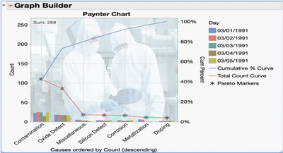
Have you ever wanted to go beyond standard Run, Bar and Pareto Charts to visualize performance over time? Marvin (Marv) Paynter came up with such a graph in the 1980’s at Ford Motors to show the effectiveness of their Correct Action Systems. Called a Paynter Chart, this graph combines the best features of Run, Bar and Pareto Charts to show how things are performing over time among total count and failure subgroups. The great news is JMP 17 offers two ways to generate a Paynter Chart, both as options in the Pareto Plot and the Graph Builder platforms.
Case Study: Failure GB Data
Modern semiconductor manufacturing seeks to produce even smaller and more advanced silicon computer wafers. Over several days the count of failures by cause were recorded. Typical failure causes were from contamination, corrosion, doping, metallization, miscellaneous, oxide defect and silicon defects. A Paynter Chart graph is desired to allow for visual drill down of failure performance over time.
Paynter Plots in Pareto Plot Platform
Improvements in the Pareto Plot Platform in JMP 17 now allow the building of Paynter Plots. To build this graph:
Data Import & Platform Open:
- Open the Failure GB.jmp data file
- Start the Quality and Process -> Pareto Plot platform dialog
Pareto Platform Settings:
- Put “Causes” in the Y, Cause area
- Put “Day” in the Subcategory
- Put “Count” in the Freq
- Click OK to generate the Pareto Plot
From the Report Window:
- Right Click under the Pareto Plot Red Triangle and select “N Legend” to get a total count of all N (Failure Causes)
Optional Settings:
- Right Click on the Pareto Markers in the Legend area -> Marker -> Marker Shape = *
- Right Click on the Cumulative % Curve in the Legend Area -> Line Color -> Blue
- Right Click on the Total Count Curve in the Legend Area -> Line Color -> Red
- Right Click on the left Y Axis, Select Axis Settings, then check the Major Grid Line option
- Right Click on the bottom X Axis, Select Axis Settings, then check the Show Grid option
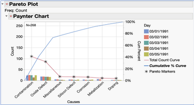
This generates a combined view that shows the count of Total Causes via a Line Chart, side-by-side Bar Chart of Causes by Day, and a descending Pareto Chart by Cause with a Cumulative % Curve.
Benefits of the Pareto Plot Platform
Making a Paynter Chart using the JPM 17 Pareto Plot platform is the fastest way (least number of steps) and offers many unique features. One of these is that the Cumulative % Curve (blue line) is reflective of the count of all the individual Cause subgroup bars, not just based off the total Cause amount like with the Total Count Curve (red line). Also, this platform automatically synchs both the left and right Y axis to reflect the true relationship between the two. This synching is very helpful if you plan on zooming in on the graph. If not desired, this can be unchecked under the Pareto Plot red triangle option of “Synchronize Y Axes”.
Paynter Plots in Graph Builder Platform
A Paynter Plot can also be created in the Graph Builder platform. To build this graph:
Data Import and Platform Open
- Open the Failures GB.jmp data file
- Start the Graph Builder Platform
Graph Builder Initial Set-Up
- Put “Count” onto the left Y Axis
- Put in another “Count” into almost the exact same spot (slightly into the body of the graph) on the left Y Axis to get a Count & Count
- Put “Causes” on the X Axis
- Put “Day in the Overlay area
- Right Click in the Left Y Axis (Count & Count) and “Move Right” the second Count
- Right Click in the Graph and change Points (right) to Line (Right)
- Right Click in the Graph and Add -> Line element
- Right Click in the Graph and Add -> Bar element
Set the Ordering
- Right Click on X Axis -> Order By -> Count, descending
- Right Click on X Axis -> Order Statistic -> Sum
Adjust Element Panel Settings (bottom left of the graph)
- In the Points section, Summary Statistic = Sum and uncheck the Variables -> Overlay (Day)
- In the Line (right) section, Summary Statistic = Cumulative Percentage and uncheck the Variables -> Overlay (Day)
- In the Line section, Summary Statistic = Sum and uncheck the Variables -> Overlay (Day)
- In the Bars section, Summary Statistic = Sum, and ensure Bar Style = Side by side
Align the Axes
- Click on Count name in the right Y Axis and rename as “Cum Percent”
- Right click in the Graph and Add -> Caption Box
- In the bottom left part of the Caption Box section, Summary Statistic = Sum, X Position = Left and uncheck the Variables -> Overlay Day
- Right click in the left X Axis, select Axis Settings, and set the Maximum to the Count Sum (in this case Sum = 268 total failures) to help us synch with the Cum Percent scaling on the right Y Axis
- Right click in the left X Axis, select Axis Settings, and set the Increment = 50
Formatting and Labeling (Optional):
- Right Click on the Legend area -> Marker -> marker shape = *
- Right Click in the Legend Settings, change name of points Sum = “Pareto Markers”, red line Sum = “Total Count Curve”, blue line Sum % = “Cumulative % Curve”
- Right Click in the Legend Settings, and reorder to legend items as desired
- Right Click on the left Y Axis, select Axis Settings, then check the Major Grid Line options
- Right Click on the bottom X Axis, select Axis Settings, then check Show Grid
Benefits of the Graph Builder Platform
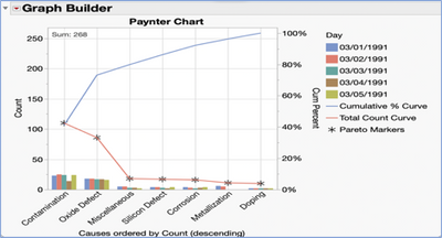
Making a Paynter Chart using the Graph Builder platform does take more steps but offers more control of the final view. One of the only differences from the Pareto version is that due to the Overlay usage, the Graph Builder’s Cumulative % Curve (blue line) is reflective of the total Cause, which is the same way we calculate the Total Count Curve (red line). But most importantly the Graph Builder platform offers that ability to mix and match many different types of graph elements, as well and additional formatting setting options that are not all available on the Pareto Platform.
How to Read the Paynter Chart
The Total Count Curve in the Line portion of the chart gives us a look at the largest contributions of the Contamination and then the Oxide Defects. The Cumulative % Curve in the Pareto portion of the chart shows us that Contamination and Oxide Defects alone contribute around 70% of all recorded failure causes.
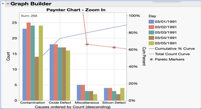
If we zoom in a little bit to view just the Bar Chart of Causes by day, we can not only see the leading causes that need more work (like with Contamination), but also can see where we can see where some improvement reduction efforts may be working over the time (like with Oxide Defects).
No matter which platform in JMP you choose, the Paynter Chart will add another great combination graph to your toolkit to best tell the story in your data!
Click here for access to featured graphs and data on JMP Public: https://public.jmp.com/spaces/ALLUSERS/posts/K1T_MNyX0ftx3YsndjwMn/reports
- © 2024 JMP Statistical Discovery LLC. All Rights Reserved.
- Terms of Use
- Privacy Statement
- About JMP
- JMP Software
- JMP User Community
- Contact


You must be a registered user to add a comment. If you've already registered, sign in. Otherwise, register and sign in.