The 2015 Women's World Cup is underway, and the US team has already notched its first victory in Group D play. I was curious to see if the US had been placed in a "Group of Death" -- meaning that its group had the strongest teams in it. The women's World Cup has a slightly different format than the men's World Cup. After group play, the top two teams from each of the six groups move on to the knockout stage. In addition to those 12 teams, the best four third-place finishing teams go to the knockout stage as well. Obviously, you'd like to avoid finishing third in your group and guarantee yourself a spot in the knockout stage of the tournament.
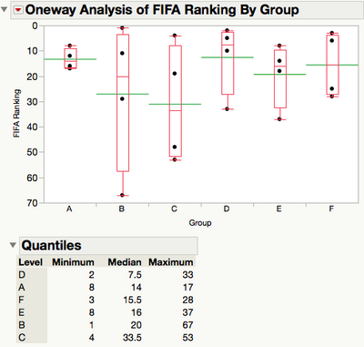
For a quick analysis of the strengths of the groups, I created a JMP data table of the FIFA rankings and group draw for each of the 24 teams in this year's World Cup final. Then I used Oneway in JMP's Fit Y by X platform to compare the groups:

The groups vying for Group of Death status look to be A, D, and F. The group with the highest median ranking is group D (which contains the US). However, the teams in group A are all ranked 17th or better in the world. When (at least) one of those teams can't make the knockout stage (corresponding to the final 16 teams), that makes for a tough group!
From this quick analysis, I think I would give the edge for Group of Death status to group A, since there isn't a low-ranked team for the rest of the teams to earn points against. (The ranking of third place teams is done by points, goal difference, and then number of goals scored.)
How would you measure the Group of Death? I’m sure there are other better methods that I didn’t think of. It would also be interesting to look at which two teams advanced out of each group based on their ratings going into the World Cup group stage. It might also be interesting to see from which groups the four third-place finishing teams come.
A few tips for JMP users that I used here:
- In Axis Settings, there is a checkbox for “Reverse Order” which is nice for plotting rankings where a lower number is generally better.
- Right-click on the column headings in the Quantiles table, go to Columns and unselect the columns you’d like to hide. With only four observations per group here, the 10%, 25%, 75%, and 90% aren’t really very interesting.
You must be a registered user to add a comment. If you've already registered, sign in. Otherwise, register and sign in.