- JMP User Community
- :
- Blogs
- :
- Melisa Muhamed
- :
- [JMP SEA] JMP on Tuesday Session #1 : Beginner's Tutorial
- Subscribe to RSS Feed
- Mark as New
- Mark as Read
- Bookmark
- Subscribe
- Printer Friendly Page
- Report Inappropriate Content
JMP on Tuesday Session #1, 21st April, 2020
Presenter : Bass Masri (@Bass_Masri )
Topic : Beginner's Tutorial
Thank you for your questions during the session. We're sharing the answers here for everyone and for us to improve our JMP skills together.
Recorded video of the session
Q1: Can you show how to get the 'p' value please.
A1: P-values are shown in the outline box items in your analyses, for example you can see p-values in the last column of the Parameter Estimates…
Here the p-value for height is low at <0.001. The null hypothesis is that height is not a significant predictor of weight.
Since the p-value is less than 0.05 we reject the null hypothesis and conclude that there is evidence to show that height is a significant predictor of weight.
Q2: How did you do number of analyses by row?
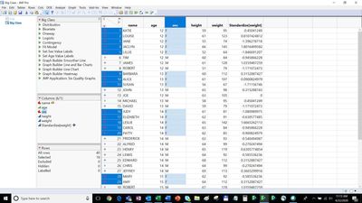
A2: When you open a data table, JMP®15 numbers each individual row and tells you how many rows and also how many rows you have selected in the Rows box in the bottom left corner …
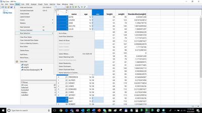
You can also go to a specific row number and much more with the Rows menu…
Q3: I wish to have two different chart types in a single graph using two axis.
A3: I found this article in the JMP community that might help you.
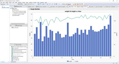
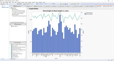
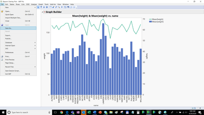
Using the big class sample data example of height and weight I was able to create a bar chart for weight and a line plot for height on the same chart using the Overlay Plot.
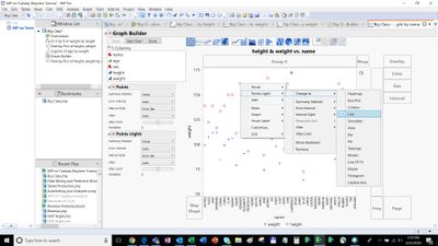
To do this clear the row states in the JMP table. Create the overlay plot with the two variables, one on the left axis and one on the right axis.
Then go to the Red Triangle and click Show Control Panel.
Then select a point (for Height) and then right click and select Change to > Line
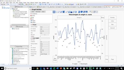
Then the circles for height change to a line.
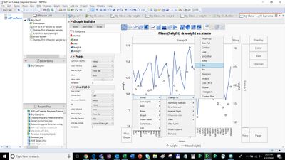
Similarly select a point (for Weight) and then right click and select Change to > Bar
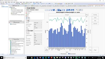
Then change the axis scale, legend location and colours to suit.
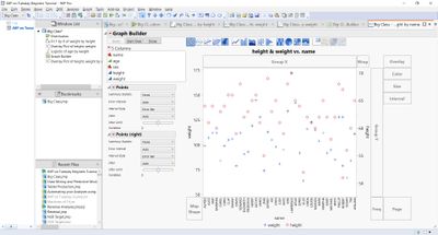
Final chart with x label for name.
Q4: Can you display the graph when you do logistic regression?
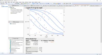
A4: Yes, you can. In the Fit Y by X platform you can fit a categorical nominal/ordinal response such as Age by a continuous variable like Weight and obtain a Logistic Regression plot.
In this plot we see that the older you are the higher the probability that you will weigh more… This is emphasized by the line drawn for each Age interval.
Q5: The save to project - is this available on JMP14?
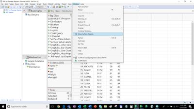
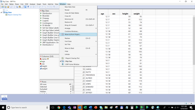
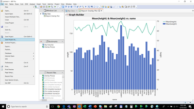
A5: Yes, save project is available in JMP®14 under Window > Move to/from Project the File > Save Project.
To take advantage of the many new features, I highly recommend upgrading to JMP®15 and JMP®15 Pro.
Q6: Can you display the all data value on the chart permanently?
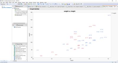
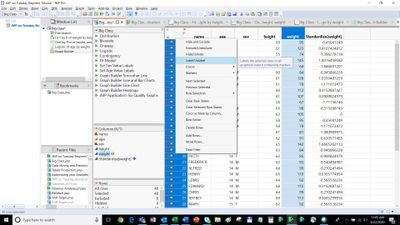
A6: Yes, you can display a value permanently. You simply Label the variable that you are interested in, select the rows and it will display…
Q7: Is the Beginners tutorial available by default in JMP or is it made specifically for this training?
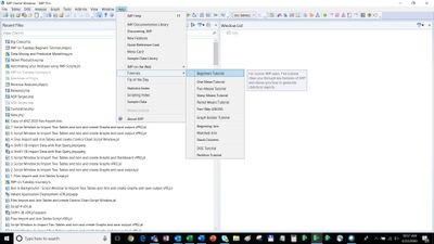
A7: Yes, you can find the Beginners Tutorial and many more under JMP®15 > Help > Tutorials.
You might also like to take a look at these useful resources:
|
1. A global community of JMP experts standing by at community.jmp.com 2. Live and on-demand webinars from our Mastering JMP series 3. Whitepapers, book chapters, articles and more in our resource center 4. Statistical training and education at jmp.com/statisticalthinking 5. World-class technical support services at jmp.com/support |
Q8: How do you save the chart as HTML and as project?
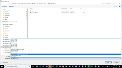
A8: To save a chart as Interactive Html, click on the chart and go to:
File > Save As > Interactive HTML
A8: To save your work in a Project go to:
Window > Move to/from Project
> Move All > Bookmark All
File > Save as Project
- © 2024 JMP Statistical Discovery LLC. All Rights Reserved.
- Terms of Use
- Privacy Statement
- About JMP
- JMP Software
- JMP User Community
- Contact


You must be a registered user to add a comment. If you've already registered, sign in. Otherwise, register and sign in.