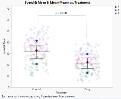
In a recent article in the Journal of Cell Biology, "SuperPlots: Communicating reproducibility and variability in cell biology," the authors present recommendations for creating a data visualization (SuperPlots) with an emphasis on presenting observation-level variability and experimental reproducibility simultaneously. The authors demonstrate how to create the SuperPlot with several different software packages. In this blog post, I present the steps necessary to reproduce the SuperPlot using JMP.
The article contains sample data consisting of two treatments and three replicates within each treatment. Each replicate is measured 50 times. The desired graph displays both the raw data, as well as a summary of the data across the 50 records of each treatment. For each treatment, the mean and standard error of the mean are calculated with an n = 3, not of the full data, and then added to the plot. The first step in JMP is to make a summary column and add that to our data table. To do this in JMP, select the Replicate and Treatment columns simultaneously. Then right-click and choose New Formula Column > Group By. There is no change to the data after this step. Next select the Speed column, then right-click and choose New Formula Column > Aggregate > Mean to add a new column to the data table with means. While this column contains the desired summarized data, the values are each repeated 50 times, so we have not yet reduced our N. To reduce the N, we want to remove duplicate records. One way to do this is to copy the data into another column and then select Replicate, Treatment, and the Copy of the Mean column. Click Rows > Row Selection > Select Duplicate Rows to select 294 rows. Now click on the Mean column and press Delete to clear the duplicate records.
Now we are ready to construct the plot:
Click Graph > Graph Builder.
Drag both Speed and the Mean column to Y.
Drag Treatment to X.
Drag Replicate to Overlay.
Right-click in the graph and choose Add > Points.
Right-click in the graph and choose Add > Bars.
Once those steps have been completed, the plot will look like this:
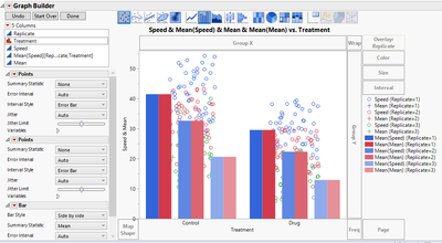
We have all the components that we need, but we must now clean up the plot. On the left-hand side under the first Points menu, click on the gray triangle next to variables and uncheck Mean.
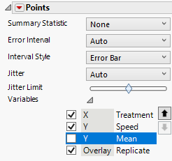
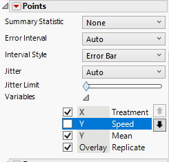
Under the second Points menu, click on the gray triangle next to variables and uncheck Speed.
Drag the Jitter Limit to the far left.
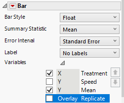
Under the Bar menu, click on the gray triangle next to variables and uncheck Speed and Replicate.
Change the Bar Style to Float.
Change the Error Interval to Standard Error.
Looking at the plot, now we can see that we are getting closer.
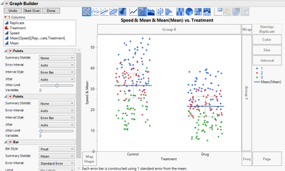
Next, right-click in the plot and choose Graph > Marker Size > XXL.
Now double-click on the legend. The legend Setting window will open.
Right-click on each legend item and set the desired characteristics. For the raw data, the first set of 1, 2, and 3 changed the markers to circle, diamond, and square, respectively. Change the transparency to .1 for these three.
Change the line color for mean to black.
Change the markers for the means (the second set of 1, 2, and 3) to match the markers from above.
Change the line color for standard error to black.
Finally, uncheck mean. Check the 1, 2, 3 that have transparency of 1, while unchecking those with transparency .1 so that the legend will be clearer.
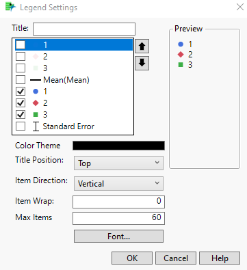
Click OK on the legend setting window.
Click Done on the plot.
After following those steps, we get this final plot:
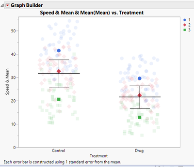
There is one additional component added to the plot in the article, which is a p-value. While JMP does have the option to calculate the p-value, it will have to be added manually to the plot. There is a line drawing tool and annotation tool that can be used to add the p-value.

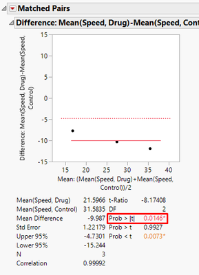
The p-value calculation as described in the paper is a matched pairs t-test, matched on Replicate. JMP can perform this test, although not easily with the data in the current format. To verify the p-value, we create a summary table. Click on Tables > Summary. Choose Speed, and then click the Statistical drop- down menu and pick Mean. Then add Replicate to Group and Treatment to Subgroup. Click OK.
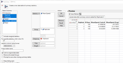
From the Summary Table, click Analyze > Specialized Modeling > Matched Pairs.
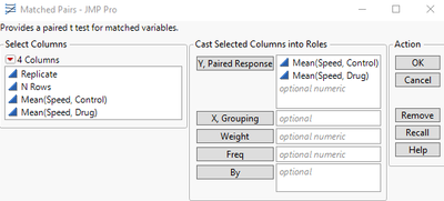
Drag Both Mean (Speed, Control) and Mean (Speed, Drug) to the Y, Paired Responses section.
Click OK.
From the output we can find the p-value.
After adding that to the plot, we get this final plot:
