- JMP User Community
- :
- Blogs
- :
- JMPer Cable
- :
- Genetic Association with JMP Genomics, Part 3d: Q-K Mixed Model Workflow for Gen...
- Subscribe to RSS Feed
- Mark as New
- Mark as Read
- Bookmark
- Subscribe
- Printer Friendly Page
- Report Inappropriate Content
There two ways to run a Q-K analysis in JMP Genomics. One example uses the Q-K Mixed Model process which was outlined in an earlier blog post, Genetic Association with JMP Genomics, Part 3c: Q-K Mixed Model. This is a general tool that has a great deal of flexibility, but it requires you to construct the input data set yourself.
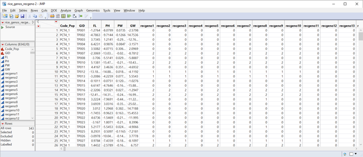
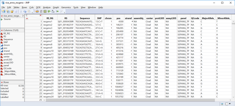
A simpler option is the Genetics Q-K Analysis Workflow, which performs all the steps for the Q-K Analysis and merges the data automatically. It is, however, less flexible than the Q-K Mixed Model process: The workflow only allows a Q matrix computed from PCA, and a K matrix from IBD calculations from the Relationship Matrix process. In this post, we work through a Q-K analysis using the workflow using the marker data file rice_genos_recgeno.sas7bdat, and the corresponding annotation file rice_anno_recgeno.sas7bdat.
- From the Genomics Starter menu, choose Workflows > Advanced > Genetics Q-K Analysis Workflow.
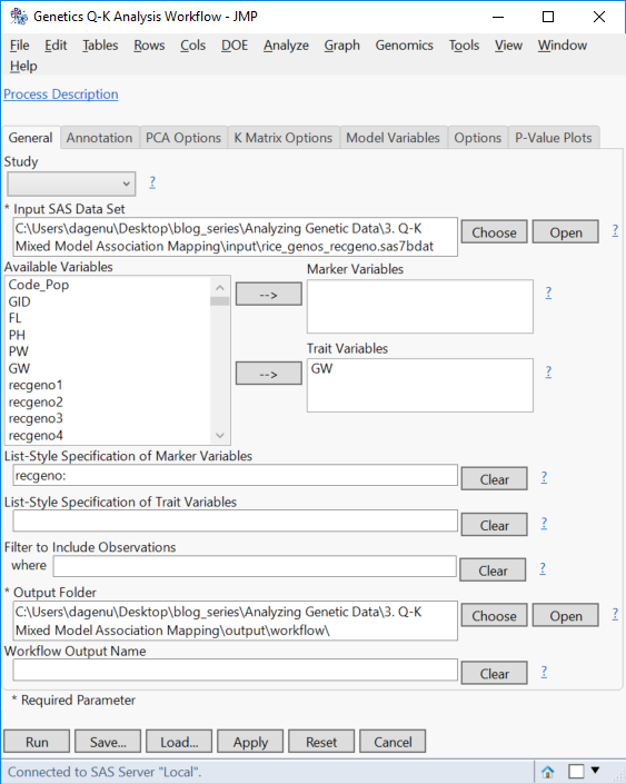
- On the General tab, select rice_genos_recgeno.sas7bdat as the Input.
- Select GW as the Trait Variable. The Q-K workflow can handle all of the traits at once; but to perform K Matrix compression, the analysis will need to be done on a trait-by-trait basis.
- Enter recgeno: in the box under List-Style Specification of SNP Variables.
- Choose an Output Folder.
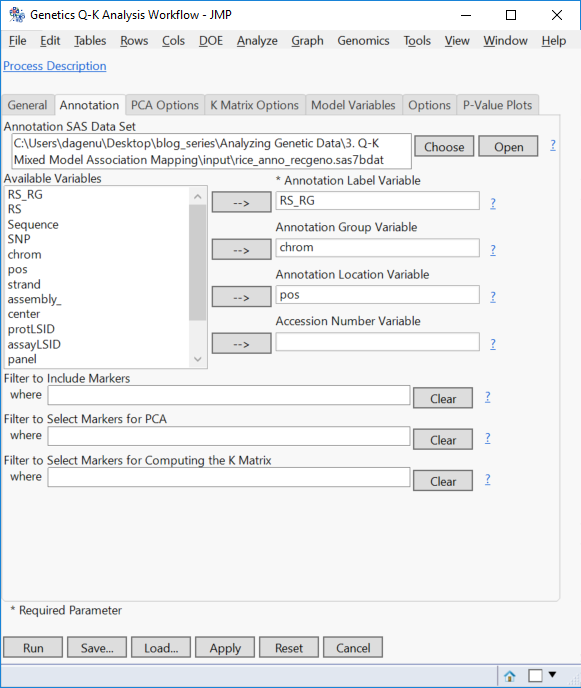
- On the Annotation tab, Choose rice_anno_recgeno.sas7bdat as the Annotation SAS Data Set.
- Fill out the Annotation tab with RS_RG as the Annotation Label Variable, chrom as the Annotation Group Variable and pos as the Annotation Location Variable.
- Marker filtering options are available on this tab as well. But for this example, leave the filters blank to include all markers.
- Marker filtering options are available on this tab as well. But for this example, leave the filters blank to include all markers.
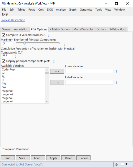
- Move now to the PCA Options. Set 5 as the Maximum Number of Principal Components, which attempt to explain 50% of the variance in the data (Enter 0.50 as the Cumulative Proportion of Variation to Explain with Principal Components).
- From previous analysis, we know that 5 PCs are sufficient to explain 50% of the variance in the data.
- From previous analysis, we know that 5 PCs are sufficient to explain 50% of the variance in the data.
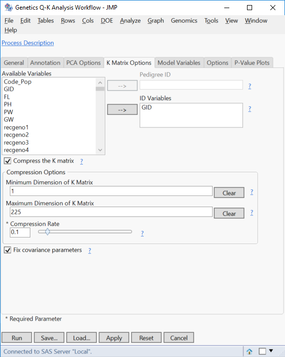
- On the K Matrix Options tab, check the box next to Compress K Matrix.
- This option will only be available if a single Trait Variable is specified on the General tab.
- In the Compression Options section, set the Minimum Dimension of K Matrix to 1 and the Maximum Dimension of K Matrix to 225.
- To let JMP determine the optimal dimensions for the K Matrix, these boxes can be left blank.
- Set the Compression Rate to 1.
- This means the K Matrix will be compressed by 10% at each compression level. Lower numbers for this option will increase the precision of the compression by causing more iterations of compression.
- This means the K Matrix will be compressed by 10% at each compression level. Lower numbers for this option will increase the precision of the compression by causing more iterations of compression.
- On the Model Variables tab, select the Continuous for Type of Trait.
- Here, additional effects (non-marker) can be added to the model.
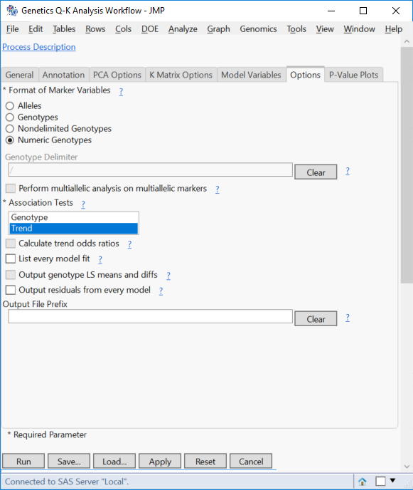
- On the Options tab, specify Numeric Genotypes for the Format of Marker Variables.
- Deselect Genotype from the Association Tests. The Genotype test performs chi-square tests based on genotypes, whereas the Trend test performs a Cochran-Armitage test. Removing the genotype option results in much faster run times.
- Leave the default selections on the P-Value Plots.
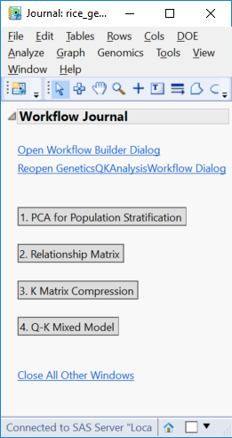
- Click Run to launch the analysis. When the workflow analysis is complete, the following JMP Journal will be displayed.
Results
- Click the PCA for Population Stratification result to bring up results pertaining to population structure and the Q Matrix.
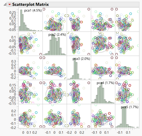
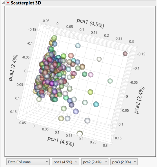
- Both the PCA 2D & 3D Row Scores tabs show the relationships between the principal components. Individuals that cluster together in these plots would be considered to share ancestry. The 2D Plot shows the correlation of each of the 5 PCs with one another. In the 3D Plot, the relationship between any 3 PCs (selected beneath the plot) can be shown in a three-dimensional space.
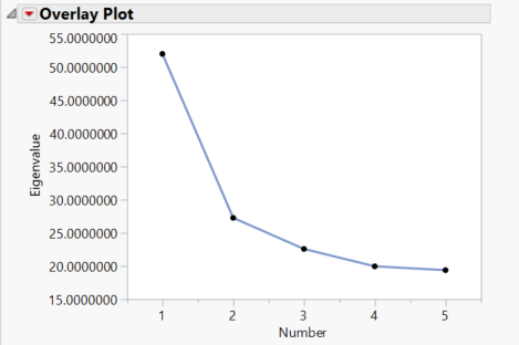
- The Scree Plot tab shows the amount of variance accounted for by each of the 5 Principal Components.
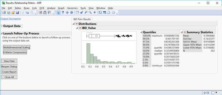
- Return to the Journal and open the Relationship Matrix. These are results associated with Identity By Descent and the K Matrix.
- The IBD Pairs Results tab shows a distribution of IBD values above the specified threshold for individuals.
- The Launch Follow-Up Processes menu on the left has options for Multidiminsional Scaling and K Matrix Compression (which has already been done).
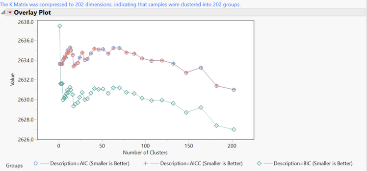
- Return to the Journal and open the K Matrix Compression. The plot shows the number of clusters for each compression iteration, with lower y values being more effective compression. The final version of the K Matrix has 202 clusters.
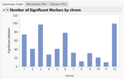
- Return to the Journal and open the Q-K Mixed Model. The Summary Chart tab shows the number of significant markers on each chromosome for Grain Yield (GW). The blue bars represent results from the Trend test. The trend test looks for a linear relationship in the trend scores when moving from homozygous minor to heterozygous to homozygous major.
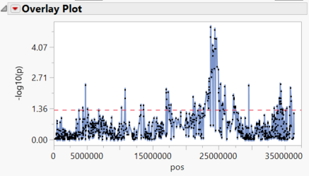
- Selecting any of the chromosomes from the Tabs menu on the left brings up a plot of each marker on the chromosome plotted by position. Significant markers fall above the red dotted line which represents our alpha value of 0.05. Below is the plot of chrom 3 Results.
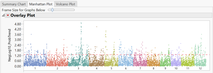
- The Manhattan Plot tab shows significant markers by chromosome as determined by the trend test. The red dotted line once again represents the alpha value of 0.05.
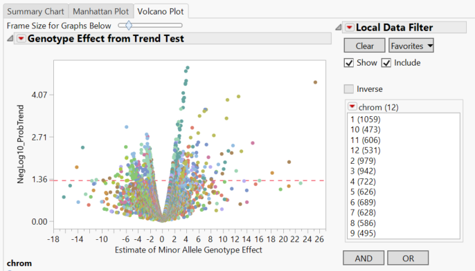
- The Volcano Plot tab gives a volcano plot for each marker, with minor allele genotype effect on the x-axis and the log transformed p-value on the y-axis. Points above the red line are considered significant.
- Clicking through the Local Data Filter options on the right gives volcano plots for each individual chromosome.
- Clicking through the Local Data Filter options on the right gives volcano plots for each individual chromosome.
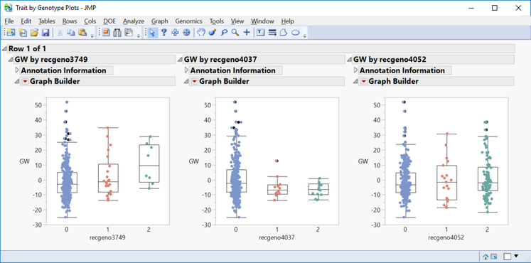
- In the Drill Downs menu, a subset can be created for selected markers, or a plot of Grain Yield values by genotype can be created by selecting Plot Trait By Genotype.
- This is a great way to quickly see the effect different genotypes have on a trait for a given marker.
- Shown below are trait by genotype plots from three markers on chromosome 5. The first marker shows a highly significant positive minor allele effect on GW. The second marker shows a slightly negative minor allele effect for GW. The third marker does not have significant effect on grain yield.
*See the interactive results of this analysis on JMP Public.
Summary
There are multiple methods for creating a Q-K Mixed Model in JMP Genomics. Earlier posts outlined creating a K Matrix, compressing it, creating a Population Structure (Q) Matrix, and making a Q-K Mixed Model separately. The Genetics Q-K Analysis Workflow handles all of those analyses using one tool. Keep in mind that there is less flexibility in the model-building process when using the workflow, but in most cases it produces similar output.
- © 2024 JMP Statistical Discovery LLC. All Rights Reserved.
- Terms of Use
- Privacy Statement
- About JMP
- JMP Software
- JMP User Community
- Contact

You must be a registered user to add a comment. If you've already registered, sign in. Otherwise, register and sign in.