What inspired this wish list request?
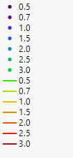
I made a plot using graph builder (x and y variables plus an 'overlay' variable). I applied a colour scale to the points/overlay variable but it treats them independently! For example with the rainbow colour scheme i applied i get this result:

What is the improvement you would like to see?
What I'd really like to see is that the line colours are representative of the colour of the dots/data points that they are fitted through. So my green lines should really be blue/purple, and my green dots should really be red/orange.
Why is this idea important?
Because as it is it just looks weird and makes it more difficult to interpret.