What inspired this wish list request?
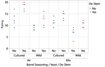
If nominal values are used on an axis - esp. if such values are stacked in a hierarchy - it's hard to trace which data belongs to which entry:

What is the improvement you would like to see?
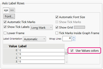
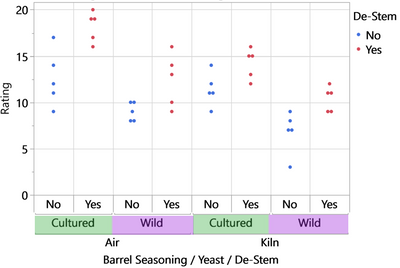
In the Axis settins, please provide an option to define the background of the axis labels by the Value Color of the respective label:

This makes the plot much nicer and easier to understand.
It should be possible to activate and deactivate value colors for each level of the hierarchy:

alternative: all levels get the color from one of the levels, like @Thierry_S suggested in

Why is this idea important?
The ability to change the background of the axis labels is a cool new feature to generate more attractivep lots.
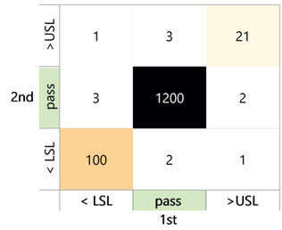
It can be used to highlight a specific value - like in this comparison of 2 test runs:
By the green background color, the focus is directed to the central value - at the intersection of pass/pass devices.
