Hello! Welcome to today’s Need for Speed! Today is all about graphing!

For previous Need for Speed posts, click here!
My name is 2-Click Clovis, and I am truly passionate about data analysis and, most importantly, time efficiency! JMP was an integral tool for my previous work in the semiconductor and manufacturing industries. Since joining JMP, I have learned so many new tips and tricks. I could have saved so many hours in my data analysis workflow! I see it as my responsibility to share my newfound knowledge with all JMP users to help them regain precious time.
After I demonstrate how quickly JMP can perform your routine data manipulation and analyses compared to other tools, I’ll show you the quickest way to get it done in JMP.
Graphing
No matter your industry or role, data visualization will allow you and your co-workers to see, interact with, and better understand your data. Graphing is a universally vital tool for exploratory data analysis. Whether you are searching for relationships, patterns, or outliers, graphs are necessary for breakthrough discoveries and better communication of your results.
However, the issue with a lot of graphing software is how very hard it is to create your desired visualization!
I remember the frustration of looking up online tutorials and right-clicking aimlessly for at least an hour, hoping for some kind of miracle to obtain my exact, desired visualization!
Many times, I could not even create my desired graph and had to settle for a different type of graph. I wasted my precious time and potentially missed out on key data discoveries!
When I discovered JMP’s intuitive, interactive, and easy-to-use Graph Builder, my world was changed for the better, and I have never looked back. With Graph Builder, creating the most comprehensive graphs is extremely quick and easy!
JMP’s Graph Builder
To open Graph Builder, all you need to do is click on this symbol on your menu bar:

You can also choose Graph from the top menu and choose Graph Builder, the first item under the menu.
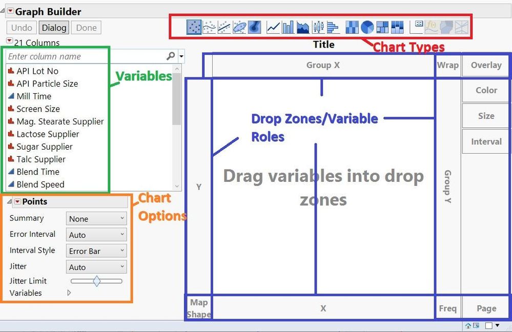
A new window will then appear. At the center of the window, you will have an interactive graph with specific roles and drop zones for your variables/column names. The list of column names/variables in your table is to the left of it. Above the list is all of JMP’s chart types. Finally, below the column names, you will find all the chart options for the selected chart types.
Now let’s go over my five favorite features:
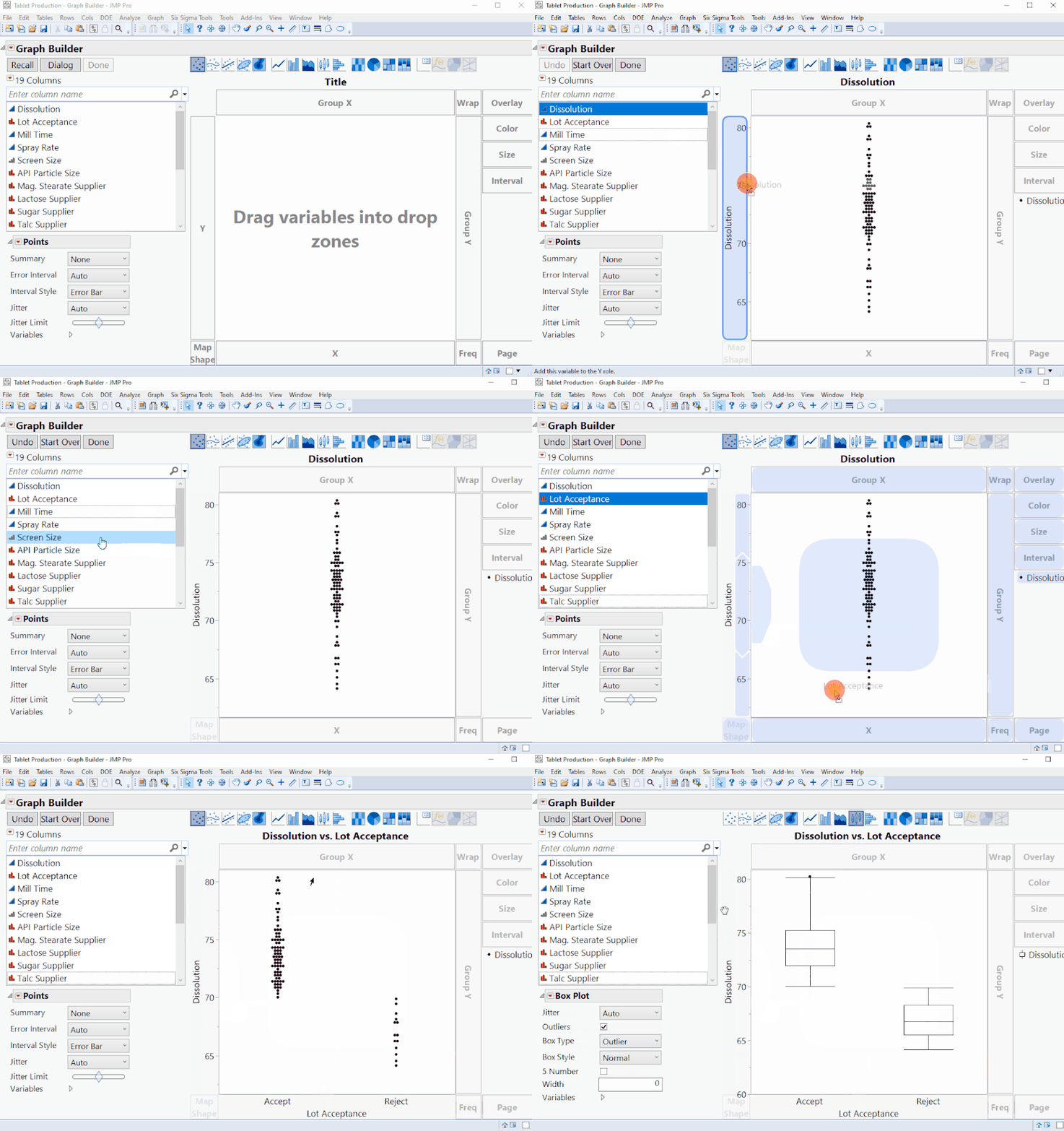
- You can temporarily call me 1ClickClovis because it only takes one drag-and-drop click to put a variable in a specified role, and it only takes one click to change your chart type! In the example below, watch as I drag and drop Dissolution as my “Y”, Lot Acceptance as my “X”, and change the chart type to a box plot.
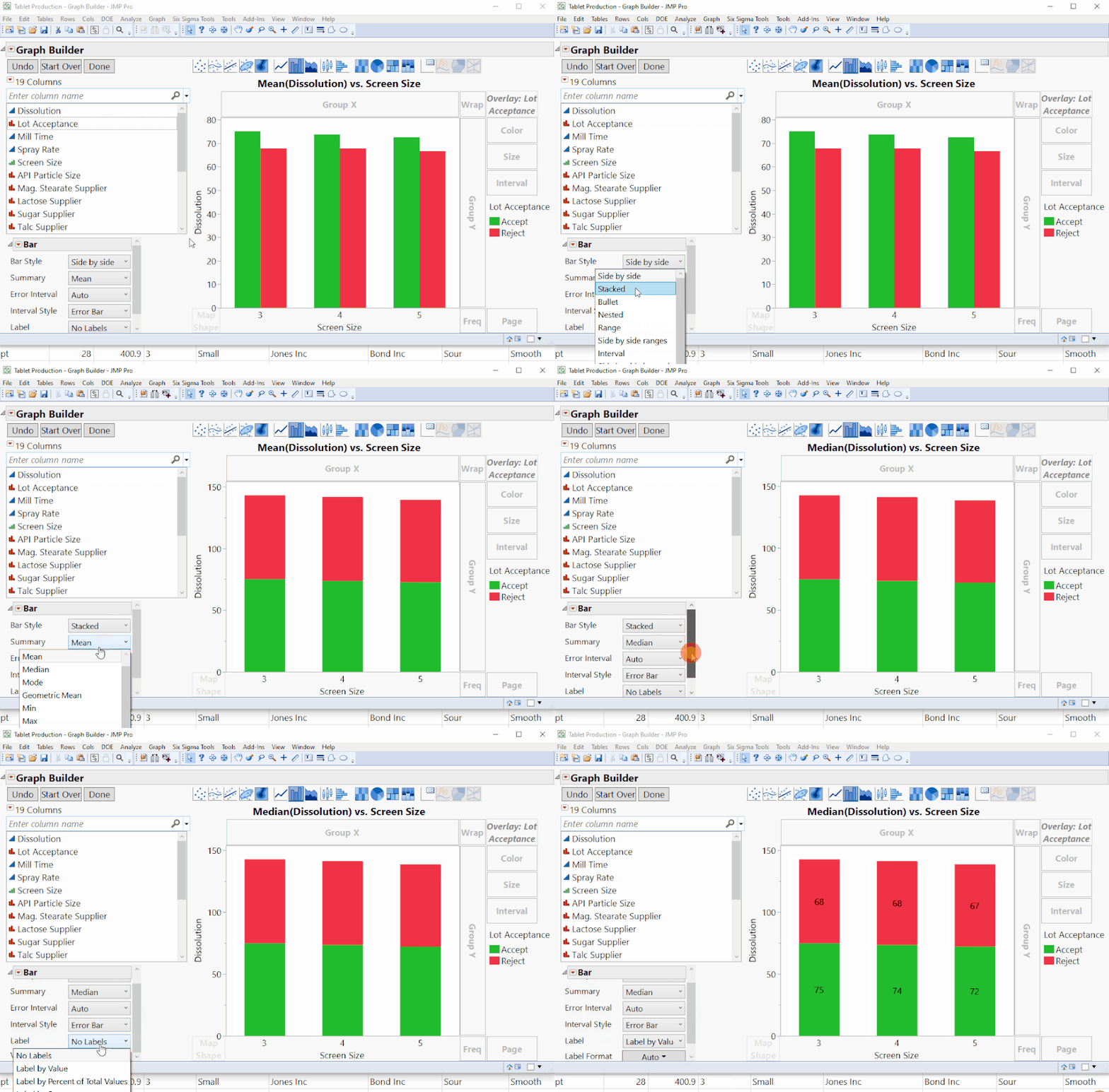
- It only takes one to two clicks to activate a desired chart option selection. In the example below, watch as I change the bar chart from a Side-by-Side format to Stacked, the summary statistic to Median, and add the Label by Value as a graph label.
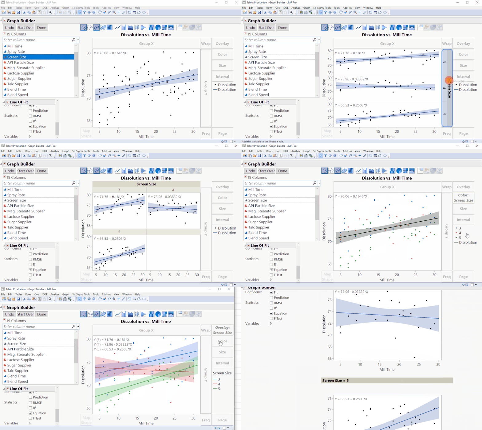
- You can create comprehensive graphs in various configurations in a matter of seconds by using the different drop zone variable roles. In the example below, we are initially looking at a scatterplot of Dissolution vs. Mill time. Watch as I also incorporate Screen Size into some of the different roles such as Group X, Group Y, Wrap, Color, Overlay, and Page.
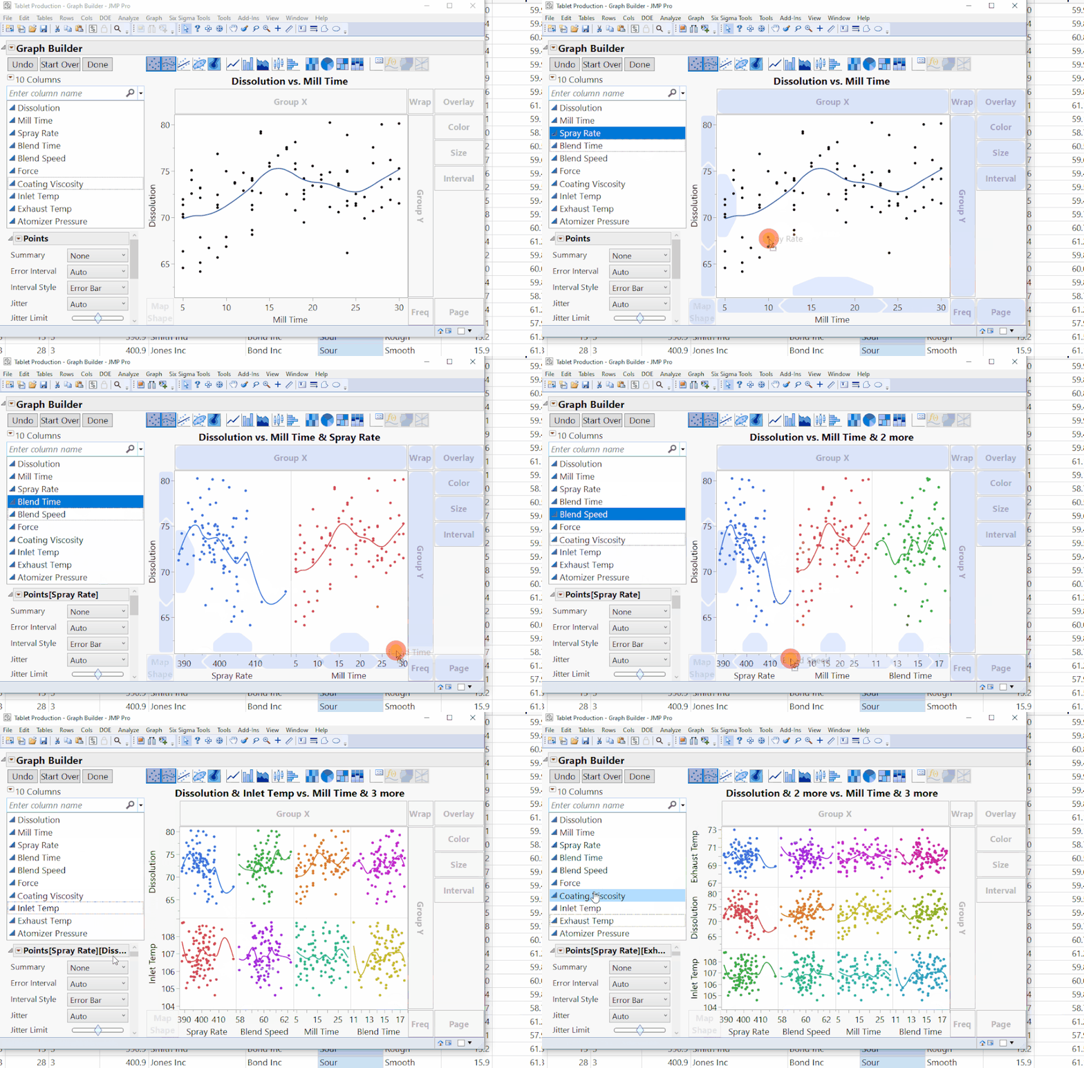
- Graph Builder is a highly flexible platform. One aspect of its flexibility is the ability to incorporate as many variables as you desire into the X or Y axis. All you need to do is drag-and-drop a variable to the left/right of an existing X-axis variable, or above/below an existing Y-axis variable.
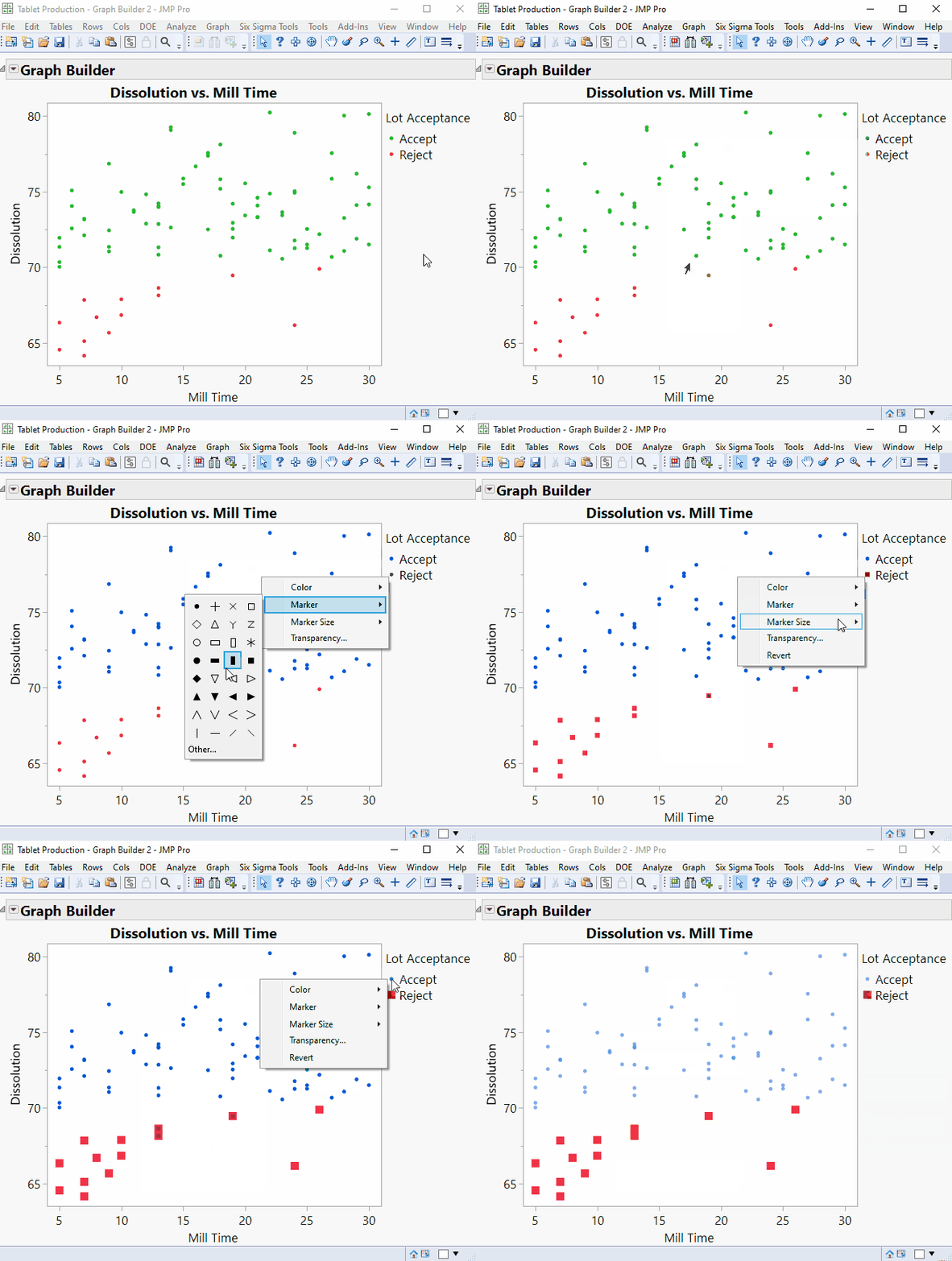
- Visualizations are fully customizable by right clicking any part of your legend. In the scatterplot example below, I can easily change the Color, Shape, Size, and Transparency of my points.
I am just scratching the surface of Graph Builder’s capability. If you want to see even more Graph Builder features, please comment below!
On that note,

is clicking out!
You must be a registered user to add a comment. If you've already registered, sign in. Otherwise, register and sign in.