- JMP User Community
- :
- Blogs
- :
- JMP Blog
- :
- Just how mad was this year’s March Madness?
- Subscribe to RSS Feed
- Mark as New
- Mark as Read
- Bookmark
- Subscribe
- Printer Friendly Page
- Report Inappropriate Content

No. 16 seed UMBC upsets No. 1 seed Virginia! Marshall knocks off Wichita State! Loyola (Chicago) ends Tennessee dreams!
According to the headlines, it appears that the 2018 NCAA Men’s Basketball Tournament was one for the ages, with upsets galore. Indeed, as a basketball fan, I was drawn to the tournament more so this year than in years past (even though my team didn’t make the cut.)
But just how unusual was this year’s tournament, in terms of upsets? Conversely, how often did the favored team “hold serve”? I decided to take a look.
Data source
Data for past NCAA Tournament results is available from a variety of sources. Of course, we want data that includes 1) results for all individual games from 1985 onward and 2) seeds for all individual winners and losers. Three of these sources are:
JMP has excellent tools for retrieving (Internet Open) and cleaning (Recode) the data into a data table where each individual game occupied one row in the table, and included information on the year, round, team seeds and team scores. Then, the analysis fun begins! I looked at the data three different ways.
A first pass: Counting upsets
There are probably as many ways to judge “upsets” as there are analysts. As a first pass, I decided to look at the percentage of correct picks, with “Correct” meaning that the higher seed won the game, and “Upset” meaning that the lower seed won. So I created a new formula column in JMP to identify Correct vs. Upset results for each game.
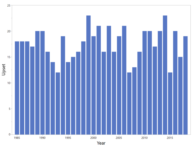
With the results in hand, I made summaries of the data. Then I viewed the results (ordered by most-to-least upsets) in Graph Builder. Here is a look at the results:
So in terms of percentage of upsets, 1999 and 2014 are tied, with 23 upsets out of 63 games. The years 1993, 2007 and 2015 had the fewest upsets, at 12. In 2018, there were 19 upsets, a very middle-of-the road year in this regard.
But this is based on ALL upsets, regardless of the magnitude of the upset. Let’s take another look.
Second pass: Surprise factors
To gauge surprise, we need a way to weight the magnitude of the upset. There are many different ways to do this, but I decided to simply take the difference between the seeds as a metric. So if a No. 14 seed upsets a No. 3 seed, the “Surprise” metric is 14-3 = 11 “Surprise Points.”
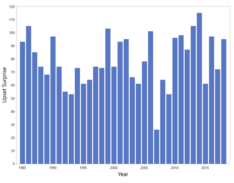
I added another column to my data table called “Upset Surprise” for the games that resulted in Upsets. Plotting Upset Surprise by Year gives this graph:
Now 2014 clearly stands out as the most “surprising” year. In 2014, in the first round (No. 14) Mercer upset (No. 3) Duke, and there were three games where 12 seeds upset 5 seeds; plus, in the second round, there were 11/3 10/2 and 8/1 upsets.
What about this year? It turns out that 2018 is tied for 10th place based on total Surprise Points.
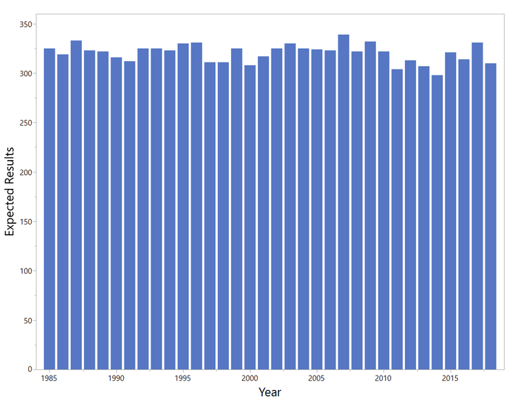
What about the opposite of “Upset Surprise”? In other words, which year had the most “Expected Results”? Here we have an “Expected Result” when the higher seed wins a game (or if the seeds were equal). We weight similarly to Upset Surprise, i.e., if a No. 3 seed defeats a No. 7 seed, this is 7-3 = 4 “Expected Results” points.
We might anticipate that the year with the most expected results was 2007, where the Upset Surprise was by far the lowest. But we need to check this, because (after the first round) we get a jumble of pairings that might affect the results:
Indeed, 2007 (when Florida won the title) was the year with the most “expected” outcomes, though not by as much as you might think! Note that 1987 (when my Indiana Hoosiers picked up the championship) was only six points behind.
On the other end of the scale, 2014 had the least expected outcomes. 2018 was fifth lowest.
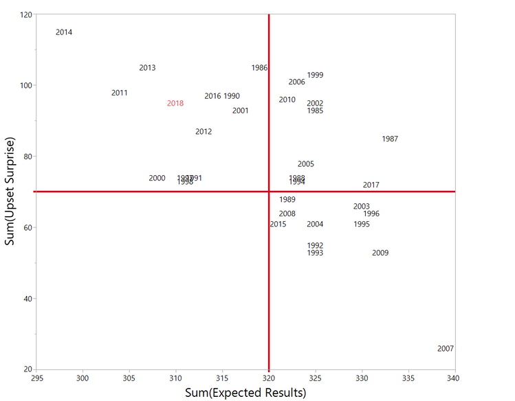
We can combine the results of Upset Surprise and Expected Outcome into a single graph to see which are the Most and Least Surprising years for the tournament:
Here, we see in the upper left quadrant the years with high Upset Surprise and low Expected Outcome. 2014 stands out as the most unpredictable year. 2018 is in the same quadrant and might be considered the fourth most surprising year (by this metric), behind 2011, 2013, and 2014. (It is interesting that several of the most surprising years occurred recently!) At the other end (lower right quadrant) of the plot, clearly 2007 was the least surprising year.
Third pass: First- and second-round surprise
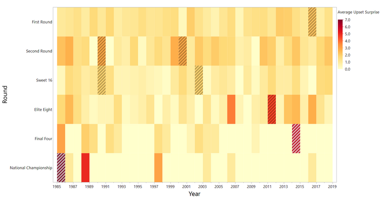
Finally, I looked at Upset Surprise by Round and Year to see if there were any interesting trends. For this study, I used a Heat Map plot. Since there are different numbers of games played in each round, I normalized the data by taking the Average Upset Surprise for each round, by year:
I’ve highlighted the highest Upset Surprise scores for each round.
Recall that 2014 was a year with high overall Surprise. As we look down the 2014 column, we see that the Elite Eight and Final Four rounds were pretty surprising that year! In fact, 2014 saw three upsets in the Elite 8 (the most surprising being No. 8 Kentucky over No. 2 Michigan), and both Final Four games were big upsets (No. 8 Kentucky over No. 2 Wisconsin, and No. 7 UConn over No. 1 Florida)! On the other hand, 2018 didn’t have any particular rounds that were all that “upsetting” compared to other years.
Not as “upsetting” after all
Clearly, there are lots of ways to look at data. In this case, we began with the hypothesis that 2018 was a crazy year in terms of “upsets.” But the different ways that we looked at the data suggest that perhaps 2018 wasn’t all that unusual. But there are other ways to look at the data as well! What do you think?
- © 2024 JMP Statistical Discovery LLC. All Rights Reserved.
- Terms of Use
- Privacy Statement
- About JMP
- JMP Software
- JMP User Community
- Contact

You must be a registered user to add a comment. If you've already registered, sign in. Otherwise, register and sign in.