These hands-on activities allow you to practice building graphs in JMP using Graph Builder. The data files for the activity are in the zip file attached to this post. Extract the data in Graph Builder Hands-on Activity.zip for use in the following activities. Click this link for the solutions. A PDF file of these activities and solutions (in English) is attached to this post.
Level 1
1. Open the Australian Tourism data table and create the following graph.
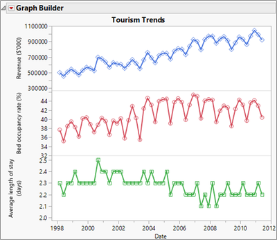
2. Open the Dose Response data table and create the following graph.
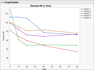
3. Open the Car Physical Data data table and create the following graph.
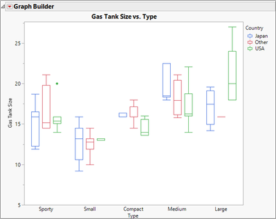
4. Open the Sales by Quarter data table and create the following graph.
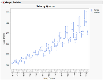
Level 2
5. Open the Likert Survey data table. Examine the columns, especially notice the formula columns, then create the following graph.
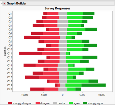
6. The DOE Results data table contains data from a designed experiment. A full factorial (all combinations) of factors X1, X2, X3 was performed, and the response Y for each treatment combination was recorded.
A main effects plot shows the average value of the response at each level of the factors. A two-factor interaction plot shows the average value of the response at each level of two of the factors.
Create graphs to show the main effects and two-factor interaction effects.
7. The Potter data table contains measurements taken on different examples of pottery jugs from three different potters. Use Graph Builder to make a scatterplot of two of the continuous variables, then switch columns to find relationships that vary depending on the potter.