- New to JMP? Let the Data Analysis Director guide you through selecting an analysis task, an analysis goal, and a data type. Available now in the JMP Marketplace!
- See how to install JMP Marketplace extensions to customize and enhance JMP.
- Subscribe to RSS Feed
- Mark Topic as New
- Mark Topic as Read
- Float this Topic for Current User
- Bookmark
- Subscribe
- Mute
- Printer Friendly Page
Discussions
Solve problems, and share tips and tricks with other JMP users.- JMP User Community
- :
- Discussions
- :
- Re: how to plot an overlay variability chart
- Mark as New
- Bookmark
- Subscribe
- Mute
- Subscribe to RSS Feed
- Get Direct Link
- Report Inappropriate Content
how to plot an overlay variability chart
I am a new one for JMP :)
For example, I have 4 columns
Name Gender Score1 Score2:
Jason M 98 87
Alice F 67 78
Emma F 89 79
John M 70 89
Jennifer 76 65
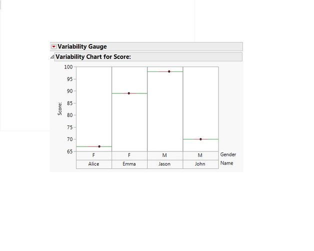
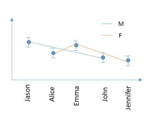
I would like to generate a varibility chart (although the example only has 1 data for each people). I want to plot 2 curves (in different color for example) in 1 figure grouped by Gender, and connect the data with a line for each group. The x axis names need to be the listing order, like this
Thanks a lot!
Accepted Solutions
- Mark as New
- Bookmark
- Subscribe
- Mute
- Subscribe to RSS Feed
- Get Direct Link
- Report Inappropriate Content
Re: how to plot an overlay variability chart
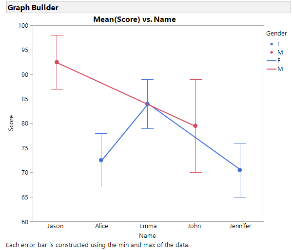
I wasn't sure about Score 1 and Score 2. I assumed that the two scores provides the range for your error bars. That means I stacked the Score columns first. For the Name column I turned on the Row Order Levels property so that JMP would plot them in the order they appear in the data table.
At the graph builder I drug the Name to the X-axis. I drug the Score column to the Y-axis. I changed the statistic to be the Mean with an Error Bar using the Range. I then drug the Gender column to the Overlay field and added the connector line. Results look like below. The JSL is below the graph.
Graph Builder(
	Size( 528, 465 ),
	Show Control Panel( 0 ),
	Variables( X( :Name ), Y( :Score ), Overlay( :Gender ) ),
	Elements(
		Points(
			X,
			Y,
			Legend( 5 ),
			Summary Statistic( "Mean" ),
			Error Bars( "Range" )
		),
		Line( X, Y, Legend( 6 ) )
	),
	SendToReport(
		Dispatch(
			{},
			"400",
			ScaleBox,
			{Legend Model(
				5,
				Base( 0, 0, 0, Item ID( "F", 1 ) ),
				Base( 1, 0, 0, Item ID( "M", 1 ) )
			)}
		),
		Dispatch( {}, "Graph Builder", FrameBox, {Marker Size( 6 )} )
	)
);
- Mark as New
- Bookmark
- Subscribe
- Mute
- Subscribe to RSS Feed
- Get Direct Link
- Report Inappropriate Content
Re: how to plot an overlay variability chart
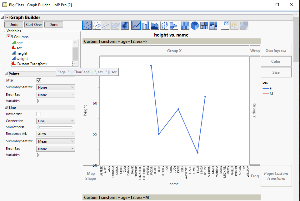
You can create a new virtual column by right clicking on one of the variables in the column names in the Columns area, you can select Formula to create a new column in which you can concatenate the 3 column's values into one column, and then use that column to drag into the Page drop area
- Mark as New
- Bookmark
- Subscribe
- Mute
- Subscribe to RSS Feed
- Get Direct Link
- Report Inappropriate Content
Re: how to plot an overlay variability chart
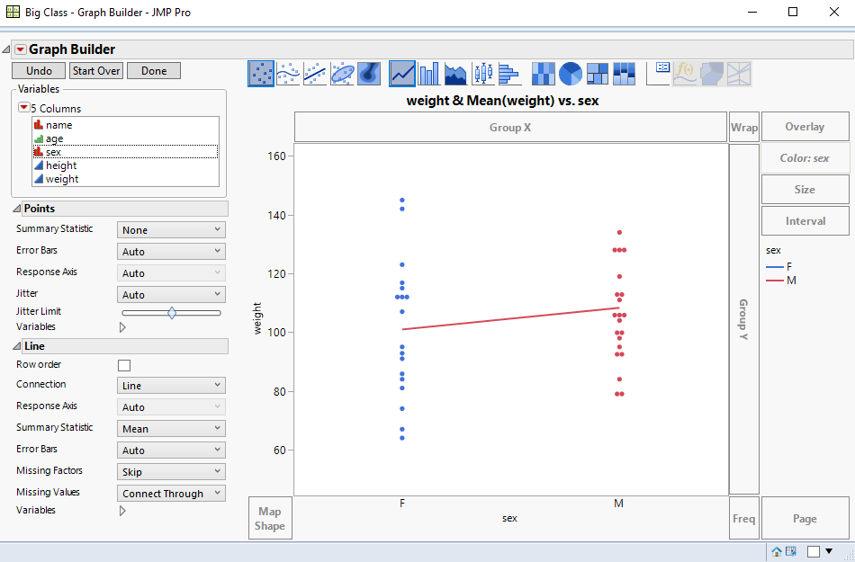
Graph Builder is what you want to use. It is documented in the Essential Graphics document
Help==>Books==>Essential Graphing
The below graph was generated interactively, using the Big Class sample data table.
Below is a script that also generates the above graph
Names Default To Here( 1 );
dt = Open( "$SAMPLE_DATA/Big Class.jmp" );
Graph Builder(
	Variables( X( :sex ), Y( :weight ), Color( :sex ) ),
	Elements( Points( X, Y, Legend( 3 ) ), Line( X, Y, Legend( 4 ) ) ),
	SendToReport(
		Dispatch(
			{},
			"weight",
			ScaleBox,
			{Min( 44.3877551020408 ), Max( 164.387755102041 ),
			Inc( 20 ), Minor Ticks( 0 )}
		)
	)
);- Mark as New
- Bookmark
- Subscribe
- Mute
- Subscribe to RSS Feed
- Get Direct Link
- Report Inappropriate Content
Re: how to plot an overlay variability chart
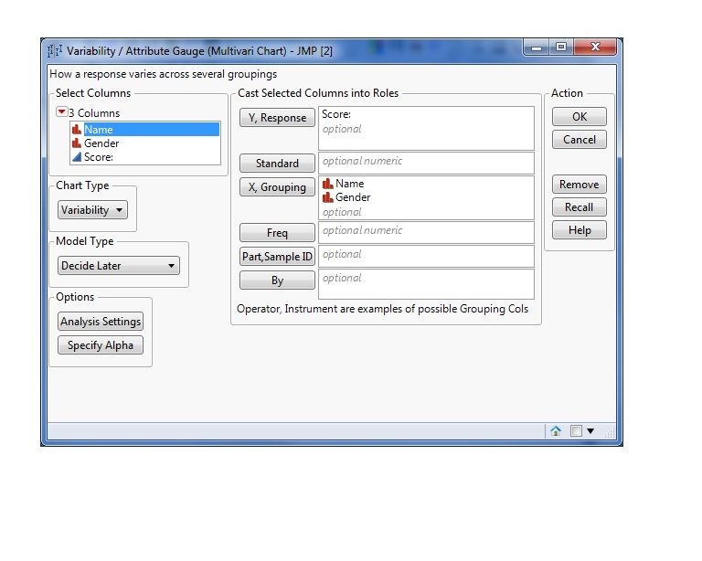
Hi, you can use also
Analyze --> QUALITY and PROCESS --> VARIABILITY /ATTRIBUTE GAUGE CHART
- Mark as New
- Bookmark
- Subscribe
- Mute
- Subscribe to RSS Feed
- Get Direct Link
- Report Inappropriate Content
Re: how to plot an overlay variability chart
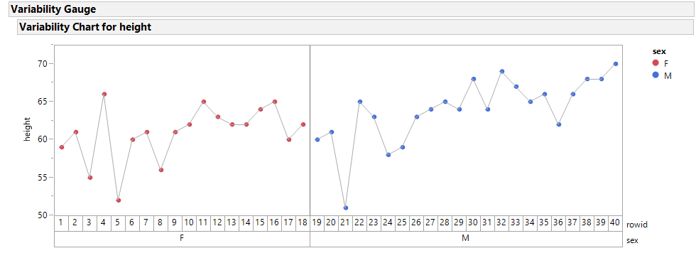
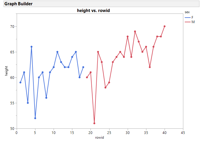
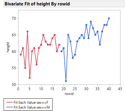
This is an extension of @txnelson and @gianpaolo suggestions.
- Sort your data by your grouping ( gender )
- Add a sequence column call it rowid which is just the row number (this is needed for GraphBuilder)
Below are 3 examples
- Variability which has only one connection color,
- GraphBuilder allows different colored connectors but can be combersome if you want a true overlay with an X-axis like datetime
- Bivariate with GroupBy allows colored connectors to match the group points, and here if you wanted x to be the original row order (like a Date axis) where the groups are spread, the graph will produce a true overlay
- Mark as New
- Bookmark
- Subscribe
- Mute
- Subscribe to RSS Feed
- Get Direct Link
- Report Inappropriate Content
Re: how to plot an overlay variability chart
Thanks guys. Sorry, I didn't make it clear. Is there any possible way to plot like this?
- Mark as New
- Bookmark
- Subscribe
- Mute
- Subscribe to RSS Feed
- Get Direct Link
- Report Inappropriate Content
Re: how to plot an overlay variability chart
I wasn't sure about Score 1 and Score 2. I assumed that the two scores provides the range for your error bars. That means I stacked the Score columns first. For the Name column I turned on the Row Order Levels property so that JMP would plot them in the order they appear in the data table.
At the graph builder I drug the Name to the X-axis. I drug the Score column to the Y-axis. I changed the statistic to be the Mean with an Error Bar using the Range. I then drug the Gender column to the Overlay field and added the connector line. Results look like below. The JSL is below the graph.
Graph Builder(
	Size( 528, 465 ),
	Show Control Panel( 0 ),
	Variables( X( :Name ), Y( :Score ), Overlay( :Gender ) ),
	Elements(
		Points(
			X,
			Y,
			Legend( 5 ),
			Summary Statistic( "Mean" ),
			Error Bars( "Range" )
		),
		Line( X, Y, Legend( 6 ) )
	),
	SendToReport(
		Dispatch(
			{},
			"400",
			ScaleBox,
			{Legend Model(
				5,
				Base( 0, 0, 0, Item ID( "F", 1 ) ),
				Base( 1, 0, 0, Item ID( "M", 1 ) )
			)}
		),
		Dispatch( {}, "Graph Builder", FrameBox, {Marker Size( 6 )} )
	)
);
- Mark as New
- Bookmark
- Subscribe
- Mute
- Subscribe to RSS Feed
- Get Direct Link
- Report Inappropriate Content
Re: how to plot an overlay variability chart
Thanks Dan! It works! A further question. How I can I generate group plot in graph builder. Similar example as above
Name Gender Score1 Score2 Class
Jason M 98 87 1
Alice F 67 78 1
John M 70 89 2
Emma F 89 79 2
Patrick 65 98 1
Jennifer 76 65 1
Dan 100 99 2
Wendy 78 84 2
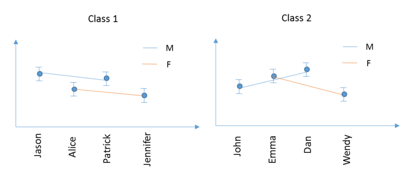
Would like generate 2 plots by class, just like when you using group in varibility plot:
Further more, if I have 3 varibales for grouping, such as class, area, school, so I would like to have 2x2x2=8 seperate plots, just like we use the group function in varibility plot.
- Mark as New
- Bookmark
- Subscribe
- Mute
- Subscribe to RSS Feed
- Get Direct Link
- Report Inappropriate Content
Re: how to plot an overlay variability chart
- Mark as New
- Bookmark
- Subscribe
- Mute
- Subscribe to RSS Feed
- Get Direct Link
- Report Inappropriate Content
Re: how to plot an overlay variability chart
Thanks Jim. Is it possible to create 2 seperate plots instead squeezing all data in 1 plot? . If I have 3 varibales for grouping, such as class, area, school, so I would like to have 2x2x2=8 seperate plots, just like we use the group function in varibility plot.
- Mark as New
- Bookmark
- Subscribe
- Mute
- Subscribe to RSS Feed
- Get Direct Link
- Report Inappropriate Content
Re: how to plot an overlay variability chart
Recommended Articles
- © 2026 JMP Statistical Discovery LLC. All Rights Reserved.
- Terms of Use
- Privacy Statement
- Contact Us


