- New to JMP? Let the Data Analysis Director guide you through selecting an analysis task, an analysis goal, and a data type. Available now in the JMP Marketplace!
- See how to install JMP Marketplace extensions to customize and enhance JMP.
- Subscribe to RSS Feed
- Mark Topic as New
- Mark Topic as Read
- Float this Topic for Current User
- Bookmark
- Subscribe
- Mute
- Printer Friendly Page
Discussions
Solve problems, and share tips and tricks with other JMP users.- JMP User Community
- :
- Discussions
- :
- Re: Stacked bar - show % contribution of each column (using Graph builder)
- Mark as New
- Bookmark
- Subscribe
- Mute
- Subscribe to RSS Feed
- Get Direct Link
- Report Inappropriate Content
Stacked bar - show % contribution of each column (using Graph builder)
Dear all,
I am struggling in making a graph using the graph builder for something that is probably fairly easy…
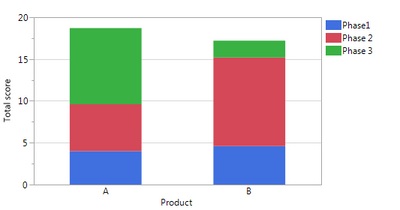
I have the following fictional dataset, with 2 products A and B and for each of them a score in 3 categories/phases. This can easily be shown with a stacked bar.
FIG1:
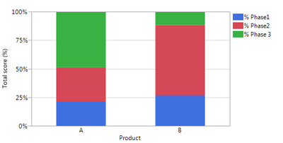
Now I want to see the results in % contributions to the total score each product has. I know I can do this by first summing the 3 columns Phase 1->3, and then divide the Phase1 score by this total etc, as I now manually did in the table. And then again, you can make a stacked bar to get the graph I need.
FIG2:
So this definitely works. However, I now have a whole lot of columns to analyse, so manually dividing each column by the total seems like a big hurdle… Is there any fast way of converting FIG1 into FIG2??
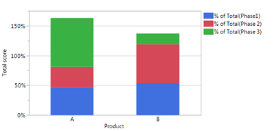
I already tried with changing “summary statistic = % of total” in FIG1, but then my total is not 100% as shown in FIG3, so I think this gives me the % of total per column, while I want % of total per row (for those columns displayed in the chart).
Many thanks for your tips!
Yanne
Accepted Solutions
- Mark as New
- Bookmark
- Subscribe
- Mute
- Subscribe to RSS Feed
- Get Direct Link
- Report Inappropriate Content
Re: Stacked bar - show % contribution of each column (using Graph builder)
Hi @yanne,
As you have discovered, to make this plot in Graph Builder you will need to create the % of total formula columns. I have to do this sort of thing pretty often (calculate % of total columns for a set of columns in a data table) and to streamline the process I put together a simple Add-in to do it. I just uploaded that Add-in to the file exchange here:
I hope this helps!
Julian
- Mark as New
- Bookmark
- Subscribe
- Mute
- Subscribe to RSS Feed
- Get Direct Link
- Report Inappropriate Content
Re: Stacked bar - show % contribution of each column (using Graph builder)
Hello Yanne ,
You can probably try something like this , I proceed with a couple of assumptions here
Assumptions:
1. You capture the data table and its reference is "dt"
dt = Current Data Table();
ColNames = Get Column Names("String");
Mat = dt << Get As Matrix(); // Get the numeric data out of the data table
ColSum = VSum(Transpose(Mat));
dt << New Column("Totals",Numeric,Continuous,Set Values(ColSum));
for( i = 1 , i <= N Items(ColNames), i ++,
If (i == 1,
continue(); // assuming column 1 is always the product name
,
Col = Column(i);
Num = Col << Get Values();
Col = Column("Totals");
Den = Col << Get Values();
ValuesToSet = E Div(Num,Den);
dt << New Column("%" || ColNames[i] ,Numeric,Continuous,Set Values(ValuesToSet ) );
);
);
This should solve the problem of getting % contributions for any number of variables. If you need the variable names for plotting , you can again re-run the "Get Column Names" and the plotting script you have in place will tackle the rest .
Best
Uday
Uday
- Mark as New
- Bookmark
- Subscribe
- Mute
- Subscribe to RSS Feed
- Get Direct Link
- Report Inappropriate Content
Re: Stacked bar - show % contribution of each column (using Graph builder)
Hi @yanne,
As you have discovered, to make this plot in Graph Builder you will need to create the % of total formula columns. I have to do this sort of thing pretty often (calculate % of total columns for a set of columns in a data table) and to streamline the process I put together a simple Add-in to do it. I just uploaded that Add-in to the file exchange here:
I hope this helps!
Julian
- Mark as New
- Bookmark
- Subscribe
- Mute
- Subscribe to RSS Feed
- Get Direct Link
- Report Inappropriate Content
Re: Stacked bar - show % contribution of each column (using Graph builder)
Dear Julian,
Many thanks for this add-in! this is exactly what I needed!!!
Many many thanks!!! You make my day as I too have to calculate this % pretty often, and for many different tables and columns, so this really makes my life so much easier!
Great add-in! thanks!!
Yanne
- Mark as New
- Bookmark
- Subscribe
- Mute
- Subscribe to RSS Feed
- Get Direct Link
- Report Inappropriate Content
Re: Stacked bar - show % contribution of each column (using Graph builder)
Hi Julian.
I am trying to solve a similar problem however my data is not numeric. I am trying to graph %survival by species. So, I have a categorical columns: alive/dead (a or d), sampling period (initial or final) and species (acru, qubi, or tadi). I want to show the percent living for each species at the end of the experiment.
Looks like your add-in requires numbers... any suggestions for how to create the graph using catergorical data?
Thanks
Diane
- Mark as New
- Bookmark
- Subscribe
- Mute
- Subscribe to RSS Feed
- Get Direct Link
- Report Inappropriate Content
Re: Stacked bar - show % contribution of each column (using Graph builder)
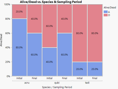
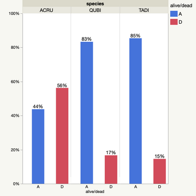
Are you looking for something like this:
No add-in was needed for this mosaic plot. I have included my mocked-up data with the script that Graph Builder created. This was about 5 steps and totally interactive.
1) Drag Species to the x-axis.
2) Drag Sampling Period inside the x-axis frame to nest it within species.
3) Drag Alive/Dead to the Y-axis
4) Change the plotting element to mosaic plot.
5) In the control panel area, change from No Labels to Label by Percent.
- Mark as New
- Bookmark
- Subscribe
- Mute
- Subscribe to RSS Feed
- Get Direct Link
- Report Inappropriate Content
Re: Stacked bar - show % contribution of each column (using Graph builder)
Good morning Dan.
Thanks for your help with this....
Your suggestion is close - any way to get just a plot of alive or dead instead of both? My solution was similar to yours but I'd like to show only the percent of living (or percent dead) at end of the season for each species.
Thank you!
Diane
- Mark as New
- Bookmark
- Subscribe
- Mute
- Subscribe to RSS Feed
- Get Direct Link
- Report Inappropriate Content
Re: Stacked bar - show % contribution of each column (using Graph builder)
The problem is that without the Dead group, there is no way to know what the percentage is unless you calculate it beforehand. Think about it with your picture. You cannot possibly know the percentage alive unless you also know the percentage dead. So, if you want JMP to calculate it automatically, get a bar for the Dead also. If you are okay with doing some of the calculations, then you will need to create a column with the percentage that you want.
This is partially why I chose the Mosaic plot. It automatically "stacks" the alive and dead bars so it mimics a traditional bar chart, but no calculations are necessary.
But, here is how you can do it. Note that there are multiple ways to do this, I am choosing one that will not require you write any formulas. I will also be ignoring the Sampling Period since you did in your graph, and using the sample table I included in an earlier post.
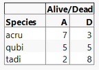
Choose Analyze > Tabulate.
Drag Alive/Dead to the Drop zone for columns.
Drag Species into the Drop zone for rows (the label will disappear, but remember the location. It will be the left-most box of the table).
You should see this:
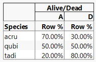
Now in the field with all of the statistics listed, drag Row % and drop into the middle of the table. Your table should now look like this:
From the red triangle menu at the top-left, choose Make Into Data Table.
You now have a data table with this information.
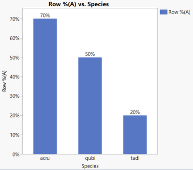
Go to Graph Builder.
Drag Species to the X-axis.
Drag Row %(A) to the Y-axis.
Change the graphing element to a bar chart.
I then changed the label to be Label by Value.
And click Done.
Lots could be done to make this prettier, but you have the basics.
- Mark as New
- Bookmark
- Subscribe
- Mute
- Subscribe to RSS Feed
- Get Direct Link
- Report Inappropriate Content
Re: Stacked bar - show % contribution of each column (using Graph builder)
I recognize that without having both alive and dead the percent total can't be calculated I was just hoping there was some way to force graph builder to do it without modifying my table by adding calculations (as a new user, seemed way to difficult). I did use tabulate to calculate the percents but didn't consider going the step further and making a graph from that - I will!
Thanks again
Diane
Recommended Articles
- © 2026 JMP Statistical Discovery LLC. All Rights Reserved.
- Terms of Use
- Privacy Statement
- Contact Us

