- New to JMP? Let the Data Analysis Director guide you through selecting an analysis task, an analysis goal, and a data type. Available now in the JMP Marketplace!
- See how to install JMP Marketplace extensions to customize and enhance JMP.
- Subscribe to RSS Feed
- Mark Topic as New
- Mark Topic as Read
- Float this Topic for Current User
- Bookmark
- Subscribe
- Mute
- Printer Friendly Page
Discussions
Solve problems, and share tips and tricks with other JMP users.- JMP User Community
- :
- Discussions
- :
- Re: Shading X regions in Graph Builder
- Mark as New
- Bookmark
- Subscribe
- Mute
- Subscribe to RSS Feed
- Get Direct Link
- Report Inappropriate Content
Shading X regions in Graph Builder
I would like to adapt the two graphs in the attached file to have vertical bars highlighting the Holiday regions (shown in the Holiday column). As an example of what I want, see https://www.asc.upenn.edu/sites/default/files/styles/1200w/public/2022-12/1999-2021_avg_sui_per_mont.... If someone can provide a script, that would be great, but I am also interested if there is a way to do it using the built in capabilities in Graph Builder.
Accepted Solutions
- Mark as New
- Bookmark
- Subscribe
- Mute
- Subscribe to RSS Feed
- Get Direct Link
- Report Inappropriate Content
Re: Shading X regions in Graph Builder
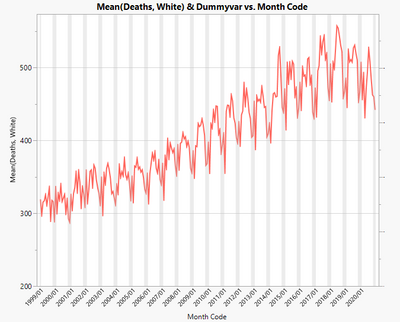
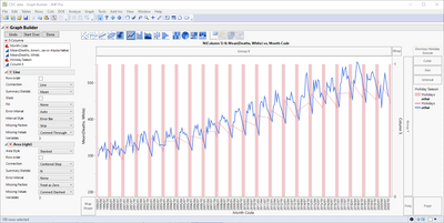
I think this is very close to what you want. I added a "Dummyvar" column to your data that is just a 1 for the holiday months, and empty otherwise. Then, I was able to create the graph entirely using the GUI (the secret was adding this dummyvar column, then moving it to the right axis and changing it to a bar chart, then adjusting that axis to make the bars go all the way to the top. Data table attached, with script saved to data table.
- Mark as New
- Bookmark
- Subscribe
- Mute
- Subscribe to RSS Feed
- Get Direct Link
- Report Inappropriate Content
Re: Shading X regions in Graph Builder
Both Solutions from Jarmo and Jed are great with coding and dummy variables element solutions...great solutions!
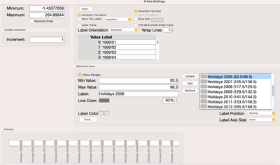
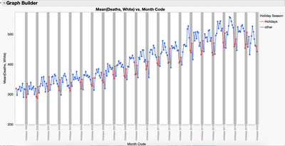
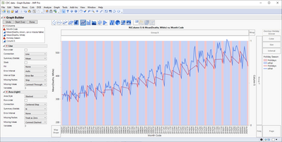
Another less elegant way of doing this is to use a pattern of axis range shading. While pretty manual at first to set up (or script), it does give you nice labeling and other features that can make the shaded areas "pop" a little more to the views. This can be set up though the axis setting GUI or through direct scripting in Graph Builder. Attached my updated version of the data: CDC Axis Range Shading Data.jmp.
This type of shading was also used a few times to make the horizontal lanes in JMP Graph Builder Gant Charts easier to visualize and can be seen in this blog: Best of Pictures from the Gallery.
- Mark as New
- Bookmark
- Subscribe
- Mute
- Subscribe to RSS Feed
- Get Direct Link
- Report Inappropriate Content
Re: Shading X regions in Graph Builder
I think this is very close to what you want. I added a "Dummyvar" column to your data that is just a 1 for the holiday months, and empty otherwise. Then, I was able to create the graph entirely using the GUI (the secret was adding this dummyvar column, then moving it to the right axis and changing it to a bar chart, then adjusting that axis to make the bars go all the way to the top. Data table attached, with script saved to data table.
- Mark as New
- Bookmark
- Subscribe
- Mute
- Subscribe to RSS Feed
- Get Direct Link
- Report Inappropriate Content
Re: Shading X regions in Graph Builder
Excellent! Just what I wanted. Another example that answers are not as important a skill as questions (sure I wish I knew how to do it myself, but getting other people to solve the problem is almost as good).
- Mark as New
- Bookmark
- Subscribe
- Mute
- Subscribe to RSS Feed
- Get Direct Link
- Report Inappropriate Content
Re: Shading X regions in Graph Builder
Thanks @Jed_Campbell for this elegant solution.
What a brilliant idea to use a dummy variable on the second Y axis and a bar graph to switch the shading on and off.
Then the user has still all the flexibility in the original graph.
Alternative approach:
Use the dummy variable as color for a Heatmap, like @John_Powell_JMP suggested some years ago for a similar task:
The disadvantage: one has to fiddle around with the variables (no Y variable for the Heatmap, don't use the Color/dummyVariable for the main plot)
The benefit: one doesn't have to fiddle around with the second axis (remove the grid lines etc)
Which approach is better?
Depends on the application case.
If there is just a single weekend to be shaded, a reference line on the X axis can also do the job ;).
@dale_lehman
I am curious which of the three solutions you had in mind when posting the question - or even better: a fourth one?
Nevertheless, thanks for the question which added a wonderful solution to the community collection.
Graph Builder(
	Size( 937, 401 ),
	Show Control Panel( 0 ),
	Show Legend( 0 ),
	Summary Statistic( "Median" ),
	Graph Spacing( 4 ),
	Variables( X( :Month Code ), Y( :"Mean(Deaths, White)"n ), Color( :Dummyvar ) ),
	Elements( Heatmap( X, Legend( 37 ) ), Points( X, Y, Color( 0 ), Legend( 38 ) ) ),
	SendToReport(
		Dispatch(
			{},
			"400",
			ScaleBox,
			{Legend Model(
				37,
				Properties( 0, {Transparency( 0.2 )}, Item ID( "Dummyvar", 1 ) )
			)}
		)
	)
);
- Mark as New
- Bookmark
- Subscribe
- Mute
- Subscribe to RSS Feed
- Get Direct Link
- Report Inappropriate Content
Re: Shading X regions in Graph Builder
The approach via Heatmap would be really great - if it did not "block" the color attribute ....
But wait, really? Let's try ...
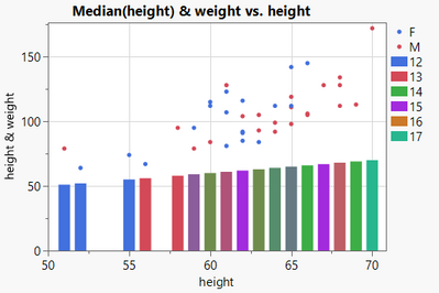
This is amazing - multiple color settings possible for different plot types?
How could I miss this opportunity all the time !!!
Synergies:
https://community.jmp.com/t5/Discussions/Graph-Builder-subplot-with-different-color-settings/m-p/597...
Names Default to Here(1);
dt = Open( "$SAMPLE_DATA/Big Class.jmp" );
Graph Builder(
	Show Control Panel( 0 ),
	Variables(
		X( :height ),
		Y( :height ),
		Y( :weight, Position( 1 ) ),
		Color( :sex ),
		Color( :age )
	),
	Elements(
		Points( X, Y( 2 ), Color( 1 ) ),
		Bar( X, Y( 1 ), Color( 2 ) )
	)
)
- Mark as New
- Bookmark
- Subscribe
- Mute
- Subscribe to RSS Feed
- Get Direct Link
- Report Inappropriate Content
Re: Shading X regions in Graph Builder
You can build graph like this with just Graph Builder, but it is a bit annoying.
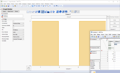
I have created additional column (Column 5) with all values as 1. Then I have moved it to right side and and user Area chart for it. Key thing is to use "Treat as Zero" for Missing Factors (if you want to hide other regions from areas, set their transparency to 0).
You need to add Column 5 for script below to work
Graph Builder(
	Size(1141, 600),
	Variables(
		X(:Month Code),
		Y(:Column 5, Side("Right")),
		Y(:"Mean(Deaths, White)"n, Position(1)),
		Overlay(:Holiday Season)
	),
	Elements(
		Line(X, Y(2), Legend(7)),
		Area(
			X,
			Y(1),
			Legend(6),
			Connection("Centered Step"),
			Summary Statistic("N"),
			Error Interval("None"),
			Missing Factors("Treat as Zero"),
			Missing Values("Connect Dashed")
		)
	),
	SendToReport(
		Dispatch(
			{},
			"400",
			ScaleBox,
			{Legend Model(
				6,
				Properties(0, {Transparency(0.3)}, Item ID("Holidays", 1)),
				Properties(1, {Transparency(0)}, Item ID("other", 1))
			)}
		),
		Dispatch(
			{},
			"400",
			LegendBox,
			{Legend Position({7, [2, 3], 6, [0, 1, -3, -3]})}
		)
	)
)
There are also other ways of building something like this, here is a list of few of them
- You can script it with Graphic Script
- You can duplicate the data to include start/end-time for each period and use line char (other chars might also work)
Maybe @scwise has more ideas?
- Mark as New
- Bookmark
- Subscribe
- Mute
- Subscribe to RSS Feed
- Get Direct Link
- Report Inappropriate Content
Re: Shading X regions in Graph Builder
Both Solutions from Jarmo and Jed are great with coding and dummy variables element solutions...great solutions!
Another less elegant way of doing this is to use a pattern of axis range shading. While pretty manual at first to set up (or script), it does give you nice labeling and other features that can make the shaded areas "pop" a little more to the views. This can be set up though the axis setting GUI or through direct scripting in Graph Builder. Attached my updated version of the data: CDC Axis Range Shading Data.jmp.
This type of shading was also used a few times to make the horizontal lanes in JMP Graph Builder Gant Charts easier to visualize and can be seen in this blog: Best of Pictures from the Gallery.
- Mark as New
- Bookmark
- Subscribe
- Mute
- Subscribe to RSS Feed
- Get Direct Link
- Report Inappropriate Content
Re: Shading X regions in Graph Builder
I am marking this as a solution as well. It may be more labor intensive than the others, but this is intuitively straightforward. I didn't realize that the use of ranges and shading for reference 'lines' would produce the bars that I want. This is the simplest to understand for me.
Recommended Articles
- © 2026 JMP Statistical Discovery LLC. All Rights Reserved.
- Terms of Use
- Privacy Statement
- Contact Us


