- New to JMP? Let the Data Analysis Director guide you through selecting an analysis task, an analysis goal, and a data type. Available now in the JMP Marketplace!
- See how to install JMP Marketplace extensions to customize and enhance JMP.
- Subscribe to RSS Feed
- Mark Topic as New
- Mark Topic as Read
- Float this Topic for Current User
- Bookmark
- Subscribe
- Mute
- Printer Friendly Page
Discussions
Solve problems, and share tips and tricks with other JMP users.- JMP User Community
- :
- Discussions
- :
- Re: Selection on One Graph changes Another Graph
- Mark as New
- Bookmark
- Subscribe
- Mute
- Subscribe to RSS Feed
- Get Direct Link
- Report Inappropriate Content
Selection on One Graph changes Another Graph
Is is possible in JSL to make a second graph alter its appearance dependant on the selection in another graph?
For instance, if my first graph is Appetizer, and the user selects a salad, I want my second graph to display wines that would pair nicely. I guess this would be like the first graph acting like a Local Data Filter for the second graph.
Thanks
Accepted Solutions
- Mark as New
- Bookmark
- Subscribe
- Mute
- Subscribe to RSS Feed
- Get Direct Link
- Report Inappropriate Content
Re: Selection on One Graph changes Another Graph
Here is an example from
Help==>Scripting Index=>Data Filter Source Box
that does what you want
Names Default To Here( 1 );
dt = Open( "$SAMPLE_DATA/Big Class.jmp" );
New Window( "Selection Filter",
	Data Filter Context Box(
		H List Box(
			Data Filter Source Box(
				Graph Builder(
					Size( 208, 207 ),
					Show Control Panel( 0 ),
					Show Legend( 0 ),
					Variables( X( :age ) ),
					Elements( Bar( X, Legend( 3 ) ) ),
					SendToReport(
						Dispatch(
							{},
							"Graph Builder",
							OutlineBox,
							{Set Title( "Filter" )}
						)
					)
				)
			),
			Platform(
				Current Data Table(),
				Bubble Plot(
					X( :weight ),
					Y( :height ),
					Sizes( :age ),
					Title Position( 0, 0 )
				)
			)
		)
	)
);- Mark as New
- Bookmark
- Subscribe
- Mute
- Subscribe to RSS Feed
- Get Direct Link
- Report Inappropriate Content
Re: Selection on One Graph changes Another Graph
Could there be several nested local filters together, each one further limiting the scope of the data?
Thanks
- Mark as New
- Bookmark
- Subscribe
- Mute
- Subscribe to RSS Feed
- Get Direct Link
- Report Inappropriate Content
Re: Selection on One Graph changes Another Graph
The local data filter has a 'Conditional' option from the red triangle which might be what you want. However, if you mean hierarchical filtering by selections in a graph, then, yes, the example used by Jim above could be extended. Also Dashboard Builder has a two-level graphical filter as a pre-defined template.
- Mark as New
- Bookmark
- Subscribe
- Mute
- Subscribe to RSS Feed
- Get Direct Link
- Report Inappropriate Content
Re: Selection on One Graph changes Another Graph
If you have JMP 13, you could also consider using one of the templates in 'File > New Dashboard' which will do all the work for you.
- Mark as New
- Bookmark
- Subscribe
- Mute
- Subscribe to RSS Feed
- Get Direct Link
- Report Inappropriate Content
Re: Selection on One Graph changes Another Graph
Still trying to figure out the difference between a Dashboard and an Application. I think this is an area where JMP could do A LOT better on documentation and expansion of the software!
- Mark as New
- Bookmark
- Subscribe
- Mute
- Subscribe to RSS Feed
- Get Direct Link
- Report Inappropriate Content
Re: Selection on One Graph changes Another Graph
In terms of the functionality that can be accesssed or constructed, Application Builder offers a superset of Dashboard Builder. But the way this functionality is used is different, in the sense that Dashboard Builder is intended to require no coding at all (hence the template gallery). If you do 'File > New > New Application', you will also see the Dashboard Builder templates, but a lot more besides. As a rule, if Dashboard Builder can do what you want, it's probably easiest to use that.
Could you ellaborate on what you mean by 'expansion of the software', please?
- Mark as New
- Bookmark
- Subscribe
- Mute
- Subscribe to RSS Feed
- Get Direct Link
- Report Inappropriate Content
Re: Selection on One Graph changes Another Graph
I wish I had enough time to describe my ideas on this.
I would like to see the ability to have multiple graphs/tables in a grid format, but with the ability to span multiple columns or rows of the grid. The ability for edges of items to snap to one another would be nice. Another thing is multi-tiered filtering - I love how with multiple graphs JMP highlights across all of them, but I want to be able to have several layers of "local filters", where with each successive selection, the following graphs subset or change.
The dashboards could also be publishable to a website.
There could be significantly more written about these Builders to just explain them to the users of the software, as they are far from intuitive.
Just my two cents.
- Mark as New
- Bookmark
- Subscribe
- Mute
- Subscribe to RSS Feed
- Get Direct Link
- Report Inappropriate Content
Re: Selection on One Graph changes Another Graph
Dashboard layouts are supported and perserved when saving JMP reports as interactive HTML in JMP 13. On Windows, select File > Save As and select Interactive HTML with Data from the Save as type list. On Macintosh, select File > Export > Interactive HTML with Data.
You can see a set of example dashboards published as interactive HTML with data on the dashboards page on jmp.com.
If you want to create an index page of dashboards you can also investigate the View > Create Web Report functionality.
Thank you for the suggestions on improving the snap to grid capabilities of dashboards in the future. It's something that we will consider improving for sure. In the mean time, there is a mode of a running dashboard called summary view (Dashboard LIRT > Report View > Summary), which helps to simplify the layout of the embedded reports in a dashboard and also makes all panes of the dashboard stretchable, even when the platform is not stretchable in the standalone platform (e.g. Distribution).
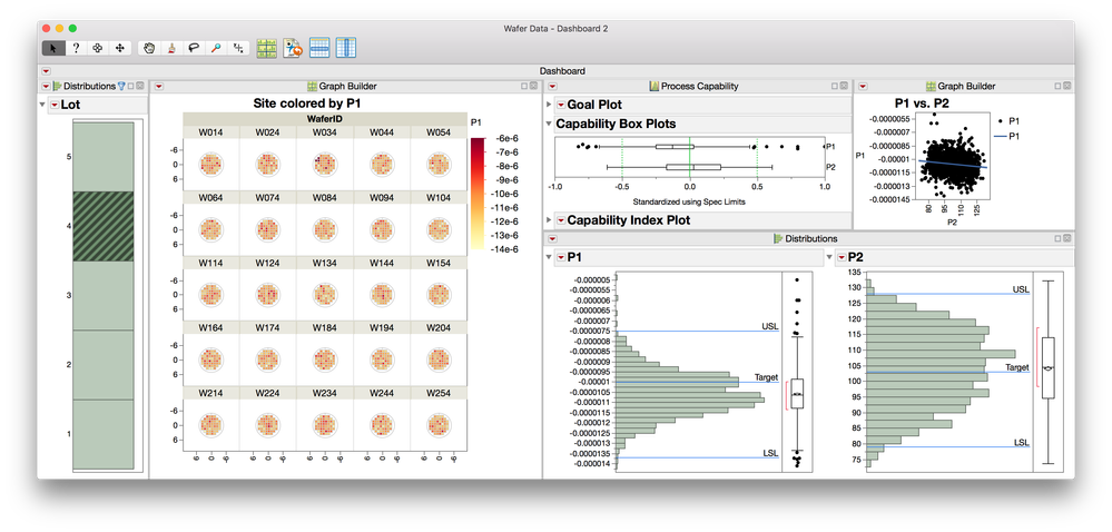
Attached is an example screenshot of a dashboard using the Filter + 1 template from the Dashboard Builder. This dashboard is in summary mode and the three graphs line up in columns. The distribution of 'lot' acts as a selection filter, where selection in the one graph cause a local data filter effect on the Graph Builder graph as well as the two statistical platform outputs from Process Capability and Distribution "downstream".
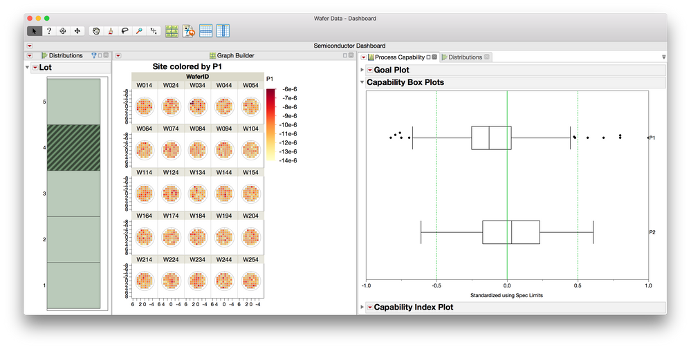
- Mark as New
- Bookmark
- Subscribe
- Mute
- Subscribe to RSS Feed
- Get Direct Link
- Report Inappropriate Content
Re: Selection on One Graph changes Another Graph
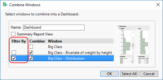
@Daniel_Valente shows how to create grid views and single-level filters in the Dashboard Builder. You might also consider using Combine Windows to create your initial grid - arrange the windows roughly on the screen and select the menu item Windows > Combine Windows. The resulting dialog has an option to choose a single report as a filter for the other reports:
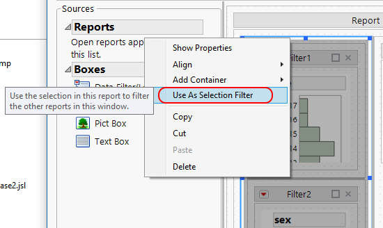
Within the Dashboard Builder, you can also create hierarchical filters similar to what you describe as 'layers'. Start by selecting a container (in this case Splitter Box) that holds all of the filter reports, right-click, and choose 'Use As Selection Filter".
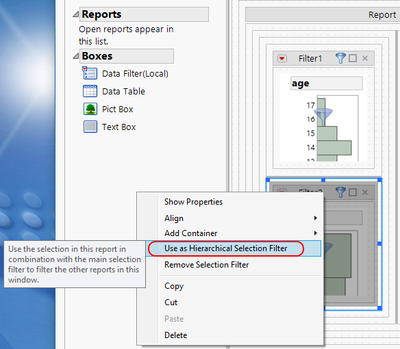
Next, select a box within that filter to choose the next layer of the filter, right-click, and choose 'Use As Hierarchical Selection Filter'.
You do have to arrange the reports in a manner that supports the layering that you want to accomplish. Similar examples are also presented in the Using Selection Filters in JMP 12.
Recommended Articles
- © 2026 JMP Statistical Discovery LLC. All Rights Reserved.
- Terms of Use
- Privacy Statement
- Contact Us


