This website uses Cookies. Click Accept to agree to our website's cookie use as described in our Privacy Policy. Click Preferences to customize your cookie settings.
- JMP User Community
- :
- Discussions
- :
- Plotting censored values in a Life Distribution
Turn on suggestions
Auto-suggest helps you quickly narrow down your search results by suggesting possible matches as you type.
Topic Options
- Subscribe to RSS Feed
- Mark Topic as New
- Mark Topic as Read
- Float this Topic for Current User
- Bookmark
- Subscribe
- Printer Friendly Page

Level IV
- Mark as New
- Bookmark
- Subscribe
- Mute
- Subscribe to RSS Feed
- Get Direct Link
- Report Inappropriate Content
Plotting censored values in a Life Distribution
Mar 23, 2015 11:10 AM
(14278 views)
I am building a model using the Life Distribution tool and get a nice plot that shows my failures. Other tools I've used will allow me to plot my censored data, or suspensions, on top of this plot, but I cannot seem to figure out how to do it in JMP. Has anyone figured out how to add the censored data in? Using JSL to do this would be perfectly acceptable too, if anyone knows how to add this in.
11 REPLIES 11

Staff
- Mark as New
- Bookmark
- Subscribe
- Mute
- Subscribe to RSS Feed
- Get Direct Link
- Report Inappropriate Content
Re: Plotting censored values in a Life Distribution
Hi bradford.foulkes,
Does the Event Plot in Life Distribution plot the censored data in the manner that you're looking for?
Best,
Michael
open("$SAMPLE_DATA/Reliability/Fan.jmp");
Life Distribution( Y(:Time), Censor( :Censor ),
SendToReport(
Dispatch( {}, "Event Plot", OutlineBox, {Close( 0 )} ),
Dispatch( {}, "Compare Distributions", OutlineBox, {Close( 1 )} )
)
);
Michael Crotty
Sr Statistical Writer
JMP Development
Sr Statistical Writer
JMP Development
Level IV
- Mark as New
- Bookmark
- Subscribe
- Mute
- Subscribe to RSS Feed
- Get Direct Link
- Report Inappropriate Content
Re: Plotting censored values in a Life Distribution
Not quite, I'd almost like a combination of the two plots. The previous software we would use showed the events across the bottom of the chart at a risk of 0 to differentiate them from failures. I received the request to recreate that chart, and that's the only aspect I can't figure out. The idea is to be able to see very easily if we have censored values well past our suspensions or if the failures are on highest values.
Staff
- Mark as New
- Bookmark
- Subscribe
- Mute
- Subscribe to RSS Feed
- Get Direct Link
- Report Inappropriate Content
Re: Plotting censored values in a Life Distribution
Would it be possible to send a screenshot of what you're trying to recreate?
Michael Crotty
Sr Statistical Writer
JMP Development
Sr Statistical Writer
JMP Development
Level IV
- Mark as New
- Bookmark
- Subscribe
- Mute
- Subscribe to RSS Feed
- Get Direct Link
- Report Inappropriate Content
Re: Plotting censored values in a Life Distribution
Created:
Mar 23, 2015 03:19 PM
| Last Modified: Oct 18, 2016 06:54 PM
(13722 views)
| Posted in reply to message from michael_jmp 03-23-2015

This is what I'm trying to recreate, where the blue circles are the failures and the red triangles are the censored values
Level IV
- Mark as New
- Bookmark
- Subscribe
- Mute
- Subscribe to RSS Feed
- Get Direct Link
- Report Inappropriate Content
Re: Plotting censored values in a Life Distribution
Michael, what is really odd is that when I run a Life Distribution model on a segmented part of my population, it doesn't show the suspensions, but when I run it on all the data, the suspensions do show up. It seems that adding in a "By" or a "Where" column to my modeling makes the suspensions not show up, which is how I've been running these up to this point.
Staff
- Mark as New
- Bookmark
- Subscribe
- Mute
- Subscribe to RSS Feed
- Get Direct Link
- Report Inappropriate Content
Re: Plotting censored values in a Life Distribution
This is admittedly not the most robust or nicest looking script, but I think it should help you on your way toward getting a plot like you're looking for.
dt = open("$DOCUMENTS/Temp/JMP_EXAMPLE_TABLE.jmp");
cvec = (dt:Aging << get values)[dt << get rows where(:Censor=="S")];
ld = Life Distribution( Y( :Aging ), Censor( :Censor ), Censor Code( "S" ) );
rp = report(ld);
fb = rp["Compare Distributions"][FrameBox(1)];
buildexpr = expr(Glue());
for( i=1, i<=nrows(cvec), i++,
insertinto(buildexpr,evalexpr(Marker(1,{Expr(cvec[i]),0})))
);
nameexpr(buildexpr);
addexpr = expr(Add Graphics Script);
insertinto(addexpr,nameexpr(buildexpr));
nameexpr(addexpr);
finalexpr = expr(Send(fb));
insertinto(finalexpr,nameexpr(addexpr));
nameexpr(finalexpr);
eval(finalexpr);
Michael Crotty
Sr Statistical Writer
JMP Development
Sr Statistical Writer
JMP Development
Level IV
- Mark as New
- Bookmark
- Subscribe
- Mute
- Subscribe to RSS Feed
- Get Direct Link
- Report Inappropriate Content
Re: Plotting censored values in a Life Distribution
Michael, what is really odd is that when I run a Life Distribution model on a segmented part of my population, it doesn't show the suspensions, but when I run it on all the data, the suspensions do show up. It seems that adding in a "By" or a "Where" column to my modeling makes the suspensions not show up, which is how I've been running these up to this point.
Staff
- Mark as New
- Bookmark
- Subscribe
- Mute
- Subscribe to RSS Feed
- Get Direct Link
- Report Inappropriate Content
Re: Plotting censored values in a Life Distribution
I agree that does sound strange. Is there any way that you could share the data? I'd be interested to see if I can reproduce that behavior.
Regards,
Michael
Michael Crotty
Sr Statistical Writer
JMP Development
Sr Statistical Writer
JMP Development
Level IV
- Mark as New
- Bookmark
- Subscribe
- Mute
- Subscribe to RSS Feed
- Get Direct Link
- Report Inappropriate Content
Re: Plotting censored values in a Life Distribution
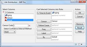
Michael, when I load it like this, I only get failures to show on the plot. If I remove the “By” value, everything shows up. I’ve attached a document with some data that this is happening on too, so I’ll be curious to see if you can recreate it.
Brad
- © 2024 JMP Statistical Discovery LLC. All Rights Reserved.
- Terms of Use
- Privacy Statement
- About JMP
- JMP Software
- JMP User Community
- Contact