- New to JMP? Let the Data Analysis Director guide you through selecting an analysis task, an analysis goal, and a data type. Available now in the JMP Marketplace!
- See how to install JMP Marketplace extensions to customize and enhance JMP.
- Subscribe to RSS Feed
- Mark Topic as New
- Mark Topic as Read
- Float this Topic for Current User
- Bookmark
- Subscribe
- Mute
- Printer Friendly Page
Discussions
Solve problems, and share tips and tricks with other JMP users.- JMP User Community
- :
- Discussions
- :
- Multiple correspondence analysis
- Mark as New
- Bookmark
- Subscribe
- Mute
- Subscribe to RSS Feed
- Get Direct Link
- Report Inappropriate Content
Multiple correspondence analysis
I have produced some interesting multiple correspondent analysis graphs using a 600,000 case data set. The plots show products and issues fairly clearly for a small number of examples. I do not have control over the examples--or the number of them illustrated. I would like a few more. Most important, I would like to control the scale of the figures that are plotted. I want to move the extreme points out to break apart the overlaps between near concepts. Presumably, if I had access to the actual material plotted, I could transform the axes, stretching the ends. Does anyone have insight into how to access the coordinates? When I try to use the coordinates as saved, I cannot seem to reproduce the two-dimensional plot.
Thanks
Accepted Solutions
- Mark as New
- Bookmark
- Subscribe
- Mute
- Subscribe to RSS Feed
- Get Direct Link
- Report Inappropriate Content
Re: Multiple correspondence analysis
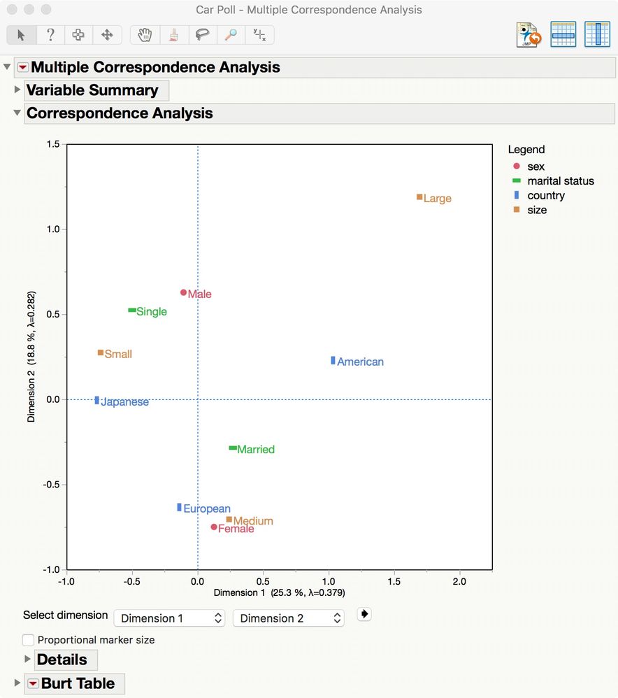
I have re-created the Car Poll example at the beginning of chapter 4 about Multiple Correspondence Analysis in the Consumer Research guide book for JMP 13:
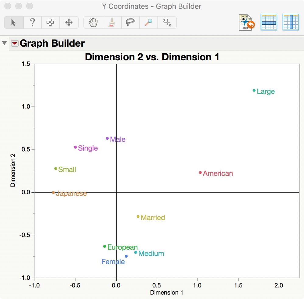
I used the Correspondence Analysis > Save Coordinates command in the red triangle menu at the top to produce the same plot in Graph Builder. I used Rows > Color or Mark by Column and then manually adjusted the axes (scaling, add reference lines at 0) to finish:
So you should be able to re-produce the same plot as well. We can walk through the steps here or you can study this platform on your own with the guide book (select Help > Books > Consumer Research).
The MCA method is also known among the myriad multi-dimensional scaling methods as 'optimal scaling.' I am not sure what you mean when you say that you "want to move the extreme points out to break apart the overlaps between near concepts." The point of MCA is to show variable association between the individual levels. This plot is an analytical graphic and the coordinates are determined by the data based on their associations.
Note that you can manually drag the labels from their original positions if the plot is cluttered in one particular area where the associations are strong and they overlap.
Recommended Articles
- © 2026 JMP Statistical Discovery LLC. All Rights Reserved.
- Terms of Use
- Privacy Statement
- Contact Us


