- New to JMP? Let the Data Analysis Director guide you through selecting an analysis task, an analysis goal, and a data type. Available now in the JMP Marketplace!
- See how to install JMP Marketplace extensions to customize and enhance JMP.
- Subscribe to RSS Feed
- Mark Topic as New
- Mark Topic as Read
- Float this Topic for Current User
- Bookmark
- Subscribe
- Mute
- Printer Friendly Page
Discussions
Solve problems, and share tips and tricks with other JMP users.- JMP User Community
- :
- Discussions
- :
- Mixed Stacked and Side-by-side Bar Graph in JMP
- Mark as New
- Bookmark
- Subscribe
- Mute
- Subscribe to RSS Feed
- Get Direct Link
- Report Inappropriate Content
Mixed Stacked and Side-by-side Bar Graph in JMP
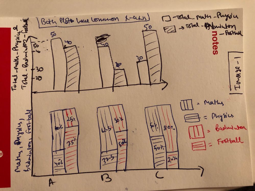
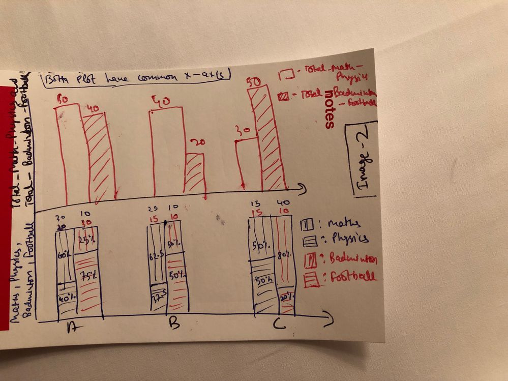
I have a data with all numerical values. How would I plot mixed of Mixed Stacked and Side-by-side Bar Graph in graph builder. I want to plots my graphs as shown in attached 2 images.
First image only shows the percentage of each variable in mixed of stacked and side-by-side bar plot but in Second images also shows the value of the variable as well.
If you can share the detailed procedure or JSL script, that would be great help.
Below is the sample data.
| Student | Total_Math_Physics | Maths | Physics | Total_Badminton_Football | Badminton | Football |
| A | 50 | 30 | 20 | 40 | 10 | 30 |
| B | 40 | 25 | 15 | 20 | 10 | 10 |
| C | 30 | 15 | 15 | 50 | 40 | 10 |
Thanks :)
- Mark as New
- Bookmark
- Subscribe
- Mute
- Subscribe to RSS Feed
- Get Direct Link
- Report Inappropriate Content
Re: Mixed Stacked and Side-by-side Bar Graph in JMP
- Mark as New
- Bookmark
- Subscribe
- Mute
- Subscribe to RSS Feed
- Get Direct Link
- Report Inappropriate Content
Re: Mixed Stacked and Side-by-side Bar Graph in JMP
Hi @Rajat
your question is a good one but i do not think JMP can do this on the fly.
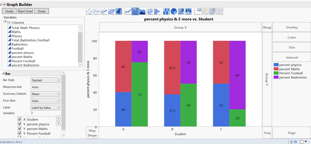
please see attached my file with the scripts to produce the output. my approach is more of a low-tech solution. i have added columns to calculate the shares for each subject and (fake) rows to allow for the side by side effect. once this is done i modified some things in the graph properties to complete the illusion.
please let us know if this is in the right direction.
ron
- Mark as New
- Bookmark
- Subscribe
- Mute
- Subscribe to RSS Feed
- Get Direct Link
- Report Inappropriate Content
Re: Mixed Stacked and Side-by-side Bar Graph in JMP
I posted only sample data. I have many more variable that just 4 as well as many observations. This approach might be very tedious to my original data set as it have lot of manual work.
- Mark as New
- Bookmark
- Subscribe
- Mute
- Subscribe to RSS Feed
- Get Direct Link
- Report Inappropriate Content
Re: Mixed Stacked and Side-by-side Bar Graph in JMP
Can We have different approach as data I have, has many variable as well as observations. It would be very tedious for me to modify data as per the posted approach.
- Mark as New
- Bookmark
- Subscribe
- Mute
- Subscribe to RSS Feed
- Get Direct Link
- Report Inappropriate Content
Re: Mixed Stacked and Side-by-side Bar Graph in JMP
Earlier you helped me bar plot doubt. Can you also please look into this?
Appreciate your help.
- Mark as New
- Bookmark
- Subscribe
- Mute
- Subscribe to RSS Feed
- Get Direct Link
- Report Inappropriate Content
Re: Mixed Stacked and Side-by-side Bar Graph in JMP
Hi @Rajat
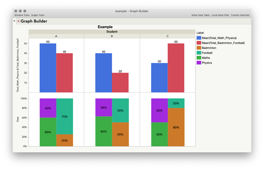
I think we can get pretty close to what you want with only a little bit of work:
I've attached the restructured data table with the saved script so you can look for yourself. Here's what I did:
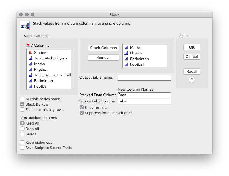
1. Stack your original table:
Current Data Table() << Stack(
	columns( :Maths, :Physics, :Badminton, :Football ),
	Source Label Column( "Label" ), Stacked Data Column( "Data" )
);
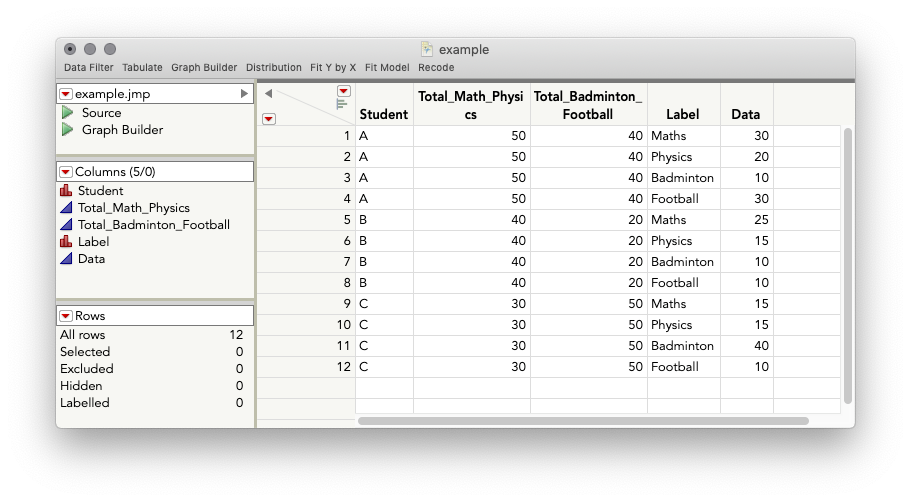
This gives the following:
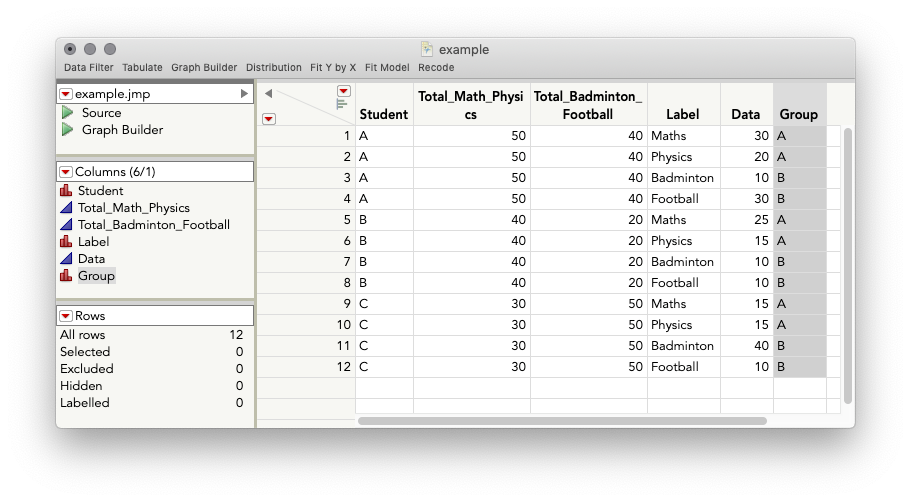
2. We need a variable that will let us split up the grouping of activity (maths/physics vs badminton/football), so I'll add a new column, Group, and iterate A-A-B-B-A-A-B-B, etc. You can do this any way you like, you just need a nominal variable. Here's another way with Sequence():
New Column("Group", Numeric, "Nominal", Formula(Sequence(1, 2, 1, 2)) );3. Graph Builder:
I tweaked a number of settings to get the graph looking the way I did, but here are the basic steps and a short video:
Steps:
- Drag "Data" column to Y role
- Drag both of the "Total" columns, at the same time, to the top of the Y drop zone
- Toggle off the points, and toggle on the Bar element
- Change the bar style for the lower graph, "Data," to "Stacked"
- Drag "Label" to the overlay role
- Under the controls for the top bars, turn off the overlay role under "Variables"
- Drag "Group" to the X axis role
- Turn off "Group" variable for upper plot in the control panel
- Drag "Student" to the Group X role
- Change "Summary Statistic" for the lower graph to "% of Factor" (I neglected to show this in the video)
- Change label to "Label by Value" for each bar
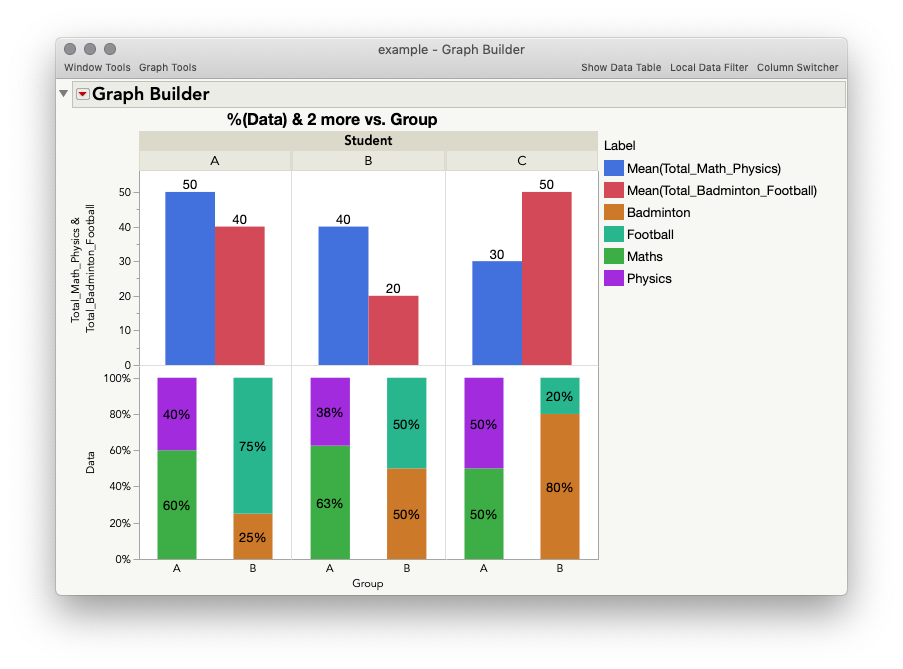
This gives:
From here you can do a lot. For the final graph I showed at the beginning, I also made some additions like changing the bar widths (right click a graph > customize), removed the X axis labels (double click axis and uncheck labels), and also changed the Graph Spacing (Red Triangle> Graph Spacing). Here is a script for the final graph:
Graph Builder(
	Size( 799, 566 ),
	Show Control Panel( 0 ),
	Graph Spacing( 2 ),
	Variables(
		X( :Group ),
		Y( :Total_Math_Physics ),
		Y( :Total_Badminton_Football, Position( 1 ) ),
		Y( :Data ),
		Group X( :Student ),
		Overlay( :Label )
	),
	Elements(
		Position( 1, 1 ),
		Bar( Y( 1 ), Y( 2 ), Overlay( 0 ), Legend( 5 ), Label( "Label by Value" ) )
	),
	Elements(
		Position( 1, 2 ),
		Bar(
			X,
			Y,
			Legend( 4 ),
			Bar Style( "Stacked" ),
			Summary Statistic( "% of Factor" ),
			Label( "Label by Value" )
		)
	),
	SendToReport(
		Dispatch(
			{},
			"Group",
			ScaleBox,
			{Min( -1.167069008972 ), Max( 2.147362067225 ), Inc( 1 ),
			Minor Ticks( 0 ), Label Row( Show Major Labels( 0 ) )}
		),
		Dispatch(
			{},
			"Total_Math_Physics",
			ScaleBox,
			{Min( 0.23109243697479 ), Max( 55 ), Inc( 10 ), Minor Ticks( 1 )}
		),
		Dispatch(
			{},
			"Data",
			ScaleBox,
			{Min( 0 ), Max( 1.1209749344709 ), Inc( 0.2 ), Minor Ticks( 0 )}
		),
		Dispatch( {}, "graph title", TextEditBox, {Set Text( "Example" )} ),
		Dispatch( {}, "X title", TextEditBox, {Set Text( "" )} ),
		Dispatch(
			{},
			"Graph Builder",
			FrameBox,
			{DispatchSeg( BarSeg( 1 ), Set Width Proportion( 0.6 ) )}
		),
		Dispatch(
			{},
			"Graph Builder",
			FrameBox( 2 ),
			{DispatchSeg( BarSeg( 1 ), Set Width Proportion( 1 ) )}
		),
		Dispatch(
			{},
			"Graph Builder",
			FrameBox( 3 ),
			{DispatchSeg( BarSeg( 1 ), Set Width Proportion( 0.6 ) )}
		),
		Dispatch(
			{},
			"Graph Builder",
			FrameBox( 4 ),
			{DispatchSeg( BarSeg( 1 ), Set Width Proportion( 1 ) )}
		),
		Dispatch(
			{},
			"Graph Builder",
			FrameBox( 5 ),
			{DispatchSeg( BarSeg( 1 ), Set Width Proportion( 0.6 ) )}
		),
		Dispatch(
			{},
			"Graph Builder",
			FrameBox( 6 ),
			{DispatchSeg( BarSeg( 1 ), Set Width Proportion( 1 ) )}
		)
	)
);
I hope this helps!
- Mark as New
- Bookmark
- Subscribe
- Mute
- Subscribe to RSS Feed
- Get Direct Link
- Report Inappropriate Content
Re: Mixed Stacked and Side-by-side Bar Graph in JMP
Only I wanted to put the student variable to the x-axis instead of using it as group by variable because my dataset have 60 observations for student variable and each observation have long name and if I put the name as groupby function,its name gets trimmed of and it gets very hard to understand the graph. But if I can put it on X-axis. I can make the name verticle.
If I put the student on X-Axis with Group variable, it shows me two same values for each group which is incorrect.
Once Again Thanks @jules
Really Appreciate your help :) :)
- Mark as New
- Bookmark
- Subscribe
- Mute
- Subscribe to RSS Feed
- Get Direct Link
- Report Inappropriate Content
Re: Mixed Stacked and Side-by-side Bar Graph in JMP
That makes perfect sense. But, as you discovered, variables used in the X-role behave a bit differently, and Graph Builder will plot both levels of the grouping variable for the top plot. Using the Group X gets around this, but unfortunately, there aren't controls for the label orientation for the Group X variables the same way there are for the Group Y, and X-axis roles. This could be a good item for the JMP Wish List! For now, the best advice I have is to shorten the labels if you can.
@jules
- Mark as New
- Bookmark
- Subscribe
- Mute
- Subscribe to RSS Feed
- Get Direct Link
- Report Inappropriate Content
Re: Mixed Stacked and Side-by-side Bar Graph in JMP
Recommended Articles
- © 2026 JMP Statistical Discovery LLC. All Rights Reserved.
- Terms of Use
- Privacy Statement
- Contact Us
