- New to JMP? Let the Data Analysis Director guide you through selecting an analysis task, an analysis goal, and a data type. Available now in the JMP Marketplace!
- See how to install JMP Marketplace extensions to customize and enhance JMP.
- Subscribe to RSS Feed
- Mark Topic as New
- Mark Topic as Read
- Float this Topic for Current User
- Bookmark
- Subscribe
- Mute
- Printer Friendly Page
Discussions
Solve problems, and share tips and tricks with other JMP users.- JMP User Community
- :
- Discussions
- :
- Linking data table with Scatterplot and question in RSM
- Mark as New
- Bookmark
- Subscribe
- Mute
- Subscribe to RSS Feed
- Get Direct Link
- Report Inappropriate Content
Linking data table with Scatterplot and question in RSM
Hi community,
I have two questions two; one jmp specific implementation question and the other on DOE strategic question.
I vaguely remember that there is a way to look at Scatterplot and data table more interactively.
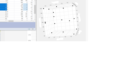
For instance, below I selected 4 rows that contain the variables on data table. I would like to have these conditions highlighted in the scatter plot on the right.
Another question is validation of model built from RSM. I was able to built pretty good predictive model through RSM.
I still want to validate this. Do you suggest to just pick random data points from design space to validate the model or use Augmentation?
Any pros and cons and something to consider on it?
Thank you all!
- Mark as New
- Bookmark
- Subscribe
- Mute
- Subscribe to RSS Feed
- Get Direct Link
- Report Inappropriate Content
Re: Linking data table with Scatterplot and question in RSM
I was using the surface profiler in fit least squares model. Included the data file.
- Mark as New
- Bookmark
- Subscribe
- Mute
- Subscribe to RSS Feed
- Get Direct Link
- Report Inappropriate Content
Re: Linking data table with Scatterplot and question in RSM
Thank you for sharing. I am not able to reproduce your results. With your table, running your Fit Least Squares script and adding the Surface Profiler gives me this:
I am running JMP 18.1, if you are running 18.0, maybe updating would fix the problem. If you are already running 18.1, you should probably contact Technical Support to truly figure out what is going on.
- Mark as New
- Bookmark
- Subscribe
- Mute
- Subscribe to RSS Feed
- Get Direct Link
- Report Inappropriate Content
Re: Linking data table with Scatterplot and question in RSM
Thanks! I will try JMP 18.1 to see if that helps!
- Mark as New
- Bookmark
- Subscribe
- Mute
- Subscribe to RSS Feed
- Get Direct Link
- Report Inappropriate Content
Re: Linking data table with Scatterplot and question in RSM
It appears to be a difference between running the surface profiler from the Fit Group red triangle or the individual Response red triangle. I'm not sure why that should be the case. As @Dan_Obermiller suggested, you can submit this to JMP Tech Support for further investigation if you like.
- Mark as New
- Bookmark
- Subscribe
- Mute
- Subscribe to RSS Feed
- Get Direct Link
- Report Inappropriate Content
Re: Linking data table with Scatterplot and question in RSM
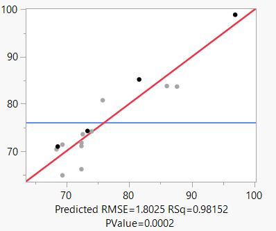
The Actual by Predicted Plot looks good! This result means that the model handles the training data well. Does the model generalize to new observations? I generally recommend using the prediction to find the best combination of factor settings and one or more combinations that should disappoint you. A good model should reproduce the response whether it is optimal or not. Also, I would replicate each combination about five times. Use the prediction interval, not the mean's confidence interval, to establish an equivalence range. Use equivalence testing to verify the model predictions.
- Mark as New
- Bookmark
- Subscribe
- Mute
- Subscribe to RSS Feed
- Get Direct Link
- Report Inappropriate Content
Re: Linking data table with Scatterplot and question in RSM
Thank you @Mark_Bailey
Yes I will take your suggestion to reproduce this with both the best and not optimal conditions.
You said "Use the prediction interval, not the mean's confidence interval, to establish an equivalence range. Use equivalence testing to verify the model predictions." I do not have statistical background and not fully grasp what this means.
Could you direct me to any tutorial or resources, if there is, for establishing an equivalence range and how to do it properly in JMP??
Thank you!
- Mark as New
- Bookmark
- Subscribe
- Mute
- Subscribe to RSS Feed
- Get Direct Link
- Report Inappropriate Content
Re: Linking data table with Scatterplot and question in RSM
I will illustrate the method using the Coffee Data data table in the Sample Data folder. I selected a model predicting coffee Strength from the Time and Charge factors.
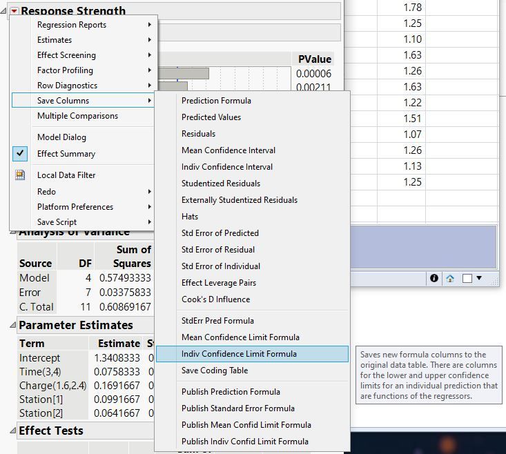
Click the red triangle at the top of Fit Least Squares (the window you show at the start of your discussion) and select Save Columns > Indiv Confidence Limit Formula.
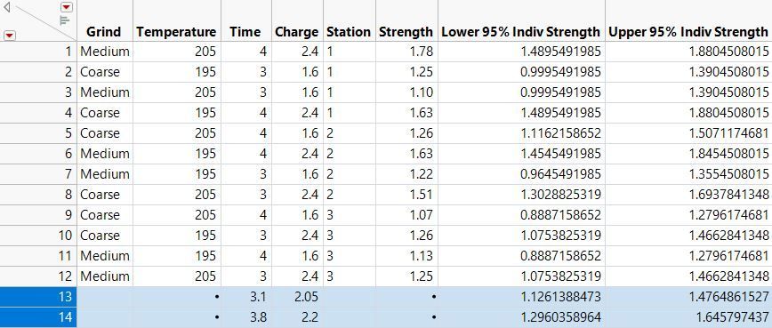
Determine the factor settings for which you want to verify the prediction. I chose settings predicted to yield the optimum and too strong responses. I enter those levels in two new rows of the original data table:
Note the target and tolerance for each condition.
| Condition | Target | Tolerance |
| Optimum | 1.30 | 0.175 |
| Too Strong | 1.47 | 0.175 |
The target is the predicted mean response from the Prediction Profiler or mid-point of the individual confidence interval. The tolerance is the half-width of the individual confidence interval.
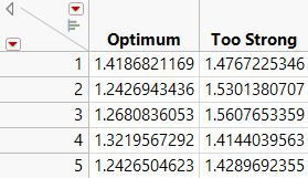
I conduct 5 runs for each condition and save the observed responses in a new data table:
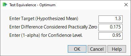
Select Analyze > Distribution and cast both data columns in the Y role. Click the red triangle next to Optimum and select Test Equivalence. Enter the target in the first box and the tolerance in the second box:
Click OK.
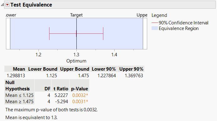
The mean is simultaneously significantly greater than the lower limit and less than the upper limit. These two one-sided tests (TOST) demonstrate that the 5 replicates under optimum conditions confirm the model's prediction. Do the same test for the other response.
- Mark as New
- Bookmark
- Subscribe
- Mute
- Subscribe to RSS Feed
- Get Direct Link
- Report Inappropriate Content
Re: Linking data table with Scatterplot and question in RSM
Thank you @Mark_Bailey
Your demonstration is so easy to follow and understand. I appreciate your guidance!
- « Previous
-
- 1
- 2
- Next »
Recommended Articles
- © 2026 JMP Statistical Discovery LLC. All Rights Reserved.
- Terms of Use
- Privacy Statement
- Contact Us
