- New to JMP? Let the Data Analysis Director guide you through selecting an analysis task, an analysis goal, and a data type. Available now in the JMP Marketplace!
- See how to install JMP Marketplace extensions to customize and enhance JMP.
- Subscribe to RSS Feed
- Mark Topic as New
- Mark Topic as Read
- Float this Topic for Current User
- Bookmark
- Subscribe
- Mute
- Printer Friendly Page
Discussions
Solve problems, and share tips and tricks with other JMP users.- JMP User Community
- :
- Discussions
- :
- Keeping colors based on column consistent across graphs
- Mark as New
- Bookmark
- Subscribe
- Mute
- Subscribe to RSS Feed
- Get Direct Link
- Report Inappropriate Content
Keeping colors based on column consistent across graphs
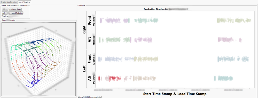
I'm currently working on a dashboard for a factory production floor. On the one side I'd like to show holes being drilled into the fuselage or the aircraft in a 3D scatterplot. On the other side I'd like to show the start times of each drill job which is basically a scatterplot with some categories on the vertical axis and continuous time on the horizontal axis. There are multiple fuselages in the data so the first step is to select one. After the selection an invisible data filter hides and excludes other points. This mainly works fine however I ran into a problem I have no idea to fix.
There are multiple machines that do the drilling. I'd like to color code all the points (both in the 3d scatter plot and in the timeline) based on the job programs loaded to the machines. When I do this by selecting :Job ID as the color variable* I notice that the two graphs use different colors for each :Job ID. When I select for example red points in the timeline, blue points get selected in the 3D scatterplot.

I'm wondering if there is a way of synchronizing/matching colors on both graphs? Any ideas are welcome. I'm completely stuck.
Also, sorry about the blurring, I'm not sure if I'm allowed to show actual numbers, just playing it safe.
Thanks!
*: the timeline plot that came from a graph builder window has:
timeline = Graph Builder(
   Size( 1300, 600 ),
   Show Control Panel( 0 ),
   Show Legend( 0 ),
   Variables(
      X( :Start Time Stamp ),
      X( :Load Time Stamp, Position( 1 ) ),
      Y( :Side ),
      Y( :Longitudinal Location, Position( 1 ) ),
      Y( :Machine, Position( 1 ) ),
      Color( :Job ID )
   ),
   Elements( Points( X( 1 ), X( 2 ), Y( 1 ), Y( 2 ), Y( 3 ) ) ),
),
and the 3D scatterplot has:
scatter = Scatterplot 3D(
   Y( :x, :y, :z ),
   Coloring( :Job ID ),
   Show Controls( 0 ),
   Frame3D(
      Set Graph Size( 500, 500 ),
      Set Grab Handles( 0 ),
      Set Rotation( -54, 0, 38 )
   ),
),
I took out some of the extra code I used to delete the legends, setting axis limits, etc. from the scripts above. They distract.
Accepted Solutions
- Mark as New
- Bookmark
- Subscribe
- Mute
- Subscribe to RSS Feed
- Get Direct Link
- Report Inappropriate Content
Re: Keeping colors based on column consistent across graphs
If you set the Value Colors column property for :Job ID, both the ScatterPlot 3D and the Graph Builder will use those colors.
- Mark as New
- Bookmark
- Subscribe
- Mute
- Subscribe to RSS Feed
- Get Direct Link
- Report Inappropriate Content
Re: Keeping colors based on column consistent across graphs
You can do it on the fly with
Names Default to Here(1);
dt = Open("$SAMPLE_DATA\Big Class.jmp");
//this will give you a legend
// the expression just makes it so it's live in both windows
legend = Expr(dt << Color By Column(:age));
//you have to make a custom report to show the proper legend
new window("Example",
	Hlistbox(
		bivariate(Y(:height), X(:weight),
			Where(:age <= 14)
		),
		legend
	),
	Hlistbox(
		bivariate(Y(:height), X(:weight),
			Where(:age >= 13)
		),
		legend
	)
);
At least this should give you an idea.
- Mark as New
- Bookmark
- Subscribe
- Mute
- Subscribe to RSS Feed
- Get Direct Link
- Report Inappropriate Content
Re: Keeping colors based on column consistent across graphs
txnelson's idea is quite simple and elegant. I added value colors to the "Job ID" column and then under the Rows menu used "Color or Mark by Column". And immediately the colors showed up on the 3D scatterplot. The timeline plot took a little more effort to match the colors. I used two variables in the horizontal axis and graph builder automatically assigns colors to which column the points come from and overrides the row coloring from the table. But once I included the Color( :Job ID ) within the graph builder all the colors matched up perfectly!
I can easily turn this into a script now based on what I learned from vince_faller's reply. They were both very helpful.
Thank you both!
Recommended Articles
- © 2026 JMP Statistical Discovery LLC. All Rights Reserved.
- Terms of Use
- Privacy Statement
- Contact Us


