- New to JMP? Let the Data Analysis Director guide you through selecting an analysis task, an analysis goal, and a data type. Available now in the JMP Marketplace!
- See how to install JMP Marketplace extensions to customize and enhance JMP.
- Subscribe to RSS Feed
- Mark Topic as New
- Mark Topic as Read
- Float this Topic for Current User
- Bookmark
- Subscribe
- Mute
- Printer Friendly Page
Discussions
Solve problems, and share tips and tricks with other JMP users.- JMP User Community
- :
- Discussions
- :
- JMP heatmap Color display wrongly with nominal data
- Mark as New
- Bookmark
- Subscribe
- Mute
- Subscribe to RSS Feed
- Get Direct Link
- Report Inappropriate Content
JMP heatmap Color display wrongly with nominal data
Hi
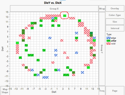
JMP seems to have a bug to show multi colors in one cell.
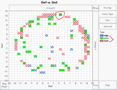
When I select "other" group, all green cell (other group) should be marked with dark color, but the cell I circled was not.
When I select the cell I circled previously, it is supposed to mark other group in legend. But it marked "edge" and "void" groups.
Any one knows how to display this multi color correctly, thank you in advance.
Accepted Solutions
- Mark as New
- Bookmark
- Subscribe
- Mute
- Subscribe to RSS Feed
- Get Direct Link
- Report Inappropriate Content
Re: JMP heatmap Color display wrongly with nominal data
I think what's happening is that the Mean of the rows represented by the cells is the Mean of Type's ordering index. With the new order, the Mean for that heatmap cell's Type is now between 0(edge) and 1(void), so both patterns are displayed, whereas before the Mean of Types 0(edge) and 2(void), was 1 (other).
Before the reordering, when clicking on the other group, only cells representing rows with "other" as their Type were selected not cells with the Mean of the Types being "other".
When clicking on the cell that contained rows with "void" and "edge", only those two Types were highlighted in the legend.
- Mark as New
- Bookmark
- Subscribe
- Mute
- Subscribe to RSS Feed
- Get Direct Link
- Report Inappropriate Content
Re: JMP heatmap Color display wrongly with nominal data
Can't say I'm 100% sure what the underlying problem is, but changing the value order of the Type column seems to fix the issue. Right click on the Type column header and go to Column Properties > Value Order, then set a custom order in which Other is either first or last. That yields blue-red crosshatching when Type is both Edge and Void.
JMP Academic Ambassador
- Mark as New
- Bookmark
- Subscribe
- Mute
- Subscribe to RSS Feed
- Get Direct Link
- Report Inappropriate Content
Re: JMP heatmap Color display wrongly with nominal data
I think what's happening is that the Mean of the rows represented by the cells is the Mean of Type's ordering index. With the new order, the Mean for that heatmap cell's Type is now between 0(edge) and 1(void), so both patterns are displayed, whereas before the Mean of Types 0(edge) and 2(void), was 1 (other).
Before the reordering, when clicking on the other group, only cells representing rows with "other" as their Type were selected not cells with the Mean of the Types being "other".
When clicking on the cell that contained rows with "void" and "edge", only those two Types were highlighted in the legend.
Recommended Articles
- © 2026 JMP Statistical Discovery LLC. All Rights Reserved.
- Terms of Use
- Privacy Statement
- Contact Us


