- JMP User Community
- :
- Discussions
- :
- Is there a way to add a new series to an existing control chart?
- Subscribe to RSS Feed
- Mark Topic as New
- Mark Topic as Read
- Float this Topic for Current User
- Bookmark
- Subscribe
- Printer Friendly Page
- Mark as New
- Bookmark
- Subscribe
- Mute
- Subscribe to RSS Feed
- Get Direct Link
- Report Inappropriate Content
Is there a way to add a new series to an existing control chart?
I have a Levey Jennings chart and want to add a new series (different variable than what is used for the chart) to the chart, is that possible? It would only be for reference, it does not need control limits and it uses the same x variable but different y scale.
- Mark as New
- Bookmark
- Subscribe
- Mute
- Subscribe to RSS Feed
- Get Direct Link
- Report Inappropriate Content
Re: Is there a way to add a new series to an existing control chart?
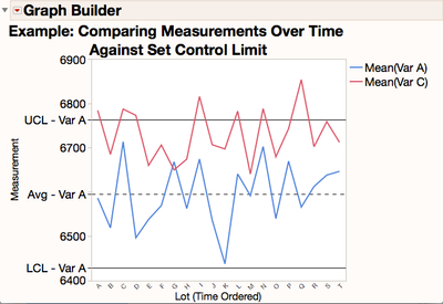
There is not a stock way within the JMP control charting platforms to overlay multiple variables on the same control chart as this would definitely confuse the programming and possible the viewer as to which variable the calculated control charts on the graph belongs to. This could definitely cause some user error if they get confused and make decisions based on comparing another variable to a control limit that it doesn't truly reflect (come from). But you mentioned this was for reference purposes only and we can try to be careful in our labeling to try and keep the information clear as to their origins. Therefore one could easily achieve the visualization in JMP Graph Builder to see two or more variables plotted over time against that original/same control limits the following way:
- First if you truly have a different Y scale between the two measurement variables of interest, might be best to transform the measurement onto a similar standardized scale (maybe a Log scale, etc.) before you start...although you can accomplish some of this "on-the-fly" in most graph axis settings. For this example, I assume it has already been done and they can be plotted over the same Y scale.
- Next generate the desired control limits in either Control Chart Builder or the regular Control Chart platform (Menu: Analyze -> Quality and Process). So start with your Levey Jennings SPC Chart for the first variable (lets call it "Variable A") and note the Mean, UCL & LCL for your chart. Note that you have the option in both the Control Chart Builder and the regular Control Chart from the platform menu to save the limits back to the column or a specification/summary table to record this into one location.
- Second: Use Graph Builder to plot the first variable and limits (Menu: Graph -> Graph Builder). So start with a blank Graph Builder area and plot the first variable ("Var A") over time with your measurement on the Y and time indicator on the X (in our case our time ordered "Lot").
- Then manually add in reference lines for your Mean, UCL & LCL for "Variable A" by right clicking on the Y Axis and using the reference line creator section in the axis dialog box. Note that I was careful here to include the origin of the control limits directly into the label so they viewer won't get confused.
- Lastly bring in your second variable (let's call it "Var C") into the Y Axis area so you can see both "Var A" and "Var C" plotted over time against the "Var A" limits you calculated earlier. You have to move this new varaible over into just the right space of the chart...just a little bit to the inside of the Y axis inside the actual graph to get them to do this overlaid view. Easy to do with a little practice.
This is not a perfect solution, but should get the job done. Just be careful to label and understand that the reference control chart limits on the graph come from "Var A" and not "Var C" or any of the other things your overlaid on the graph.
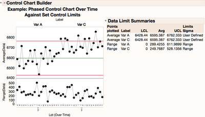
Note that another option to get a similar view would be too stack your measurement columns (with menu Table -> Stack, and phase your control chart over a pre-set SPC control limits in the Control Chart Builder - Phase option. See the JMP Help for good step-by-step on how to set up a phased control chart from stacked data. This wouldn't overlay them right on top of each other, but would give you basically a side by side control chart using the same Y axis and might be a little easier to interpret by the viewer.
Hope this helps!
- © 2024 JMP Statistical Discovery LLC. All Rights Reserved.
- Terms of Use
- Privacy Statement
- About JMP
- JMP Software
- JMP User Community
- Contact


