- New to JMP? Let the Data Analysis Director guide you through selecting an analysis task, an analysis goal, and a data type. Available now in the JMP Marketplace!
- See how to install JMP Marketplace extensions to customize and enhance JMP.
- Subscribe to RSS Feed
- Mark Topic as New
- Mark Topic as Read
- Float this Topic for Current User
- Bookmark
- Subscribe
- Mute
- Printer Friendly Page
Discussions
Solve problems, and share tips and tricks with other JMP users.- JMP User Community
- :
- Discussions
- :
- Re: How to set the y axis to cross the origin of the x axis in JMP
- Mark as New
- Bookmark
- Subscribe
- Mute
- Subscribe to RSS Feed
- Get Direct Link
- Report Inappropriate Content
How to set the y axis to cross the origin of the x axis in JMP
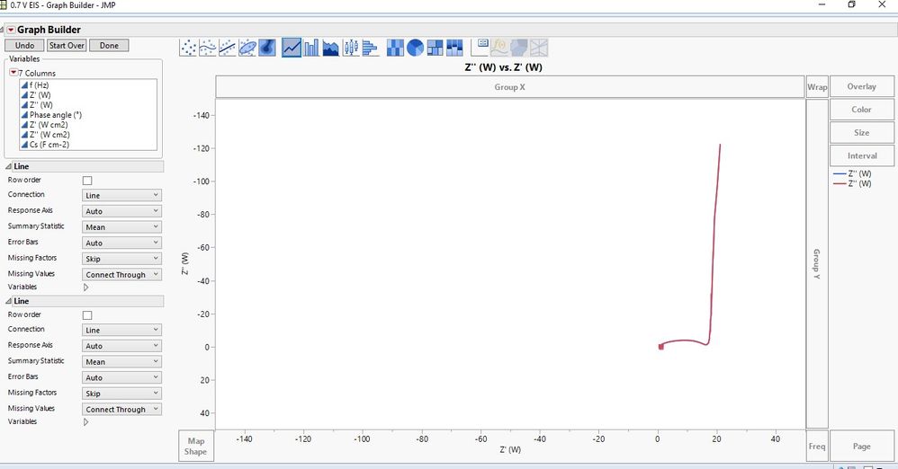
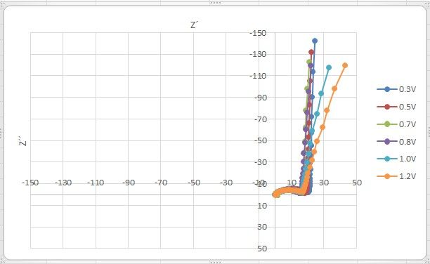
Hello, I am trying to get a nyquist plot of imaginary vs real impedance. However I cant seem to set the y axis to cross the origin 0.0 on the x axis the way it's done in excel. is this possible in JMP?
- Mark as New
- Bookmark
- Subscribe
- Mute
- Subscribe to RSS Feed
- Get Direct Link
- Report Inappropriate Content
Re: How to set the y axis to cross the origin of the x axis in JMP
Hi @richinex,
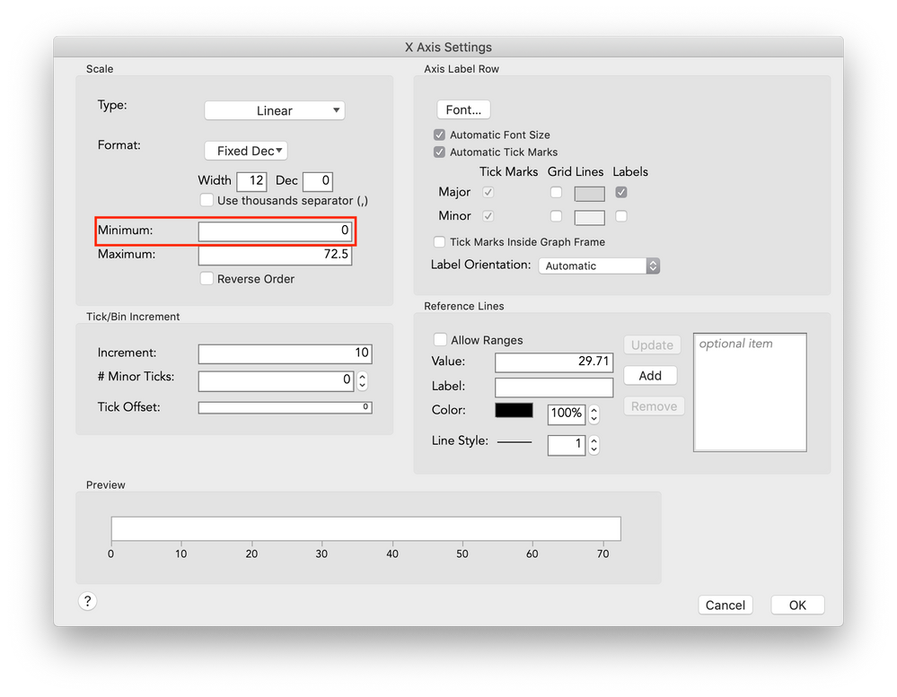
It sounds like you're looking to adjust the display range of your X and Y axes. You can control the axis settings by double-clicking an axis, or right-clicking > Axis Settings. In your case, you'll want to go to the X-Axis and Y-Axis settings, and set the Minimum to 0 -- that will set the axis such that the lower limit is 0, which means your Y axis on the plot will cross the origin.
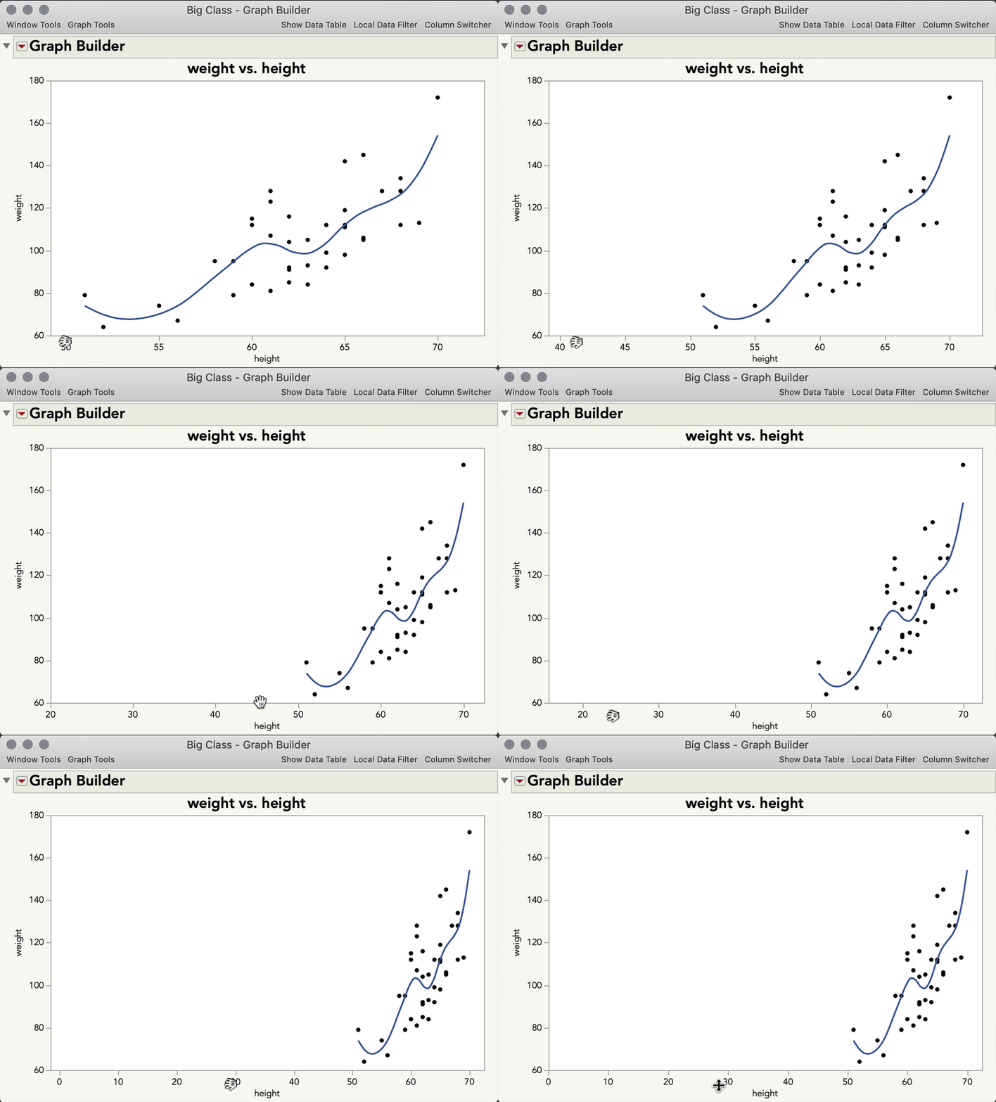
You can also adjust axes interactively by hovering on the corners until the hand turns sideways, then drag:
I hope this helps!
- Mark as New
- Bookmark
- Subscribe
- Mute
- Subscribe to RSS Feed
- Get Direct Link
- Report Inappropriate Content
Re: How to set the y axis to cross the origin of the x axis in JMP
Hi Julian, thanks for the reply. In the illustration you moved the x axis with the grabber. is it possible to move the y-axis in a horizontal direction given that both axes are isoaxial with same min and max values .
- Mark as New
- Bookmark
- Subscribe
- Mute
- Subscribe to RSS Feed
- Get Direct Link
- Report Inappropriate Content
Re: How to set the y axis to cross the origin of the x axis in JMP
Hi @richinex
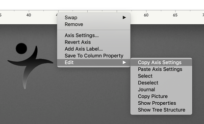
If I'm understanding your question correctly, you would like changes you make to the X-Axis to also change the Y-Axis at the same time? A kind of "Lock Y-Axis to X-Axis Settings." It's possible to do that via scripting, but not natively in Graph Builder. You can, however, copy the settings you set for one axis, and paste them on to another. Right-click an Axis > Edit > Copy Axis Settings. Then, right-click the other axis > Edit > Paste Axis Settings.
Does that address your question? If not, is there an example you can share of the kind of plot you wish to make?
- Mark as New
- Bookmark
- Subscribe
- Mute
- Subscribe to RSS Feed
- Get Direct Link
- Report Inappropriate Content
Re: How to set the y axis to cross the origin of the x axis in JMP
Please find attached a screenshot of what i meant. in the screenshot the y-axiz crosses x at (-10)
- Mark as New
- Bookmark
- Subscribe
- Mute
- Subscribe to RSS Feed
- Get Direct Link
- Report Inappropriate Content
Re: How to set the y axis to cross the origin of the x axis in JMP
Hi @richinex,
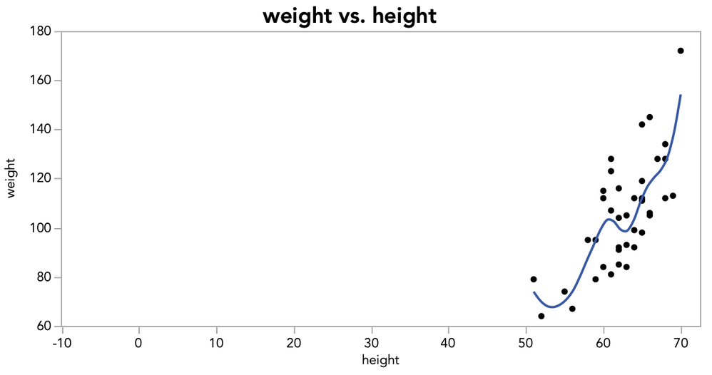
I think I understand. You want to not just change the axis scale, but you want to change where the Y axis is displayed on the plot. For instance, in this plot, the Y-axis crosses X at -10 (I simply set the axis min to -10):
But, that's not like your plot because the Y scale of your plot is actually -150 to 50, and the Y-axis is *displayed* at X=-10. Also, your X axis isn't displayed at Y = 0, but rather Y = 10. In JMP (and many programs), it's standard for the axes to be displayed at the margins, not inside the plot, to not obstruct viewing of the points. But, that's a style choice, and I get why it's desirable at times (though I think I would reserve this kind of plot with axes at the origin to not confuse the viewer). Whatever the case, there are ways you could pull this together with some scripting, or even by dragging in the axis elements, adding reference lines, and properly sizing everything, but it wouldn't be a great workflow. I'm sorry to say I don't think there is an easy solution for this one, but I'll keep pondering.
- Mark as New
- Bookmark
- Subscribe
- Mute
- Subscribe to RSS Feed
- Get Direct Link
- Report Inappropriate Content
Re: How to set the y axis to cross the origin of the x axis in JMP
- Mark as New
- Bookmark
- Subscribe
- Mute
- Subscribe to RSS Feed
- Get Direct Link
- Report Inappropriate Content
Re: How to set the y axis to cross the origin of the x axis in JMP
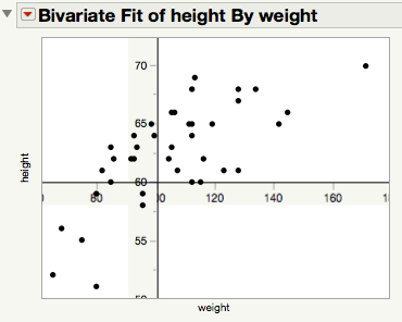
This is most definitely NOT a recommendation. But, if the axis ranges are fixed and only the data changes, you might (with some fiddling) be able to adapt the approach below. The alternative of doing everything via a graphics script is probably even more time and trouble, at least to get something general.
NamesDefaultToHere(1);
dt = Open("$SAMPLE_DATA/Big Class.jmp");

biv = dt << Bivariate( Y( :height ), X( :weight ) );
bivRep = Report(biv);
yAB = bivRep[axisBox(1)];
xAB = bivRep[axisBox(2)];

// Take a 'picture' of each axis without the label
yAB << removeAxisLabel;
yAxisPic = yAB << getPicture;
yAB << addAxisLabel("height");
xAB << removeAxisLabel;
xAxisPic = xAB << getPicture;
xAB << addAxisLabel("weight");

// Some axis values
yMax = yAB << getMax;
yMin = yAB << getMin;
xMax = xAB << getMax;
xMin = xAB << getMin;

// Positions for the fake axes
yAxisPos = 100;
xAxisPos = 60;

fb = bivRep[frameBox(1)];
// Add fake y axis
fb << Add Image(
			image( yAxisPic ),
			bounds( top( yMax+1.1 ), Left( (yAxisPos - 10) ), bottom( yMin-1.1 ), Right( yAxisPos ) )
			);
fb << addGraphicsScript(VLine(yAxisPos));

// Add fake x axis
fb << Add Image(
			image( xAxisPic ),
			bounds( top( xAxisPos ), Left( (xMin-5) ), bottom( xAxisPos - 2 ), Right( xMax+5 ) )
			);
fb << addGraphicsScript(HLine(xAxisPos));

// Edit the real axes
yAB << Show Major Labels( 0 );
yAB << Show Major Ticks( 0 );
yAB << Show Minor Ticks( 0 );
xAB << Show Major Labels( 0 );
xAB << Show Major Ticks( 0 );
xAB << Show Minor Ticks( 0 );
Recommended Articles
- © 2026 JMP Statistical Discovery LLC. All Rights Reserved.
- Terms of Use
- Privacy Statement
- Contact Us
