- New to JMP? Let the Data Analysis Director guide you through selecting an analysis task, an analysis goal, and a data type. Available now in the JMP Marketplace!
- See how to install JMP Marketplace extensions to customize and enhance JMP.
- Subscribe to RSS Feed
- Mark Topic as New
- Mark Topic as Read
- Float this Topic for Current User
- Bookmark
- Subscribe
- Mute
- Printer Friendly Page
Discussions
Solve problems, and share tips and tricks with other JMP users.- JMP User Community
- :
- Discussions
- :
- How to hide x-variables with no data in x-axis groups of Chart
- Mark as New
- Bookmark
- Subscribe
- Mute
- Subscribe to RSS Feed
- Get Direct Link
- Report Inappropriate Content
How to hide x-variables with no data in x-axis groups of Chart
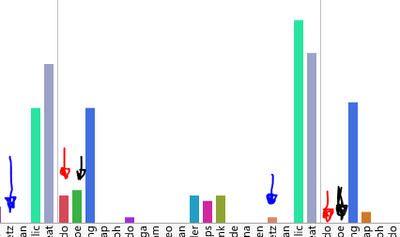
I'm really unsure how to ask this question without a picture.
I'm trying to use Chart (Graph > Chart) to display the number of username occurrences in a csv, grouped by month and, obviously, the usernames by color. Basically, a colorful histogram grouped by month (day, time, etc.).
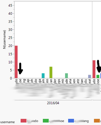
The problem is, there are so many users, it really becomes visually cluttered when usernames are given a space in a month where they don't show up. For example, the first blue arrow shows 'tz' having zero occurrences one month, and then the other blue arrow shows 'tz' having more than zero occurrences another month. The other colored arrows highlight the same thing with other names. I would love to be able to hide the names without any data for those months.
If there is any possible way to do this–i.e. use a different graph–I would be the most glad receiver of that know-how.
Thank you for your help in advance!
Accepted Solutions
- Mark as New
- Bookmark
- Subscribe
- Mute
- Subscribe to RSS Feed
- Get Direct Link
- Report Inappropriate Content
Re: How to hide x-variables with no data in x-axis groups of Chart
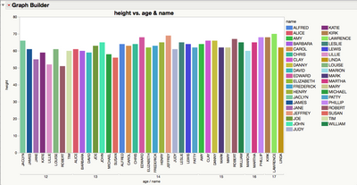
Can you try using Graph Builder and nesting your grouping column for month on the X-axis along with Name?
I think that will give you what you're looking for. Here's an example with Big Class. Pretend that Age is your Month column.
- Mark as New
- Bookmark
- Subscribe
- Mute
- Subscribe to RSS Feed
- Get Direct Link
- Report Inappropriate Content
Re: How to hide x-variables with no data in x-axis groups of Chart
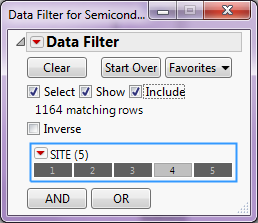
If you go to:
Rows==>Data Filter
and then select your X column to filter on and select the "Select","Show" and "Include",
You can restrict the values displayed on the X axis
- Mark as New
- Bookmark
- Subscribe
- Mute
- Subscribe to RSS Feed
- Get Direct Link
- Report Inappropriate Content
Re: How to hide x-variables with no data in x-axis groups of Chart
The local data filter is your friend in situations where the graph has a bit too much on it. The tricky part is to identify what the items you wish to exclude have in common.
In this case you wish to exclude where your Y variable is missing or zero. If the cells contain zeros then you can add the Y to the local data filter and adjust the range.
If the cells are empty (missing) then you will need to choose 'Select Missing' from the hotspot on the filter for your Y variable and check the 'Inverse' button.
- Mark as New
- Bookmark
- Subscribe
- Mute
- Subscribe to RSS Feed
- Get Direct Link
- Report Inappropriate Content
Re: How to hide x-variables with no data in x-axis groups of Chart
It seems like we are very close to an answer, but the problem–from what I can tell–is that my Y variable is the number of occurrences of one of my X variables, username.
In the picture below, I need the variable to not show up under the left black arrow, but to show up under the right black arrow.
Thank you for the help!
- Mark as New
- Bookmark
- Subscribe
- Mute
- Subscribe to RSS Feed
- Get Direct Link
- Report Inappropriate Content
Re: How to hide x-variables with no data in x-axis groups of Chart
Can you try using Graph Builder and nesting your grouping column for month on the X-axis along with Name?
I think that will give you what you're looking for. Here's an example with Big Class. Pretend that Age is your Month column.
- Mark as New
- Bookmark
- Subscribe
- Mute
- Subscribe to RSS Feed
- Get Direct Link
- Report Inappropriate Content
Re: How to hide x-variables with no data in x-axis groups of Chart
Wow. I am almost certain that was one of the first things I tried–everything in Graph Builder–and it didn't work, but now it most certainly does. As an FYI, one of the main things I was bumping was that I had no Y variable, as your example does. However, Graph Builder used the count of occurrences (histogram) as the Y variable. Brilliant. Thank you!
- Mark as New
- Bookmark
- Subscribe
- Mute
- Subscribe to RSS Feed
- Get Direct Link
- Report Inappropriate Content
Re: How to hide x-variables with no data in x-axis groups of Chart
The repeating values on the x axis indicate that you used month as X Group.
Most logical - and the best way to plot the data. Unfortunately in JMP with a lot of empty values.
Nesting the categorical values on the x axis is a workaround, but the plot looks much worse.
This way it's much more difficult to see where one month ends and the next month starts.
There is a wish in the wish list to fix the issue with grouped values:
:folded_hands: X group: restrict the values on the axis to the respective group
If this wish is too complicated to be implemented in JMP/Graph Builder ...
there is another wish:optimized graphics settings for nested X categories
With the idea: make the lines between main groups thicker to separate them better visually.
Let's see which wish will win the race for JMP 19 ...
- Mark as New
- Bookmark
- Subscribe
- Mute
- Subscribe to RSS Feed
- Get Direct Link
- Report Inappropriate Content
Re: How to hide x-variables with no data in x-axis groups of Chart
Sure, merging the main split into the hierarchy on the X axis is a working workaround — but it feels like a workaround.
The main split should be clearly visible — “as a title.”
It should NOT be merged with the other information somewhere on the X‑axis.
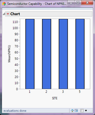
Is the semiconductor industry the only field that need a better functionality?
This type of plot is very common:
A measurement parameter (column C), shown as box plots (grouped by column A) — split by variants via X Group (column B).
… and it can only be displayed in Graph Builder with the known limitations.
Maybe other fields don’t have this issue?
A hint: when I try to “illustrate” the issue using data from the samples folder, it is hard to find a file that has enough complexity to demonstrate the problem. A "light" version of the problem, with Bar charts instead of Box plots:

Open( "$SAMPLE_STIPS/World Population 2017.jmp" );
Graph Builder(
	Variables(
		X( :Country ),
		Y( :Population ),
		Group X( :Region ),
		Color( :Region )
	),
	Elements( Bar( X, Y ) )
);Recommended Articles
- © 2026 JMP Statistical Discovery LLC. All Rights Reserved.
- Terms of Use
- Privacy Statement
- Contact Us

