- New to JMP? Let the Data Analysis Director guide you through selecting an analysis task, an analysis goal, and a data type. Available now in the JMP Marketplace!
- See how to install JMP Marketplace extensions to customize and enhance JMP.
- Subscribe to RSS Feed
- Mark Topic as New
- Mark Topic as Read
- Float this Topic for Current User
- Bookmark
- Subscribe
- Mute
- Printer Friendly Page
Discussions
Solve problems, and share tips and tricks with other JMP users.- JMP User Community
- :
- Discussions
- :
- How do I plot multiple XY Series in one graph?
- Mark as New
- Bookmark
- Subscribe
- Mute
- Subscribe to RSS Feed
- Get Direct Link
- Report Inappropriate Content
How do I plot multiple XY Series in one graph?
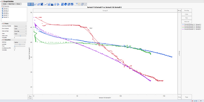
Dragging and dropping x and y values for multiple series data sets gives the following graph
I want to see only SeriesA Y vs SeriesA X,
SeriesB Y vs SeriesB X
SeriesC Y vs SeriesC X
I do not want to see the curves for SeriesA Y vs SeriesB X etc...
In excel i am able to do it by selecting the appropriate X and Y values.
Can you please help with this plotting?
- Mark as New
- Bookmark
- Subscribe
- Mute
- Subscribe to RSS Feed
- Get Direct Link
- Report Inappropriate Content
Re: How do I plot multiple XY Series in one graph?
The problem is the structure of your data. You have an X variable and you have a Y variable. You also have another variable that indicates which series it is, either A or B. Thinking that way, you see that your data needs to be structured differently. You need to stack the X and Y variables.
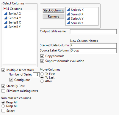
I made a sample dataset to mimic your situation (attached) with random data except for the X-axis. The data table has four columns, SeriesA X, SeriesA Y, SeriesB X, and SeriesB Y. I only put in series A and B, but you could extend to series C if needed. I then went to Tables > Stack Columns and completed the dialog as follows:
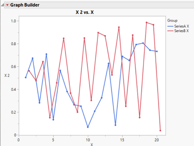
This will give me a table that has 4 columns (Group, X, Group 2, and X 2). You can rename the X 2 column to be Y, if you want as it does contain the Y values. Now go to Graph Builder. Drag X 2 (or Y if you renamed it) to the Y-axis. Drag X to the X-axis. Drag Group to the Overlay area. You might want to do some clean up as the Group column will say SeriesA X and SeriesB X when it really only needs to be an A or a B, but I think this is the picture that you are looking for. This final data table with a script for the graph is also attached.
- Mark as New
- Bookmark
- Subscribe
- Mute
- Subscribe to RSS Feed
- Get Direct Link
- Report Inappropriate Content
Re: How do I plot multiple XY Series in one graph?
Stacking the data, as @Dan_Obermiller suggests is one way to make this easy and may be the best way to have your data arranged for other analyses, but you can get the graph you want without rearranging the data.
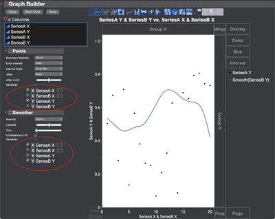
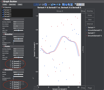
Instead, just as with Excel you can change the variables used for the individual elements (points and spline in this case) using the elements panel on the left of the graph. Just open the Variables section and pick which variables you want to use for each element.
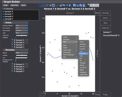
Then you can add another spline and another points element by right-clicking in the graph and set them to the next series.
- Mark as New
- Bookmark
- Subscribe
- Mute
- Subscribe to RSS Feed
- Get Direct Link
- Report Inappropriate Content
Re: How do I plot multiple XY Series in one graph?
Jeff,
Thanks for the response.
I tried both your solution and the one provided by Dan.
Both methods works as expected.
-Rahul
- Mark as New
- Bookmark
- Subscribe
- Mute
- Subscribe to RSS Feed
- Get Direct Link
- Report Inappropriate Content
Re: How do I plot multiple XY Series in one graph?
Dan,
Thank you for the quick response.
The solution you provided work's as expected.
Recommended Articles
- © 2026 JMP Statistical Discovery LLC. All Rights Reserved.
- Terms of Use
- Privacy Statement
- Contact Us
