- New to JMP? Let the Data Analysis Director guide you through selecting an analysis task, an analysis goal, and a data type. Available now in the JMP Marketplace!
- See how to install JMP Marketplace extensions to customize and enhance JMP.
- Subscribe to RSS Feed
- Mark Topic as New
- Mark Topic as Read
- Float this Topic for Current User
- Bookmark
- Subscribe
- Mute
- Printer Friendly Page
Discussions
Solve problems, and share tips and tricks with other JMP users.- JMP User Community
- :
- Discussions
- :
- How do I define spec limits by data category in variability chart
- Mark as New
- Bookmark
- Subscribe
- Mute
- Subscribe to RSS Feed
- Get Direct Link
- Report Inappropriate Content
How do I define spec limits by data category in variability chart
Hi,
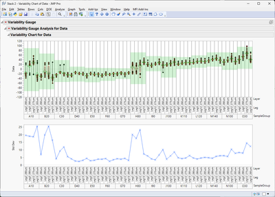
How can I draw spec limits(red line) by data category in variability chart as below example? The red line was done by manual in pptx.
Attach jmp file data for reference. Appreciate for your reply. Thanks.
- Tags:
- windows
- Mark as New
- Bookmark
- Subscribe
- Mute
- Subscribe to RSS Feed
- Get Direct Link
- Report Inappropriate Content
Re: How do I define spec limits by data category in variability chart
Refer to attachments for test data and script.
- Mark as New
- Bookmark
- Subscribe
- Mute
- Subscribe to RSS Feed
- Get Direct Link
- Report Inappropriate Content
Re: How do I define spec limits by data category in variability chart
Like I said earlier, easiest option is to create new grouping column and use that in your Summary table. It might also be enough to just get sum of the n categories over multiple groups
curcount = Sum(dt_summary[i, {"Leg", "Layer"}]);- Mark as New
- Bookmark
- Subscribe
- Mute
- Subscribe to RSS Feed
- Get Direct Link
- Report Inappropriate Content
Re: How do I define spec limits by data category in variability chart
Hi Jarmo
When I key multiple data, the spec limit does not follow script content. How could I modify script ?
- Mark as New
- Bookmark
- Subscribe
- Mute
- Subscribe to RSS Feed
- Get Direct Link
- Report Inappropriate Content
Re: How do I define spec limits by data category in variability chart
You have to calculate the group counts in different manner. One quite simple option could be to add new column to your dt which combines leg and layer
dt << new column("LEGLAYER", Character, Nominal, Formula(:Leg ||:Layer));
then use that in the summary
dt_summary = dt << Summary(
	Group(:SampleGroup),
	Max(:LSL),
	//Mean(:Target),
	Min(:USL),
	N Categories(:LEGLAYER),
	Freq("None"),
	Weight("None"),
	statistics column name format("column"),
	Link to original data table(0)
);
and get the curcount from that
curcount = Sum(dt_summary[i, {"LEGLAYER"}]);
- Mark as New
- Bookmark
- Subscribe
- Mute
- Subscribe to RSS Feed
- Get Direct Link
- Report Inappropriate Content
Re: How do I define spec limits by data category in variability chart
I used script that you shared, but spec limit is not displayed.
Please help check script as attachments, how to modify it?
- Mark as New
- Bookmark
- Subscribe
- Mute
- Subscribe to RSS Feed
- Get Direct Link
- Report Inappropriate Content
Re: How do I define spec limits by data category in variability chart
Hi there,
If you're looking for a scripting-free solution and okay with using Graph Builder, it actually handles multi-level spec limits by category — just make sure your spec limits are structured accordingly (e.g., via column property).
If you specifically want to stay with Variability Chart, this behavior isn’t built-in in core JMP — but it is supported in YieldOptiX, a plugin developed for test data analysis. It adds support for category-based spec limits directly in the Variability Chart.
So both options (Graph Builder or Variability Chart with grouped limits) are supported depending on your preferred interface — just depends on what fits your process best.
- « Previous
- Next »
Recommended Articles
- © 2026 JMP Statistical Discovery LLC. All Rights Reserved.
- Terms of Use
- Privacy Statement
- Contact Us


