Turn on suggestions
Auto-suggest helps you quickly narrow down your search results by suggesting possible matches as you type.
- New to JMP? Let the Data Analysis Director guide you through selecting an analysis task, an analysis goal, and a data type. Available now in the JMP Marketplace!
- See how to install JMP Marketplace extensions to customize and enhance JMP.
Options
- Subscribe to RSS Feed
- Mark Topic as New
- Mark Topic as Read
- Float this Topic for Current User
- Bookmark
- Subscribe
- Mute
- Printer Friendly Page
Discussions
Solve problems, and share tips and tricks with other JMP users.- JMP User Community
- :
- Discussions
- :
- How can add a specified scale to a bar chart?
- Mark as New
- Bookmark
- Subscribe
- Mute
- Subscribe to RSS Feed
- Get Direct Link
- Report Inappropriate Content
How can add a specified scale to a bar chart?
Jul 13, 2024 07:55 AM
(1474 views)
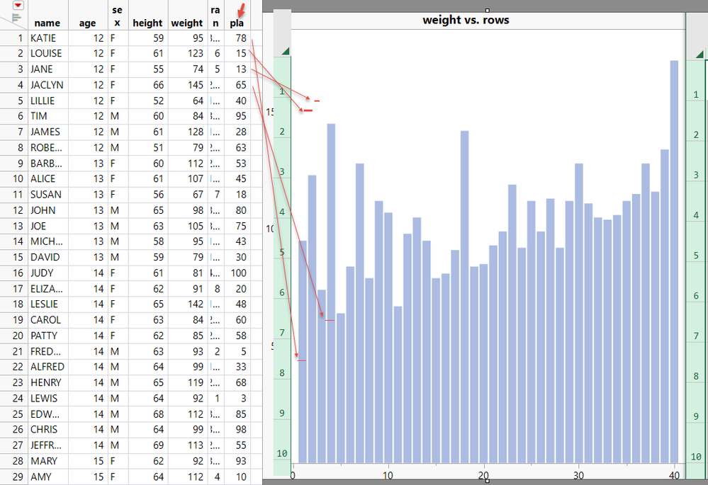
For example, using this script to add the "pla" column,
How do I add this to the horizontal scale of the bar chart?
Thanks Experts!
dt=Open("$SAMPLE_DATA/Big Class.jmp");
dt << New Column( "ran", Numeric, Continuous, Set Formula( Col Shuffle() ) );
ca="pla";New Column(ca);Column(ca)<<Formula( round(ran/40*100,0) );dt<<run formulas;Column(ca)<<deleteFormula;
p1=dt<< Graph Builder(
	Transform Column( "rows", Formula( Row() ) ),
	Size( 536, 459 ),
	Show Control Panel( 0 ),
	Variables( X( :rows ), Y( :weight ) ),
	Elements( Bar( X, Y, Legend( 5 ) ) ),
	SendToReport(
		Dispatch( {}, "400", ScaleBox,
			{Legend Model(
				5,
				Properties( 0, {Transparency( 0.5 )}, Item ID( "weight", 1 ) )
			)}
		)
	)
);- Tags:
- windows
1 ACCEPTED SOLUTION
Accepted Solutions
- Mark as New
- Bookmark
- Subscribe
- Mute
- Subscribe to RSS Feed
- Get Direct Link
- Report Inappropriate Content
Re: How can add a specified scale to a bar chart?
Created:
Jul 13, 2024 08:35 AM
| Last Modified: Jul 13, 2024 5:40 AM
(1468 views)
| Posted in reply to message from lala 07-13-2024
Basically, all that needs to be done is to
- Drag Rows to the X axis
- Drag PLA and Weight to the Y axis
- Select the Bar chart Icon to change the chart to a Bar chart
- Right click on the graph and select
- Add=>Points
- Go to the Properties for the Bar
- Open the Variables paragraph
- Unselect PLA
- Go to the Properties for the Points
- Open the Variables paragraph
- Unselect Weight
- Go to the legend
- Right click on the PLA marker and select Marker
- Change the to your marker of choice
- Click again on the PLA marker and select Color
- Change the color to Red
Jim
3 REPLIES 3
- Mark as New
- Bookmark
- Subscribe
- Mute
- Subscribe to RSS Feed
- Get Direct Link
- Report Inappropriate Content
Re: How can add a specified scale to a bar chart?
Created:
Jul 13, 2024 08:35 AM
| Last Modified: Jul 13, 2024 5:40 AM
(1469 views)
| Posted in reply to message from lala 07-13-2024
Basically, all that needs to be done is to
- Drag Rows to the X axis
- Drag PLA and Weight to the Y axis
- Select the Bar chart Icon to change the chart to a Bar chart
- Right click on the graph and select
- Add=>Points
- Go to the Properties for the Bar
- Open the Variables paragraph
- Unselect PLA
- Go to the Properties for the Points
- Open the Variables paragraph
- Unselect Weight
- Go to the legend
- Right click on the PLA marker and select Marker
- Change the to your marker of choice
- Click again on the PLA marker and select Color
- Change the color to Red
Jim
- Mark as New
- Bookmark
- Subscribe
- Mute
- Subscribe to RSS Feed
- Get Direct Link
- Report Inappropriate Content
Re: How can add a specified scale to a bar chart?
Thank Jim!
- Mark as New
- Bookmark
- Subscribe
- Mute
- Subscribe to RSS Feed
- Get Direct Link
- Report Inappropriate Content
Re: How can add a specified scale to a bar chart?
Other good option is to use two bar charts. Disable Variables and pick Float as bar style for the one you wish to use for lines
-Jarmo
Recommended Articles
- © 2026 JMP Statistical Discovery LLC. All Rights Reserved.
- Terms of Use
- Privacy Statement
- Contact Us


