- New to JMP? Let the Data Analysis Director guide you through selecting an analysis task, an analysis goal, and a data type. Available now in the JMP Marketplace!
- See how to install JMP Marketplace extensions to customize and enhance JMP.
- Subscribe to RSS Feed
- Mark Topic as New
- Mark Topic as Read
- Float this Topic for Current User
- Bookmark
- Subscribe
- Mute
- Printer Friendly Page
Discussions
Solve problems, and share tips and tricks with other JMP users.- JMP User Community
- :
- Discussions
- :
- Highlighting better data in a graph
- Mark as New
- Bookmark
- Subscribe
- Mute
- Subscribe to RSS Feed
- Get Direct Link
- Report Inappropriate Content
Highlighting better data in a graph
Hello
One feature I really appreciate in JMP is the ability to highlight data in the data table and instantly locate those points in a graph (e.g., in Graph Builder). It's a powerful way to explore and interact with the data.
However, when working with large datasets, I often find it difficult to see the highlighted points in the graph. Even on a large screen, the selected data points are barely visible, which limits the usefulness of the feature in these cases.
Is there ane asy way like in the File / Preferences section that allows users to increase or control the size (or style) of the symbols for selected data points? A shortcut key? This would greatly enhance visibility and usability when dealing with complex or crowded graphs.
Thanks for your assistance!
Accepted Solutions
- Mark as New
- Bookmark
- Subscribe
- Mute
- Subscribe to RSS Feed
- Get Direct Link
- Report Inappropriate Content
Re: Highlighting better data in a graph
There are Graph Preferences that can be set
File=>Preferences=>Graphs
- Mark as New
- Bookmark
- Subscribe
- Mute
- Subscribe to RSS Feed
- Get Direct Link
- Report Inappropriate Content
Re: Highlighting better data in a graph
You have control over marker selection mode, marker selection color and marker selection fade from the preferences ( Using JMP > JMP Preferences > Preferences for JMP Graphs )
You can also make some changes from the graphs
There is also an option of creating new nominal column with formula Selected() and using that column in Overlay/Color
- Mark as New
- Bookmark
- Subscribe
- Mute
- Subscribe to RSS Feed
- Get Direct Link
- Report Inappropriate Content
Re: Highlighting better data in a graph
There are Graph Preferences that can be set
File=>Preferences=>Graphs
- Mark as New
- Bookmark
- Subscribe
- Mute
- Subscribe to RSS Feed
- Get Direct Link
- Report Inappropriate Content
Re: Highlighting better data in a graph
Hey @jmit
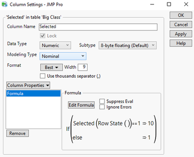
Here is another trick to combine two modes. Using the default faded mode you can make a new column that will return a value based upon the row state:
If you then put this into the Size property of graph builder then selected rows will not only use the faded highlighting mode but will also size
By changing the value of the selected date you can change the difference in the size of the selected vs un selected markers. If you want the base level of the markers to be smaller, right click on the legend and go to size settings and make the maximum a larger value.
Also, you can change the default marker mode by right clicking a graph, going to "Graph" and change the selection there (vs going to the preference). However, you can only change modes, not tweak their settings.
Hope this helps!
Steve
- Mark as New
- Bookmark
- Subscribe
- Mute
- Subscribe to RSS Feed
- Get Direct Link
- Report Inappropriate Content
Re: Highlighting better data in a graph
nice trick - size !
Another approach:
use the selected() state as Group X - to separate the selected and unselected points:
Names Default to Here(1);
dt = Open( "$SAMPLE_DATA/Big Class Families.jmp" );
Graph Builder(
	Transform Column( "selected", Nominal, Formula( Selected() ) ),
	Variables( X( :height ), Y( :weight ), Group X( :selected ), Overlay( :sex ) ),
	Elements( Points( X, Y ), Smoother( X, Y ) )
);
Recommended Articles
- © 2026 JMP Statistical Discovery LLC. All Rights Reserved.
- Terms of Use
- Privacy Statement
- Contact Us


