- Learn how to build custom Python data connectors and further customize JMP’s Data Connector Framework with the Python Data Connector Demo, available now in the JMP Marketplace!
- See how to use Accelerated Life Testing (ALT) to evaluate reliability. Register for June 5 webinar, 2pm US Eastern Time.
- Subscribe to RSS Feed
- Mark Topic as New
- Mark Topic as Read
- Float this Topic for Current User
- Bookmark
- Subscribe
- Mute
- Printer Friendly Page
Discussions
Solve problems, and share tips and tricks with other JMP users.- JMP User Community
- :
- Discussions
- :
- Generating Box Plot with Overlayed Histogram?

- Mark as New
- Bookmark
- Subscribe
- Mute
- Subscribe to RSS Feed
- Get Direct Link
- Report Inappropriate Content
Generating Box Plot with Overlayed Histogram?
Is there a way to generate a box plot with the histogram of the data overlayed on top of the box? Similar to the attached picture from Spotfire.
I used Spotfire at my previous company. Now we are using JMP. I'm trying to create some plots that look similar to better understand the data. Thanks.
.jpg")
Accepted Solutions

- Mark as New
- Bookmark
- Subscribe
- Mute
- Subscribe to RSS Feed
- Get Direct Link
- Report Inappropriate Content
Re: Generating Box Plot with Overlayed Histogram?
You can also make something similar using Graph Builder. I used the Big Class table to illustrate.
You drag each of your variables to the Y-axis where each subsequent variable is placed "below" the others so that the graphs are stacked. Choose the histogram element. Now hold the shift key and choose the boxplot element. I then modified the boxplot to have the Solid Box Type Style. I changed the width to be 3 and adjusted the baseline axis so that you could see the entire boxplot. You can turn on the 5-number summaries for the boxplots and/or the means and standard deviations for the histograms (I did neither here).

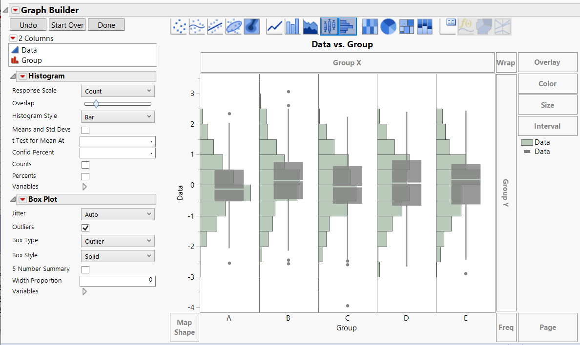
If your data is in a single column and the groupings defined in another column, you could drag the data to the y-axis. Then drag the grouping column to the x-axis. Select the histogram element. Shift-click on the boxplot element. This will give you an overlay slider (see the attached picture) that you can use to control how much the boxplot overlays the histogram. You can also right-click on the graph and customize the transparency of the boxplots and/or histograms to get the look you really want.
As an aside, your variable E has two potential outliers identified by the boxplot that don't seem to have a corresponding bar on the histogram.

- Mark as New
- Bookmark
- Subscribe
- Mute
- Subscribe to RSS Feed
- Get Direct Link
- Report Inappropriate Content
Re: Generating Box Plot with Overlayed Histogram?
Here is one way to do this in JMP, using the Distribution Platform

- Mark as New
- Bookmark
- Subscribe
- Mute
- Subscribe to RSS Feed
- Get Direct Link
- Report Inappropriate Content
Re: Generating Box Plot with Overlayed Histogram?
You can also make something similar using Graph Builder. I used the Big Class table to illustrate.
You drag each of your variables to the Y-axis where each subsequent variable is placed "below" the others so that the graphs are stacked. Choose the histogram element. Now hold the shift key and choose the boxplot element. I then modified the boxplot to have the Solid Box Type Style. I changed the width to be 3 and adjusted the baseline axis so that you could see the entire boxplot. You can turn on the 5-number summaries for the boxplots and/or the means and standard deviations for the histograms (I did neither here).
If your data is in a single column and the groupings defined in another column, you could drag the data to the y-axis. Then drag the grouping column to the x-axis. Select the histogram element. Shift-click on the boxplot element. This will give you an overlay slider (see the attached picture) that you can use to control how much the boxplot overlays the histogram. You can also right-click on the graph and customize the transparency of the boxplots and/or histograms to get the look you really want.
As an aside, your variable E has two potential outliers identified by the boxplot that don't seem to have a corresponding bar on the histogram.
- Mark as New
- Bookmark
- Subscribe
- Mute
- Subscribe to RSS Feed
- Get Direct Link
- Report Inappropriate Content
Re: Generating Box Plot with Overlayed Histogram?
Thanks guys! I was able to get it to work with Dan's suggestion. I saw that approach as the most straight forward for a novice like myself. A bunch of my colleagues didn't even know about the overlay of multiple graph types by holding shift and selecting. So that was a nice adder to our knowledge!
Recommended Articles
- © 2026 JMP Statistical Discovery LLC. All Rights Reserved.
- Terms of Use
- Privacy Statement
- Contact Us