- New to JMP? Let the Data Analysis Director guide you through selecting an analysis task, an analysis goal, and a data type. Available now in the JMP Marketplace!
- See how to install JMP Marketplace extensions to customize and enhance JMP.
- Subscribe to RSS Feed
- Mark Topic as New
- Mark Topic as Read
- Float this Topic for Current User
- Bookmark
- Subscribe
- Mute
- Printer Friendly Page
Discussions
Solve problems, and share tips and tricks with other JMP users.- JMP User Community
- :
- Discussions
- :
- Fake points on control chart. Why are they there?
- Mark as New
- Bookmark
- Subscribe
- Mute
- Subscribe to RSS Feed
- Get Direct Link
- Report Inappropriate Content
Fake points on control chart. Why are they there?
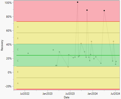
Hello. I have created a control chart where I am looking at recovery over time based on a large database. I have many different experiments in the database so I have used the Local Data Filter so only Experiment Type A results are showing. But these three points highlighted in the red section don't exist. On these dates no experiment A was performed and so the cell for this is blank ("."). Having looked closer at the value of the points it seems to be an average of the other experiments for that date (e.g. the first point is 100.5% with no Experiment A but 95% for Experiments B and C and 111% for Experiment D). So the control chart seems to only follow the local data filter selection if there is data but the decides to average the other results from that day if not. Has anyone had this problem or knows how to solve it. (the data point setting is Average and the Limits are Levey Jennings but the points appear on other control type settings too).
Accepted Solutions
- Mark as New
- Bookmark
- Subscribe
- Mute
- Subscribe to RSS Feed
- Get Direct Link
- Report Inappropriate Content
Re: Fake points on control chart. Why are they there?
Disabling this option might help
You might also want to disable this (depending on your data)
- Mark as New
- Bookmark
- Subscribe
- Mute
- Subscribe to RSS Feed
- Get Direct Link
- Report Inappropriate Content
Re: Fake points on control chart. Why are they there?
Disabling this option might help
You might also want to disable this (depending on your data)
Recommended Articles
- © 2026 JMP Statistical Discovery LLC. All Rights Reserved.
- Terms of Use
- Privacy Statement
- Contact Us


