- New to JMP? Let the Data Analysis Director guide you through selecting an analysis task, an analysis goal, and a data type. Available now in the JMP Marketplace!
- See how to install JMP Marketplace extensions to customize and enhance JMP.
- Subscribe to RSS Feed
- Mark Topic as New
- Mark Topic as Read
- Float this Topic for Current User
- Bookmark
- Subscribe
- Mute
- Printer Friendly Page
Discussions
Solve problems, and share tips and tricks with other JMP users.- JMP User Community
- :
- Discussions
- :
- Re: Data labels and error bars overlapping
- Mark as New
- Bookmark
- Subscribe
- Mute
- Subscribe to RSS Feed
- Get Direct Link
- Report Inappropriate Content
Data labels and error bars overlapping
Hey!
Currently running the trial of JMP 15.1- so far it is awesome!!!
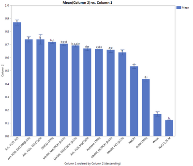
I ran into a problem tho- I did ANOVA and Tukeys on my data. Due to the funcionality of JMP I wanted to make a graph of the stats+my data where the Tukeys would be shown, however, when trying to implement the connecting letters to my bar graph I noticed that the Row Labels are overlapping with the error bars... Any way that I could move the bar labels higher, so that they are not in the way of my error bars?
- Mark as New
- Bookmark
- Subscribe
- Mute
- Subscribe to RSS Feed
- Get Direct Link
- Report Inappropriate Content
Re: Data labels and error bars overlapping
I wish I had error bars that small to have this problem.
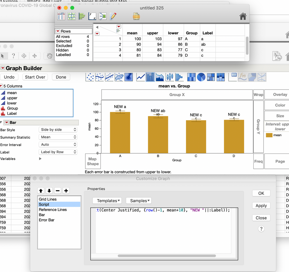
Just add this little bit of script to your graph. Use the customize option and then click the "+" to add a script.
for each row(Text(Center Justified, {row()-1, mean+10}, "NEW "||:Label));here's a picture of it
- Mark as New
- Bookmark
- Subscribe
- Mute
- Subscribe to RSS Feed
- Get Direct Link
- Report Inappropriate Content
Re: Data labels and error bars overlapping
Hi I just found this response and I am having the same issue. I am new to JMP so I am still learning could you provide this explanation about adding the script with a little more detail? I am able to get to the window where I add the script but then nothing works. Any suggestions?
Thanks in advance!
- Mark as New
- Bookmark
- Subscribe
- Mute
- Subscribe to RSS Feed
- Get Direct Link
- Report Inappropriate Content
Re: Data labels and error bars overlapping
Hello @LKlavins
I've been struggling myself with this issue. Something that worked out for me was caption boxes.
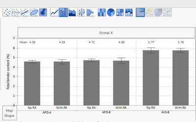
Instead of adding labels, you can go over your graph, do right-click, add, caption box. Then it will give you probably the general mean value on the right top corner (by default). You can then do again right-click, go caption box (there's an option after you've inserted it), and select the option per factor. That will show for every bar the mean value. In the same place, you can do all kinds of adjustments, eg place the caption box at the top, center, bottom, or even get other statistics like median. Just make sure there's enough space above your bars, by increasing the magnitude of your y-axis.
I hope this is helpful.
Recommended Articles
- © 2026 JMP Statistical Discovery LLC. All Rights Reserved.
- Terms of Use
- Privacy Statement
- Contact Us


