- Learn how to build custom Python data connectors and further customize JMP’s Data Connector Framework with the Python Data Connector Demo, available now in the JMP Marketplace!
- Learn some foundational elements of JMP Scripting Language (JSL) and how to extend point & click automation into repeatable, shareable routines. Register. June 26, 2 p.m. US Eastern Time.
- Subscribe to RSS Feed
- Mark Topic as New
- Mark Topic as Read
- Float this Topic for Current User
- Bookmark
- Subscribe
- Mute
- Printer Friendly Page
Discussions
Solve problems, and share tips and tricks with other JMP users.- JMP User Community
- :
- Discussions
- :
- Can someone explain the visuals JMP provides for the detailed comparisons report...

- Mark as New
- Bookmark
- Subscribe
- Mute
- Subscribe to RSS Feed
- Get Direct Link
- Report Inappropriate Content
Can someone explain the visuals JMP provides for the detailed comparisons reports?
Hello JMP community,
I am currently running into some issues understanding the detailed comparison reports JMP provides.
Specifically, can someone explain the significance of the colors and the red line that appears?
Thanks in advance.
Accepted Solutions

- Mark as New
- Bookmark
- Subscribe
- Mute
- Subscribe to RSS Feed
- Get Direct Link
- Report Inappropriate Content
Re: Can someone explain the visuals JMP provides for the detailed comparisons reports?
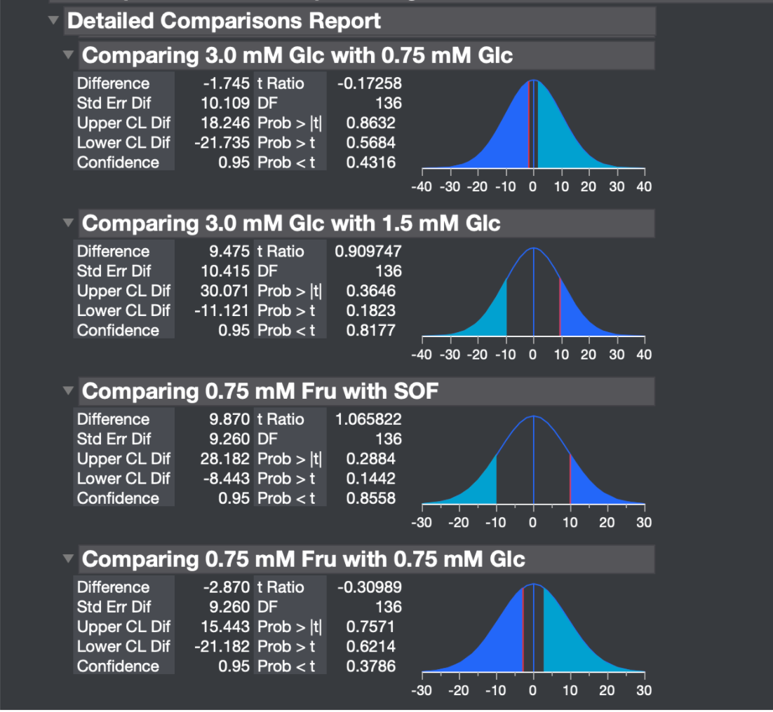
With regard to the plot, it shows the probability density function of t ratios under the null hypothesis.
- The vertical red line locates your sample t ratio.
- The dark blue area under the curve on the left side of the PDF represents the p-value for a result more extreme than your sample t ratio in the negative direction. This integral is labelled Prob < t and is 0.4316 in this case. It is the lower one-sided t-test.
- The light blue area under the curve on the right side represents the p-value for a t ratio more extreme than your sample in the positive direction.This integral is labelled Prob > t and is 0.5684 in this case. It is the upper one-sided t-test.
- The combined dark and light blue area under the curve represents the p-value for a t ratio more extreme in either direction. The integral in this case is 0.8632 in this case. It is the two-sided t-test.
- The horizontal axis is scaled by the original response variable.
The choice between the three t-tests is determined by the alternative hypothesis defined by your research question. JMP doesn't have information about your choice, so it provides all three alternative hypotheses. Choose one before the analysis and ignore the other two. They are irrelevant.

- Mark as New
- Bookmark
- Subscribe
- Mute
- Subscribe to RSS Feed
- Get Direct Link
- Report Inappropriate Content
Re: Can someone explain the visuals JMP provides for the detailed comparisons reports?
And I believe the two blue areas in total correspond with Prob > |t| = 0,8632. (NB: I'm not a statistician.)

- Mark as New
- Bookmark
- Subscribe
- Mute
- Subscribe to RSS Feed
- Get Direct Link
- Report Inappropriate Content
Re: Can someone explain the visuals JMP provides for the detailed comparisons reports?
With regard to the plot, it shows the probability density function of t ratios under the null hypothesis.
- The vertical red line locates your sample t ratio.
- The dark blue area under the curve on the left side of the PDF represents the p-value for a result more extreme than your sample t ratio in the negative direction. This integral is labelled Prob < t and is 0.4316 in this case. It is the lower one-sided t-test.
- The light blue area under the curve on the right side represents the p-value for a t ratio more extreme than your sample in the positive direction.This integral is labelled Prob > t and is 0.5684 in this case. It is the upper one-sided t-test.
- The combined dark and light blue area under the curve represents the p-value for a t ratio more extreme in either direction. The integral in this case is 0.8632 in this case. It is the two-sided t-test.
- The horizontal axis is scaled by the original response variable.
The choice between the three t-tests is determined by the alternative hypothesis defined by your research question. JMP doesn't have information about your choice, so it provides all three alternative hypotheses. Choose one before the analysis and ignore the other two. They are irrelevant.

- Mark as New
- Bookmark
- Subscribe
- Mute
- Subscribe to RSS Feed
- Get Direct Link
- Report Inappropriate Content
Re: Can someone explain the visuals JMP provides for the detailed comparisons reports?
One minor correction....the light blue area is the area to the right of absolute value of the t ratio so it has area = 0.4316. Together the shaded area is the 0.8632 (2 sided p-value = 2*0.4316). The 0.5684 is the one sided test for the t ratio of -0.17258, so 0.5684 is the area to the right of the red line.
Recommended Articles
- © 2026 JMP Statistical Discovery LLC. All Rights Reserved.
- Terms of Use
- Privacy Statement
- Contact Us