- New to JMP? Let the Data Analysis Director guide you through selecting an analysis task, an analysis goal, and a data type. Available now in the JMP Marketplace!
- See how to install JMP Marketplace extensions to customize and enhance JMP.
- Subscribe to RSS Feed
- Mark Topic as New
- Mark Topic as Read
- Float this Topic for Current User
- Bookmark
- Subscribe
- Mute
- Printer Friendly Page
Discussions
Solve problems, and share tips and tricks with other JMP users.- JMP User Community
- :
- Discussions
- :
- Can JMP make such diagrams as excel does?
- Mark as New
- Bookmark
- Subscribe
- Mute
- Subscribe to RSS Feed
- Get Direct Link
- Report Inappropriate Content
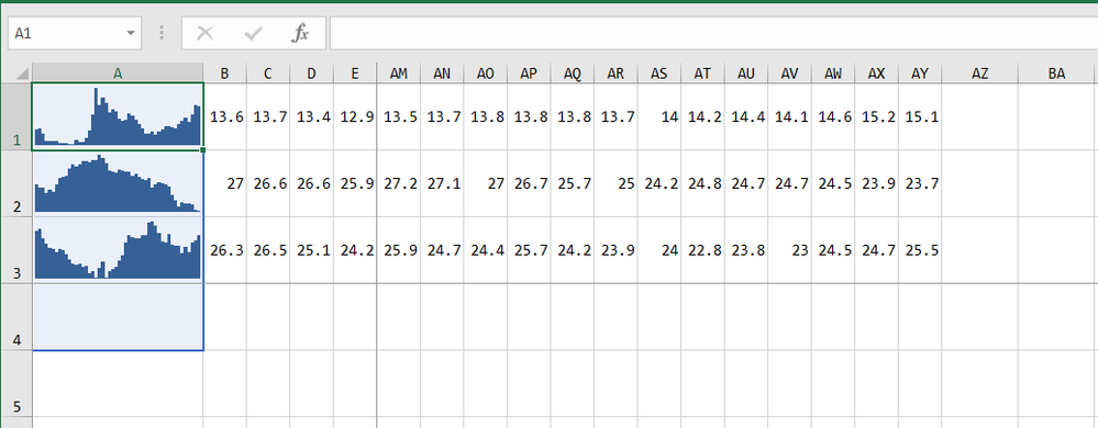
Can JMP make such diagrams as excel does?
13.64,13.71,13.38,12.9,12.85,12.9,12.89,12.76,12.73,12.74,12.65,12.64,12.92,12.83,12.79,13.08,13.57,14.6,16.3,15.23,15.66,15.35,14.7,14.9,14.78,14.3,14.17,14.23,14.68,14.49,14.24,13.97,13.67,13.34,13.35,13.5,13.28,13.47,13.66,13.82,13.82,13.8,13.67,13.97,14.21,14.4,14.1,14.6,15.2,15.11Thanks!
- Tags:
- windows
- Mark as New
- Bookmark
- Subscribe
- Mute
- Subscribe to RSS Feed
- Get Direct Link
- Report Inappropriate Content
Re: Can JMP make such diagrams as excel does?
Hi Lala,
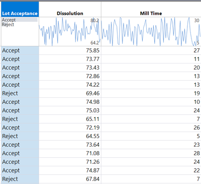
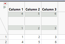
Are you trying to display a run chart of each row? You can do something similar in the new JMP 18 addition with the addition of improved header graphs - in the example below you can see it's displaying the row values for each column in row order. You can achieve this by right clicking > Chart Type > run chart.
- Mark as New
- Bookmark
- Subscribe
- Mute
- Subscribe to RSS Feed
- Get Direct Link
- Report Inappropriate Content
Re: Can JMP make such diagrams as excel does?
Thank Ben!
Yes, I want each row to display the graph for that row, so it's compact.
- Mark as New
- Bookmark
- Subscribe
- Mute
- Subscribe to RSS Feed
- Get Direct Link
- Report Inappropriate Content
Re: Can JMP make such diagrams as excel does?
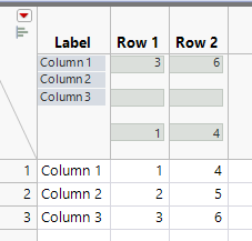
I believe what you are wanting are called sparklines (invented by Edward Tufte). If your data is in rows as you show, then you will want to transpose it so it is in columns. While you can get the displays at the top of each column as Ben_Ingham shows, you can also produce these in Graph Builder by dragging each of the desired columns into the Y variable range and choosing the line graph (assuming these are in a time sequence - or if you have a specific time variable, put that in the X variable range if it isn't already sorted by time).
- Mark as New
- Bookmark
- Subscribe
- Mute
- Subscribe to RSS Feed
- Get Direct Link
- Report Inappropriate Content
Re: Can JMP make such diagrams as excel does?
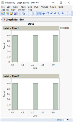
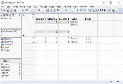
Not really something I would consider you should do with JMP, but you can do this but not directly from your data format.
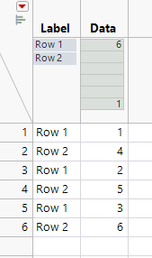
Start
Transpose data
Stack
Create graph
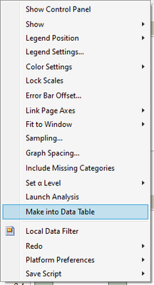
and make it into data table
Join this back to your original data by matching rows
(you can make the graphs cleaner using JSL)
Recommended Articles
- © 2026 JMP Statistical Discovery LLC. All Rights Reserved.
- Terms of Use
- Privacy Statement
- Contact Us

