- New to JMP? Let the Data Analysis Director guide you through selecting an analysis task, an analysis goal, and a data type. Available now in the JMP Marketplace!
- See how to install JMP Marketplace extensions to customize and enhance JMP.
- Subscribe to RSS Feed
- Mark Topic as New
- Mark Topic as Read
- Float this Topic for Current User
- Bookmark
- Subscribe
- Mute
- Printer Friendly Page
Discussions
Solve problems, and share tips and tricks with other JMP users.- JMP User Community
- :
- Discussions
- :
- Appearance of data and reference lines in histogram
- Mark as New
- Bookmark
- Subscribe
- Mute
- Subscribe to RSS Feed
- Get Direct Link
- Report Inappropriate Content
Appearance of data and reference lines in histogram
Hi
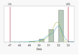
Using the Distribution tool and the capability analysis herein I get a histogram of my data with reference lines.
However, it appears as if the data point at 53 is outside the upper specification at 53.
Can someone help me how to fix this visualization problem, so the point appears to be inside specification?
Br,
M
- Mark as New
- Bookmark
- Subscribe
- Mute
- Subscribe to RSS Feed
- Get Direct Link
- Report Inappropriate Content
Re: Appearance of data and reference lines in histogram
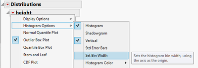
You could try changing binning
or by using Grabber tool (H for shortcut) and then dragging X-axis away from the x-axis.
- Mark as New
- Bookmark
- Subscribe
- Mute
- Subscribe to RSS Feed
- Get Direct Link
- Report Inappropriate Content
Re: Appearance of data and reference lines in histogram
This is one of the downsides to histograms. The bars represent a range of values. So the bar that is to the right of the 53 label represents values 53 <= Data <53.5.
The USL reference line isn't a range it's a singular value. As @jthi suggests you could change the binning or use the hand tool to adjust the axis to make this more to your liking.
Recommended Articles
- © 2026 JMP Statistical Discovery LLC. All Rights Reserved.
- Terms of Use
- Privacy Statement
- Contact Us


