- JMP User Community
- :
- Blogs
- :
- Scott Wise
- :
- Inflow Outflow Parallel Plots - Track Your Budget Flow with JMP Graph Builder
- Subscribe to RSS Feed
- Mark as New
- Mark as Read
- Bookmark
- Subscribe
- Printer Friendly Page
- Report Inappropriate Content
Blog: Inflow Outflow Parallel Plots - Track Your Budget Flow with JMP Graph Builder
Jed Campbell & Scott Wise
02/02/23
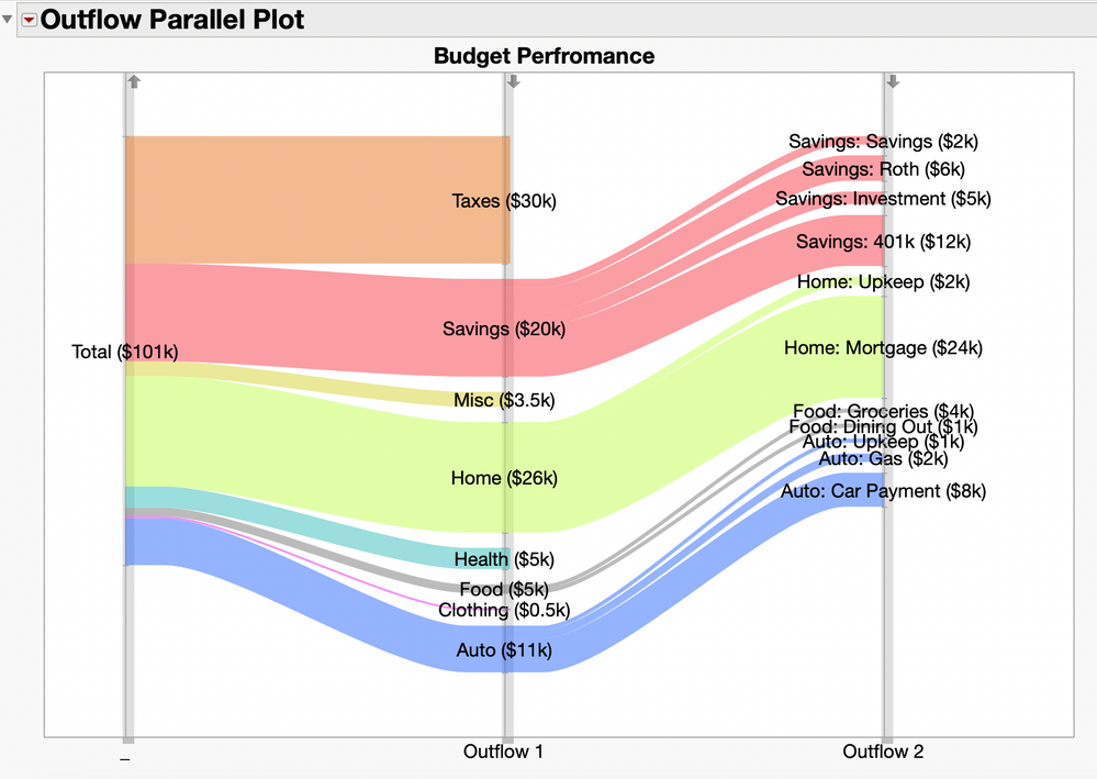
A Parallel (or Parallel Coordinates) Plot is a well-known graph that allows visual analysis of lots of high-dimensional data. Parallel plots are a great way to show relationships within your data as they connect in a row across two or more variables. One helpful application of this graph is to visually see the flow of spend across projects or personal budgets. Shown below is a JMP Graph Builder Parallel Plot showing outflows coming out of the initial Total budget of $101k. As each row grouping is sized by the total amount, it is easy to see how the spend outflows branch out from right to left by categories and subcategories. For example, the biggest expenditure for total Savings ($20k) in Outflow 1 is into a 401K plan($12k) in Outflow 2.

What if we want to also see the inflows into the Total budget in our Parallel Plot in addition to the outflows? This brings up a real challenge as most parallel plots as they assume only a one-way flow from left of right. In our case we really want two flows, one for the inflow into the total, and then to start another one to show the outflows. Luckily JMP Graph Builder Parallel Plots has an option called “Combine Sets” that will let us restart a flow in our graph.
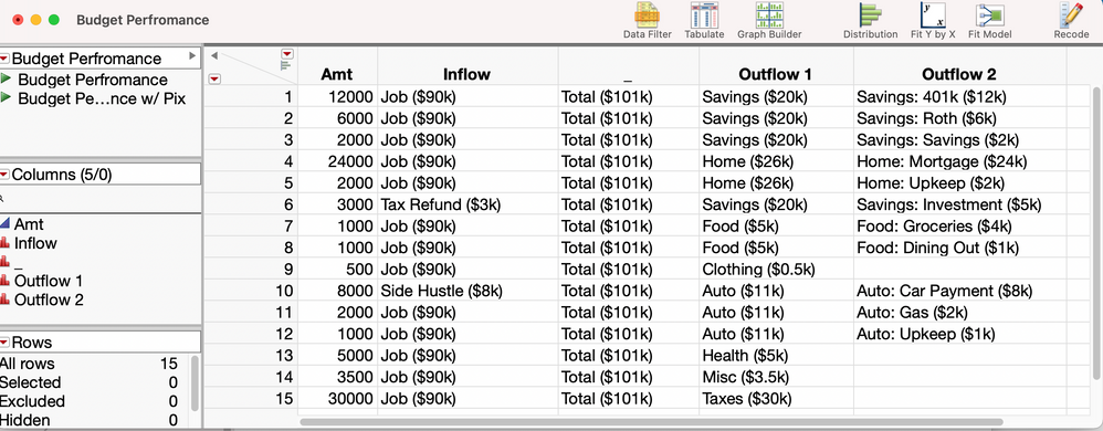
First let’s start with the setup of the data table. Our first continuous column “Amt” gives the ending flow amount for each row in our data that will help us size our graphs. The remaining columns are all categorical, giving us the contribution (“Inflow”) into the total budget, the column for the total budget (just given a small marker “_”), and then we end with the last two expenditure columns (“Outflow 1” and “Outflow 2”). Note that we also have incorporated each columns category amounts into the flow labels. This data table is called “Budget Performance” and can be downloaded (with graph scripts) in the JMP Public share link at the end of the article.
Now we are ready to build what we will call an Inflow Outflow Parallel Plot in Graph Builder. Step-by-step Instructions:
- Step 1) Open the data table “Budget Performance”
- Step 2) Open Graph Builder & Start Populating the View
- Put “Inflow”, “_ “, “Outflow 1” and “Outflow 2” on the X Axis
- Put “Amt” on the Size Landing Zone
- Put “Outflow 1” on the Color Landing Zone
- Step 3) On the Top Graphs Icon Panel Menu, Select Parallel Plot
- Step 4) In the Lower Left Parallel Element Options:
- Select Combine Sets
- Step 5) Right Click in the Y Axis -> Axis Settings
- Select Reverse Order
- Step 6) One the Parallel Plot
- Reverse the Arrow for “Inflow”, “Outflow 1” and “Outflow 2”
- Step 7) In the Upper Left, Select Done to Close the Graph Builder Control Panel
Graph Formatting (Optional)
- Step
In the Legend - Change Line Colors directly in the Legend as Desired
- Step 9) Under the Graph Builder Red Triangle
- Hide the Legend
- Hide the X Axis Title
- Step 10) Give the Graph a Better Title (“Budget Performance”)
- Step 11) Right Click on the Z Axis and Add Transparent Reference Lines to Highlight the Flow Starting Edges
- Add Reference Lines at Values 0.01, 1.01, 2.01 and 3.01
- Color the Reference Lines = Light Grey and Reduce to 50% Transparency
- Make the Line Styles = 10
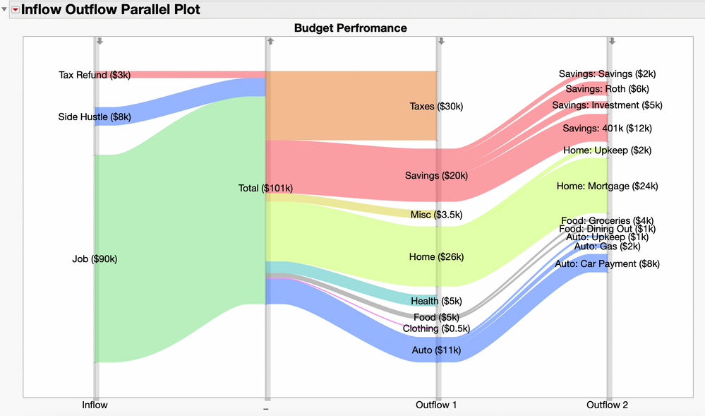
Now we can see the full Inflow Outflow Parallel Plot. By selecting the Combined Sets option in Step 4, we can see the contributions coming int the Total budget, but then restart the flow to show the outflows coming out of this same area. Sizing by the “Amt” column lets us appropriately size the flow groupings in the graph by dollars so we can see large contributions, like Job ($90k) as compared to other two incoming sources. Additionally, coloring by the “Outflow 1” lets us more easily trace the outflows coming out of the Total budget.
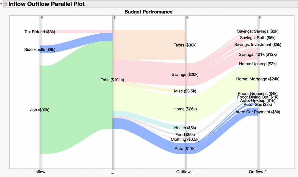
Interactively clicking on the Auto ($11k) expenditure part of the graph helps us further trace outflows. So, for the initial outflow of Auto, we can see how it breaks down into Auto: Upkeep ($1K), Auto: Gas ($2k) and Auto: Car Payment ($8k).
So, now when you want to graph your own financial or project budget, you can interactively visualize our flows with an Inflow Outflow Parallel Plot in JMP Graph Builder! Download the file attached to use the embedded scripts to practice. Also, please see the following JMP Public link to Interact with Inflow Outflow (Flow) Parallel Plot Here.
- © 2024 JMP Statistical Discovery LLC. All Rights Reserved.
- Terms of Use
- Privacy Statement
- About JMP
- JMP Software
- JMP User Community
- Contact


You must be a registered user to add a comment. If you've already registered, sign in. Otherwise, register and sign in.